- Features by Edition
- Latest Features
- Licensing/Activation
- Installation
- Getting Started
- Data Sources
- Deployment/Publishing
- Server Topics
- Integration Topics
- Scaling/Performance
- Reference
- Specifications
- Video Tutorials and Reference
- Featured Videos
- Demos and screenshots
- Online Error Report
- Support
- Legal-Small Print
- Why Omniscope?

|
|
|||||
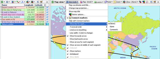
Connecting MarkersConnect Markers-Map ViewThis section demonstrates how to use the Connect Markers option in the Map View to draw a path around the map. You can download this example file showing a holiday around the world here. The various display commands on the expanded sub-menu are documented below.
1. Create a new Map View fileStart Omniscope and select File > Open map, then choose World. A new empty file will be created and opened, showing the Map View and the installed World Map, ready for adding markers. 2. Enable Connect markersFrom the Map View View Tools menu choose Connect Markers. Since you don't have any markers yet, you won't see any change. 3. Place markersFrom the Mode drop-down in the Map view, choose Place marker mode. The mouse pointer will change to a cross-hair when over the map. Move to the first location in the trip (for example, London in the UK), and click the left mouse button. The Add record dialog will appear. Type in a summary of this location, and press Enter or click OK. For example, 'Depart London, UK'. Move the mouse pointer to 'hover' over this marker. You'll see a Tooltip appear with the text you have entered. 4. Zoom in for more accuracyNow click the Map View Navigator button to show the Map Navigator, and use the controls to zoom in and pan around until you can see the next location accurately. Click to add another marker, and enter the description. For example, zoom into Hong Kong and add a marker with the text 'A few days in Hong Kong'. You'll see a black line joining the marker from the previous point. Carry on zooming into cities and adding markers and text until you've finished the path around the map. You can add more information by adding fields (columns) using Data > Manage Fields to add fields (columns), and then entering data into your new fields from the Table View, which you can open using 5. Viewing the resultClick the Map View Mode drop-down again and change to Zoom mode to avoid accidentally placing markers. Open the Mode drop-down again and click Zoom to fit map. You'll see the entire trip with a black line joining the markers. Hover the mouse pointer over a marker and you'll see the text for that point. If you don't like the "line/curve smoothing", you can adjust or turn this off from within the View Tools menu. Connect Markers sub-menu command reference
Traversal Order (showing an omni-directional path) By unticking Time series (connect markers by X axis), you can choose to draw the lines in a different order than dictated by the X axis. If you are plotting data based on criteria other than time, configure the Traversal order field appropriately. Show moving average: None; Simple & Exponential- If you have many data points in each time series, you may wish to try showing a moving average, by choosing Simple, Exponential or other data smoothing options on the sub-menu. Line/curve smoothing- By default, lines are turned into curves while preserving data points. In other words, curves are drawn between the data points. Depending on your data, this may be inappropriate. You can disable this using the Line/curve smoothing sub-menu. Alternatively, a second form of curve smoothing is provided, which does not pass through the data points. Untick Curves pass through vertex points to use this option. Both forms of smoothing can be adjusted for amount of smoothing using the Smoothing amount option. Line width-By default, lines are shown 2 pixels thick. Use the slider to change this any value between 1 and 25 pixels. Arrows: Show forward arrow; backward arrow; arrows for each segment; middle of each segment-adds different kinds of directional arrow heads to the line segments displayed Coloured- By default, if you have multiple lines displayed, these are coloured according to the values in the Category field. You can disable this and show only black lines by deselecting this option. Show markers- Hides or reveals the markers within the plotted lines (to resize markers, see Marker Options on the View Tools menu Anti-aliased- Smooths the way the line is displayed Show labels- By default, text labels will be shown beside each line if you have multiple lines. By de-selecting Show labels, these will only be shown as you move the mouse pointer over a line. The section on Time Series also covers advanced options for the Time Series > Connect Markers functions, most of which are the same in the Map View.
|
