- Features by Edition
- Latest Features
- Licensing/Activation
- Installation
- Getting Started
- Data Sources
- Deployment/Publishing
- Server Topics
- Integration Topics
- Scaling/Performance
- Reference
- Specifications
- Video Tutorials and Reference
- Featured Videos
- Demos and screenshots
- Online Error Report
- Support
- Legal-Small Print
- Why Omniscope?
|
|
|||||
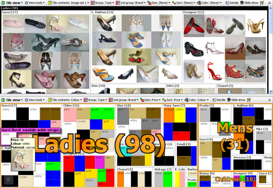
Tile ViewUsing the Tile ViewThe Tile View represents each record in the data set as a rectangular tile, which can be grouped, sized, sorted and coloured to display relationships, anomalies and outliers in the data. Tiles can be either image tiles displaying images associated with each record, or solid tiles displaying text and coloured and sized to represent various attributes of each record. The Tile View can be used as an image browser (see Open Image Set), but it is also a powerful 'heatmap' (treemap) for representing data visually along multiple dimensions. Moving the mouse over the tiles reveals the title for the record. By default, clicking on the tile selects the corresponding record. Double-clicking on the tile brings up the details display. The example below shows two Tile Views displaying the same collection of shoes. The Tile View on top is set to display an associated image set (the shoe pictures) as tile contents. Note the vertical scroll bar on the right, as the pictures have been up-sized from the default so that not all will display in the open view. The second Tile View below is showing the same collection of shoes using solid tiles coloured to match the colour of of each pair of shoes and sized in relation to price:
Tile View controlsThe Tile View is controlled using six configuration options located across the View Toolbar: Tile Contents: this drop-down menu provides the option to display either data values as solid, text containing tiles, or associated image sets as picture tiles. If you select a data field, the value of that field will display inside the tile representing each record. If you select an image set, it will display the name of the image file on tile select/hover unless you change the ungrouped tile title to the contents of another field (see below). Group: arranges the tiles into groups by any field. In the example above, the shoes are grouped first by Type: Ladies, Mens and Children's. 2nd Group: within the first grouping, arranges the tiles into sub-groups by the value in the specified field. In the example above, shoes are grouped secondarily by Brand/Designer. Size: varies the size of each tile in proportion to the value in the specified field. Can be used with both image and solid tiles. In the example above, the solid colour tiles are sized in proportion to Price. Sort: Sorts the tiles vertically by another field, such as Price. Colour: determines which field value is used to colour the tile, and can be used with image tiles as a semi-transparent overlay. In the example above, Omniscope recognised and automatically applied the colours to match the all the values in the Shoe Colour field, except for cream, which was set manually. For more on assigning colours to specific values in a given field, see Data > Manage Fields. Tile View > View Tools optionsThe Tile View Tools drop-down menu contains several options to change the display and selection behaviour in the view.
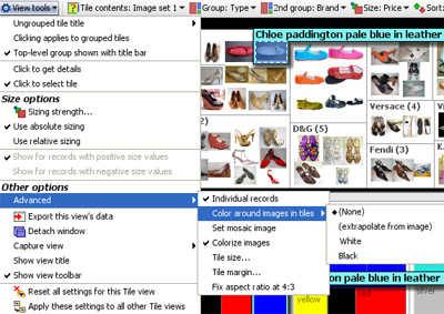
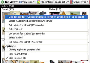
Ungrouped tile title- use this option to specify the value to be displayed on hover/selection instead of the value associated with the tile contents display value. In the example above, the Description text is showing, rather than the file name of the associated image file, which is sometimes not informative. Clicking applies to grouped tiles- when ticked, this option enables you to select entire groupings, rather than individual tiles. Top-level group shown with title bar- when ticked, this option displays the field by which the top-level grouping is defined as a nested title as shown in the examples above. When unticked, the title of the primary grouping field is displayed as a large orange text overlay on top of the primary grouped tiles, as shown in the lower Tile View example above. Click to get details- when ticked, a single left click displays the details window for that record Click to select tile- when ticked, a single left click selects that record Size OptionsSizing strength- this option is used to tune the sizing on a scale of -100% through 0 to +100%. The default is 100%, which means that the sizing calculation uses the default. Lowering the value to 0 eliminates all sizing, and further reducing it to -100% inverts the sizing, so that lower values get larger sizing. Use absolute sizing- this option calculates the sizing of all tiles based on the entire dataset, and keeps them sized this way regardless of the sub-set of records in the open view. Use relative sizing- this option re-calculates the sizing of the tiles based only on the records in the open view. Use this setting to accentuate small differences and counter the tendency of increasingly similar records to be sized similarly as the range of interest narrows. Show for records with positive/negative values- the Tile View can be used either with all positive values being displayed, or all negative values being displayed, but not both. Use two open Tile Views like the example above to show both positive and negative values, or use the Bar View. Advanced menu:Individual records- ticked by default, if the chosen tile contents field is a number or date, unticking this option will aggregate values into ranges and show the tiles for ranges, rather than the individual values per record. Show image for first token only- if your file has a tokenised image set (multiple images per record), by defaul the Tile View will show only the first image associated with the record. Untick this option to show all the images associated with the record. Colour around images in tiles- the relationship between the height and width (aspect ratio) of pictures inside image sets is often not uniform, or does not match the shape of the Tile View display. Omniscope creates blank spaces between the pictures to fill the gaps. This option controls the colour of the background fill; none, extrapolate from image (estimated from the colours on the edge of the pictures), black or white. Set mosaic image- used to create an effect in which a large high-contrast picture is re-created using many smaller images related to records in the data set. Cannot be used with grouping, sizing or sorting enabled. Colourise images- when ticked, allows semi-transparent colour overlays to cover the entire image tile. When unticked, only the border fill space is colourised according to the values of the files selected in Colour: on the View Toolbar Tile size- used to over-ride the default tile sizing which tried to ensure that all tiles display in the open Tile View without scrolling. If you increase the tile size, scroll bars will be added to the view as required. Relative or absolute sizing options are not affected. Use grid layout- only shows when sizing is not active. Changes the allocation of space within groupings to make tile size uniform within each group. Tile margin- used to increase the amount of background space displayed around the edges of the tiles. Colour around images settings are not affected Fix aspect ratio at 4:3- used to make image collections appear more uniform and minimise distortion of images with 4:3 aspect ratio. Tile View right-click menu optionsRight-clicking on a tile brings up a detailed selection menu where you can specify exactly the records you seek, and change the settings for the view.
The commands available on the right-click menu under Options are the same as those available in the View Tools menu
|