- Features by Edition
- Latest Features
- Licensing/Activation
- Installation
- Getting Started
- Data Sources
- Deployment/Publishing
- Server Topics
- Integration Topics
- Scaling/Performance
- Reference
- Specifications
- Video Tutorials and Reference
- Featured Videos
- Demos and screenshots
- Online Error Report
- Support
- Legal-Small Print
- Why Omniscope?

|
|
|||||
Details ViewUsing the Details ViewGetting into the detailsThe Details View can display all of the information about a record in Omniscope, with very flexible branding, text formatting and image display options. Can also be used as an editing form, allowing data entry and corrections by anyone with basic keyboard skills. Whenever a Details View is open, the Details display for individual records will show in the open view, rather than the pop-up or Side Bar panel details displays.
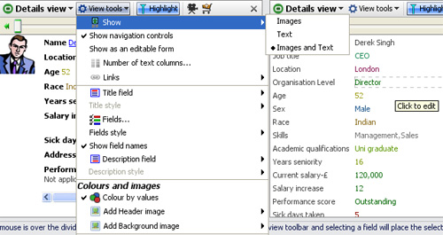
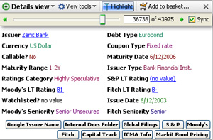
Details View ToolbarThe Details View toolbar contains a View Tools drop-down, a Highlight button (used to turn record highlighting in other views off and on) and the Slideshow, Add to Basket and [X] Close view commands common to other views. For more detail on highlighting and configuring slide shows, see Viewing Details and Highlighting. Warning: If you have global record cycling enabled, and you turn off the Highlighting option, the record cycling will stop. To re-start record cycling, hover your mouse on the barometer to expose the global automatic record cycling menu, and click on the green forward arrow to re-start. View ToolsThe View Tools drop-down menu contains many flexible options for configuring the Details View display: Show - defines what to display; images only, text only or both. When there is more than one image set configured, you can select which images to show (they appear horizontally). Show navigation controls - when ticked, displays a manual record-cycling slider only for the Details View. This is different from the automatic record cycling which affects all views. Drag the slider forwards and back, enter a record number or use the green forward/back arrows. When ticked, the Sync(hronisation) option keeps the record cycling in the that Details View on the same record as the global record-cycling. Show as an editable form - when ticked, for each record, all fields are displayed in a single column with the values in individual text editing boxes, as shown in the example above right. This mode is used to facilitate data entry and correction using a single, easy-to-understand interface that anyone can use. Number of text columns - drag the slider to the number of columns you want to use to display the text/field values you wish to show. The default is two columns with coloured values following field names as shown in the example below:
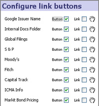
Links - similar to the command used in other views, this displays a pick list is used to assign which values will be underlined and launch associated links from the Details View. In the example directly above, the 'Issuer', 'S&P', 'Moody's' and 'Fitch' field values have been assigned links, and therefore show underlined. In the Details View, at the top the top of the links menu is a Configure links buttons option:
Title Field - selects a field (column) value to display in the upper left-hand corner of the view window. If you display a field as a Title, remember to untick the Title field in the fields pick list (see below) to avoid displaying the values twice. Title Style - enables you to apply text styling (fonts, font face, colour and alignment) to the Title field display. Fields - a pick list appears allowing you to tick/untick fields you wish to show/hide; drag the hands up or down to change the order (Note: you will only see these when ‘Text’ or ‘Images and text’ is chosen in the ‘Show’ menu). Show field names - when ticked (default) displays the field (column) names prior to the values. Untick to suppress the filed names. Description field - selects a field (column) value to display at the bottom of all other fields. Used to display longer text entries that do not wrap well if displayed in the columns with other, shorter field values. If you display a field as a Description, remember to un-tick the Description field in the fields pick list (see above) to avoid displaying the values twice. Description style - enables you to apply text styling (fonts, font face, colour and alignment) to the Description field Colour by values - when ticked, colours category values according to the colours assigned to each value, and numbers/dates by the scale reflecting the range of values (default : low=red to high = green). Text fields are always displayed in black. Add Header/Background Image - used to include logos and other faded backgrounds in the display. The other commands on the Details View Tools menu are common to all views and documented under View Tools. View Controls- configuring the display layoutThe layout and sizing of the image and text spaces in the Details View is controlled using a divider line which you can find by hovering the mouse over the divider between image and text. When you do this, the frame divider will appear. Click and drag the divider to get the proportion of image to text area you want. Click the frame divider switch button on the right when the divider appears and the orientation will switch between horizontal and vertical. Suggestion: Omniscope has powerful image re-sizing and management features. Be sure to experiment with allocating more space to the images to optimise the display in the Details View |


