- Features by Edition
- Latest Features
- Licensing/Activation
- Installation
- Getting Started
- Data Sources
- Deployment/Publishing
- Server Topics
- Integration Topics
- Scaling/Performance
- Reference
- Specifications
- Video Tutorials and Reference
- Featured Videos
- Demos and screenshots
- Online Error Report
- Support
- Legal-Small Print
- Why Omniscope?
|
|
|||||
View ToolbarsView Toolbar CommandsThis section covers the View Toolbar commands which are common to all views. Documentation for view-specific commands on the View Toolbar > View Tools menus of each view are discussed view-by-view in the Views Reference section. View Toolbars common features/options
Every View has a View Toolbar at the top. The View chooser, Data Subset query selector, Aggregation options, View Tools, Fields chooser, show Details and [X] Close View button at the far right end are present on most View Toolbars. Exceptions: Details View only shows the details for a single record, the Web and Content Views.
Fields - you can choose the fields (columns) displayed or hidden, and the order in which the columns are displayed on a view window-basis. Use the 'All' or 'None' buttons to show or hide all columns, and change the order by dragging the 'hands' up or down to order the columns.
Details - This button, next to right-most in all View Toolbars, displays a pop-up table (with the same settings as the Table View) showing all records currently visible in the view. If you have made an active selection before clicking on Details, you will be asked if you want to display only the selected records. The first column in the pop-up table will have underlined values, which are links to the individual records. Click on the underlined record to display that single record in a Details window. Alternatively, double-click the row number ("row header") to see the details for a record. For more detail, see Viewing Details.
View Toolbar > View Tools - commands common to all viewsThis discussion of the View Toolbar > View tools drop-down menu covers only those commands common to all or most views. Most of the commands under View Tools are specific to each view. These commands are discussed in the sections on each view, accessible for the links on the Views Reference page. The bottom-most section of commands in the View Tools drop-down menu is the same for all views:
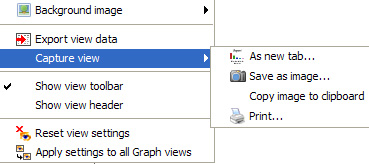
Background image - see discussion below Export view data - takes you to the Export Data wizard (also accessible from the Main Toolbar File > Export > Export files menu). Opening the Export Data wizard using the View Toolbar > View Tools > Export view data command pre-selects the data set of the current view as the set/subset of data to be exported. The Export Data wizard allows you to add or remove fields from the file to be exported, set the column order to match the view and to decide which export file format to use, either .IOK or .CSV or Excel .XLS for spreadsheets, or .XML for other applications). Capture view - provides 4 options for capturing the visible aspects of each individual view:
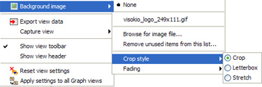
Show view toolbar - this option determines whether the View Toolbar is revealed or hidden. When creating report tabs, for example, it is often desirable to hide the View Toolbar if users do not need to alter the view settings. If you have saved the tab in default format the View Toolbar will be hidden...to reveal it for just one one view, say a Web View, tick this option. Show view header - this option reveals an editable text title space above the View Toolbar each view Reset view settings - allows you to reinstate the default settings for the view if you have changed the row heights, field order, etc. Apply these settings to all {view name} views- extends the settings you have configured for the view to all other views of the same kind. For example, if you have set a particular column order for a Table View, this command copies the settings to all other Table Views you have configured thus far. If you have configured Table Views in saved report tabs, you will be asked if you want to change those settings as well. Add Background ImageThe Pie, Bar, Graph, Portal and Details View Toolbar menus also contain the option to specify an image to be shown as a background to the view.
Image files such as logos, etc. of any size in .JPG or GIF format can be added as background, sized to fit using the Crop, Letterbox or Stretch options, then faded to create an unobtrusive backdrop for selected views. For more on working with background images, see the section on the Layout Menu.
|
 View Chooser - the selected view name and icon always appear at the far left of the View Toolbar. Click on the drop-down View Chooser to change the view displayed in the window.
 Data Subset - the data set or filtered/defined subset to be displayed is selected here. By default, the Filtered data (IN) subset is selected. If no filters are set, this will be the same as All Data. If you have defined
  Aggregation - most views enable you to select various options for defining and visualising aggregated data sets, and specifying the functions to be applied to each field (column) in the aggregated displays. For more detail, see the section on Aggregation & Grouping.
 View Tools - drop-down menu present on all View Toolbars, but most of the commands on this menu differ by view. The commands which are common to almost all views are discussed below. View-specific commands are discussed in the section on using each view.
 Close View - clicking on this icon will close each individual view.