- Features by Edition
- Latest Features
- Licensing/Activation
- Installation
- Getting Started
- Data Sources
- Deployment/Publishing
- Server Topics
- Integration Topics
- Scaling/Performance
- Reference
- Specifications
- Video Tutorials and Reference
- Featured Videos
- Demos and screenshots
- Online Error Report
- Support
- Legal-Small Print
- Why Omniscope?
|
|
|||||
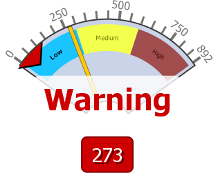
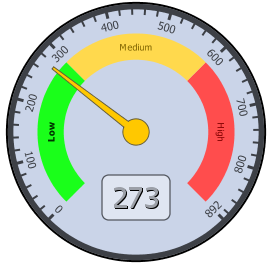
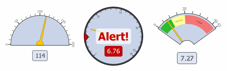
Dial ViewUsing the Dial ViewAdding typical 'dashboard' gauge-type displays and alertsDial View allows you to create three different kinds of interactive dashboards. Provides familiar representation of relative magnitude of values drived from specific columns in the data set. This makes it easier for end users to view the results at a glance. Dial view itself is highly customisable. For example, you can specify the maximum/minimum range, create coloured zones etc. Please note that dial alerts, range and zones settings are set for each individual value field. For example, if you set your dial alerts, ranges and zones and then switch your value field to something different than your settings will disappear. However, when you change your value field back to a field that previously had alerts, range or zones set, then the Dial view will restore them.
View ToolbarDial View toolbar has generic options just like other views such as View changer, Subset, Aggregate and the View tools.
Dial View toolbar also contains options and settings which are specific to the view itself. These are described below.
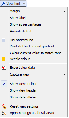
View ToolsThe view tools is available in all other views and contains general options which are available in other views, but also options specific to Dial View.
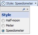
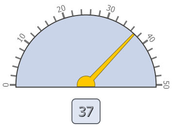
Toolbar - Style optionsStyle option allows you to choose between three different type of dial styles. This list may increase in the future versions.
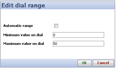
Toolbar - Range settingsThe range settings allows you to specify the minimum and maximum values for the dial. Once you have specified the range values the dial view will use that that to show represent the values. If the value falls outside the range of the dial, then warning text is shown.
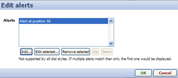
Toolbar - Alerts settingsDial view allows you to set your own alerts when certain conditions are met. For example, if you are monitoring sales target, you could have an alert that tells you once 50% of the the items are sold provide some kind of visual notification. You can also use the multiple alerts functionality of the dial view to add further alerts. However, dial view will only show the text of the first alert that has been met. For example, continuing from the previous example, if you have an alert set at 50% and another at 70%, but if the sales have gone beyond 70%, then the dial view show the alert for 50% and not for 70%. Having said that you can from the alerts dialog change this precedence. When no alert condition have been met, but there are alerts set then dial view shows a white triangle on the edge of the dial to indicate where these alerts have been set. Below is a description of how you can add alerts to your Dial View.
Adding and editing alertsWhen you click on the Alerts button you are presented with the following dialog. The edit alerts dialog allows you to add new alerts, edit existing alerts, remove alerts or change the precedence of the alerts.
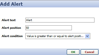
When you click on either Add or Edit buttons in the Edit alerts dialog you are presented with the Add/Edit Alerts dialog an example of which is shown and described below.
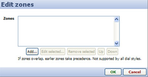
Toolbar - Zones SettingsThe zones settings allow you to set zones to sub-divide the values into different sections. Each of the sub-sections can be assigned a coloured zone and a label. This can be very useful when you have lots of values, and the values can be seperated into groups i.e Low, Medium and High. Below is a description of how you can add zones to your Dial View. Adding and editing zonesWhen you click on the Zones button in the View toolbar you are presented with the following dialog. From this dialog you can add, edit, remove and change precendence of the zones. This is useful when you have two or more zones are overlapping each other, as just like with alerts the earlier zones take precedence.
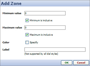
When you click Add... or Edit selected... buttons in the Edit zones dialog you are shown the following dialog which allows you to configure the zones.
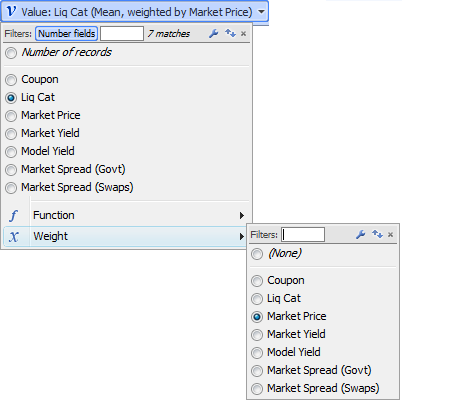
Toolbar - Value fieldThe value field drop down which is also present in some other views allows you to specify what values to show within the view. By default this is set to Number of records. However, you can easily change this to a particular field. Depending on the type of field you select, a Function: menu will appear, allowing you to chose whether to display the sum, the mean, or some other transformation of the data. If you choose a function such as mean, a Weight: menu will allowing you to specify another field to calculate weighted averages of the values. Below is an example of the Value field menu.
|