- Features by Edition
- Latest Features
- Licensing/Activation
- Installation
- Getting Started
- Data Sources
- Deployment/Publishing
- Server Topics
- Integration Topics
- Scaling/Performance
- Reference
- Specifications
- Video Tutorials and Reference
- Featured Videos
- Demos and screenshots
- Online Error Report
- Support
- Legal-Small Print
- Why Omniscope?
|
|
|
|||||
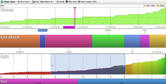
Chart ViewUsing the Chart ViewThe Chart View gives the most comprehensive overview of the contents and structure of your data sets. In one display, the entire composition of the file is revealed, enabling you to see relative proportions, ranges, gaps in the data, etc. The Chart View shows all the fields (columns) in the data set as horizontal visualisation bar devices, with continuous values like numbers and dates/times plotted smallest to largest, and category values divided into different coloured segments. Text values are shown in devices coloured in ‘alphabet soup’ where the vertical height indicates the number of characters in each text string. Null/blank values are shown as grey segments. Remember that nulls/blanks are not the same as zero values. Zero values will display as a single coloured line at the bottom of a numeric bar device with a white, rather than grey background. In the example below, the field Coupon is numeric and contains both null and zero values. All of the zero values are selected and one is highlighted:
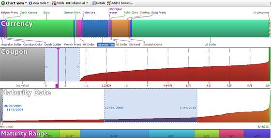 There are three types of Chart View field (column) visualisation bar devices, each shown in the example below: Text devices for text entries with many different values, such as names, comments etc. the Text visualisation bar devices show a 'staircase' curve based on the number of characters in each value in ascending order left to right. Selection inside Text devices is done in one of two ways; either by text input (keywords- the default) or by clicking and dragging. Right-clicking inside a Text visualisation device will display a menu with the option to set Selection to clicking and dragging. Using this setting, you can select suspicious text records based on blank values, or character counts longer or shorter than you would expect for your identification codes, etc. In the example below, the field 'Name' below displays as a Text device. If we select based on keywords, we can enter 'John' at upper left. Notice at the far right of the device that we found 3 'hits' on the name 'John' when entered in the search/filter box at left. Alternatively, if we set selection to clicking and dragging, we could select all the names with less than, say 11 characters using the mouse. Category devices fields with a limited number (by default, less than 100) of unique values contain text, but Omniscope will also type them as Category fields. Category visualisation bar devices show the proportions of each category in the segmented (or banded) horizontal bar. Each Category value is automatically assigned a different colour, which is the also default for other views. Selection inside Category devices is done by clicking on the bar segment(s) or on the segment labels as required. Clicking on a selection a second time de-selects that segment. The Main Toolbar ‘Deselect’ button will clear all segments. The field (column) Location displays below as a Category device, with 'Hong Kong' selected. Number devices for numbers, currencies and dates. Numeric visualisation bar devices display the range of values as curves in ascending order from left to right. Selection inside Number devices is done by clicking and dragging to the desired range of values. Multiple ranges can be selected. Right-clicking in the device will display a menu with the command to ‘Enter Selection Range’ which will allow you to specify exactly the range you wish to select. The field (column) Age displays as a Number device below, with the range of ages 25 to 45 selected. Note: it is currently not possible to change the font used for labelling in the Chart View.
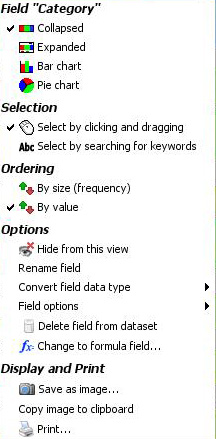
Right-click Device menuIf you right-click on a device, the device menu will appear, as shown below:
Options, Display and Print- these commands are common to all views and documented in the sections on Data > Manage Fields and View Tools. Chart View Toolbar Options
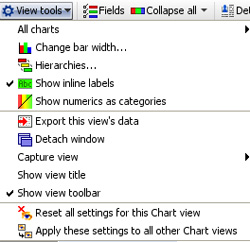
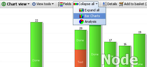
The rest of the commands shown above are common to all View Tools menus and are documented here Fields- used to choose which devices will be visible (ticked) or hidden (unticked). Also used to set the display order from top to bottom. Untick any fields you want to hide (you can bring them back later). Using the hands at the right of the menu, drag the fields in the menu upwards and downwards until you have them in the desired display order. Collapse All- The Collapse All button on the Chart View Toolbar returns all expanded devices to their collapsed state. Clicking the small drop-down arrow next to Collapse all accesses a menu from which you can choose Expand All, Bar Charts or Analysis display modes.
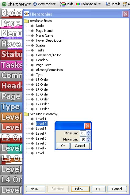
These menu items expand all the Chart View devices to one of their four possible display modes. For Number fields, Bar Chart mode creates a histogram for numerical fields with bands of values displayed both horizontally and vertically. Analysis mode shows a larger version of the plotted curve as well as key statistics on the numerical distribution. These statistics naturally update every time a query is executed. For Category fields, Bar Chart mode shows just that, while Analysis mode shows all the Category fields as pie charts. Selections of records can be made from all display modes directly with the mouse. Text fields do not display differently in Bar or Analysis display modes. Creating HierarchiesCategories which naturally 'nest' inside others, like Regions, Countries and Cities, can be combined in a hierarchy called, for example "Location". If records from more than one Region are in the IN Universe, the Chart View will display the Regionals in a new device called Location. Once only a single Region is selected, the Location Bar will 'drill down' and show the Countries in that region. If only one country is selected, Location will show only the cities in that country. Creating a new hierarchy is easy...just give it a name, "Site Map Hierarchy" in the example below...then drag the fields (columns) comprising the hierarchy underneath in the order they belong.
|