- Features by Edition
- Latest Features
- Licensing/Activation
- Installation
- Getting Started
- Data Sources
- Deployment/Publishing
- Server Topics
- Integration Topics
- Scaling/Performance
- Reference
- Specifications
- Video Tutorials and Reference
- Featured Videos
- Demos and screenshots
- Online Error Report
- Support
- Legal-Small Print
- Why Omniscope?
|
|
|||||
Table ViewUsing the Table ViewThe Table View displays your tabular data as it was imported into Omniscope from a spreadsheet tab or a database view/table. The Table View shows the underlying data values by row and column cells for selection, sorting and editing. Double or right-clicking on a cell allows you to edit the contents, and you can import large tables of data from other sources by cutting and pasting the data into the Table View. The Table View displays colour-coded values with instant aggregation and sorting, plus displays of zooming views of images associated with the data set. Like spreadsheets, you can specify formula fields (columns) calculated according to formulae you specify using values in other fields (columns). Each record (row) also has a links menu on the row footer (far right end of the row) enabling you to insert dynamically-generated local and web links, or select from a menu of pre-configured links to free web services. Use the View Tools menu commands to check for duplicates, expand and collapse text values into more or fewer columns, and many other data management and correction tasks.
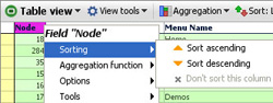
The Table View is highly-configurable, enabling you to drag columns to re-order. To hide (not delete) a field (column), right-click on the column header, select the Tools sub-menu, and select Hide from this view. The Reset all settings for this Table View command at the bottom of the View Tools menu restores all columns to the view, resets the column order to the original import order, and clears all record sorts, aggregations and colouring options. It does not affect Formula field or variable declarations. View Controls- Column, Row Header and Cell menusThe Table View control menus are available via left and right-clicks on the column and row headers, and right clicking on individual cells. These menus are discussed below. Column Header left-clickLeft clicking on column headers places a primary sort on the data set using the values in that column, and clicking again reverses the sort direction. Small orange triangles pointing up or down indicate that an ascending or descending sort has been set using the values in a column. The primary sort column triangle is solid orange, the other secondary sorts are unfilled. To see or clear sorts that have been set, use the Sorted Fields by Priority drop-down on the View Toolbar (see below). Column Header right-click: Sorting sub-menuSorting-sets the primary sort for the display ascending/descending on values in the field (column). You can remove a sort on this menu, or change the order or direction of sorts. To see and manage all sorts, use the Sorted Fields by Priority drop-down on the View Toolbar (see below).
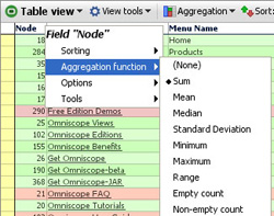
Column Header right-click: Aggregation function sub-menuAggregation function- When you have Aggregation set, the function to be applied to the record (row) values taken collectively for each filed (column) can be different field by field. The aggregation functions available on each column header sub-menu will depend on the data type of the field (column). For example, text columns minimum and maximum values are based on character counts. Note: Range gives the difference between the minimum and maximum values in the field. (See Table View > View Toolbar > Aggregation below for more on configuring aggregation.)
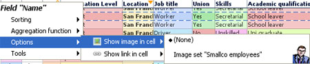
Column Header right-click: Options sub-menuOptions- You can choose to display related image sets in any column, or to display configured links, either to the details display of the record, or another link you have configured using the Settings > Links wizard on the Main Toolbar.
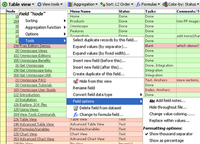
Show image in cell- allows you to insert an image into each cell of a column, regardless of the value in that cell. Choose from the list of image sets which you have previously configured using Settings > Images wizard on the Main Toolbar. Multiple image sets can be displayed this way since several columns can show different or the same images. Show link in cell- this option will display a sub-menu of links to display when the value in the column cell is clicked. You can link the values in any column to either the Details display, or other links which have been configured for the file using Settings > Links wizard on the Main Toolbar. You can link the values in more than one cell to the same link, or the Details display. Column Header right-click: Tools sub-menuTools- these column header sub-menu options mirror those available in the bottom section of the View Tools drop-down menu (documented in the View Tools section below). Some of these options (Hide, Rename, Convert field data type, Field options, etc.) mirror those available in Data > Manage Fields on the Main Toolbar documented here.
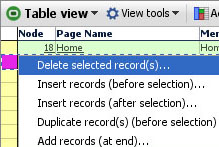
Warning: When using the Expand values commands, you need to create new, blank columns adjacent to the column being expanded to receive the separated values. If you do not, you will be warned about values in the adjacent columns being overwritten. Create new blank target columns and drag them into position to the right of the column to be expanded using Data > Manage Fields > Add new field (at the bottom). See more discussion of using the expand and collapse commands under View Tools commands below. Warning: Be careful when converting the field data type, as this will delete all non-compatible cell values in the field (e.g. text values will be deleted from a field converted to number field). see more discussion of changing field data types in Data > Manage Fields menu section. Change to formula field- changes a non-formula field to a formula field. Any values in the column will be replaced by calculated results. Convert to static values- changes a formula field with calculated values to an input colmun with static values, which you can overwrite. All formula logic will be lost. Row Header right-clickThe rectangular space at the far left of each row is called the row header. Left clicking on the row header selects the row, such that you can apply power query filtering operations like Move or Keep to exclude or focus on that record (row). Double-clicking on the row header brings up the Details display. Right-clicking on the row header displays a menu of options for managing the rows in the data set:
Note: If you have sorting or aggregations set, you may not see new blank rows where you expect them. Often it is best to clear all sorts and aggregations when adding or deleting rows. Row Footer left/right clickThe rectangular space at the far right of each row is called the row footer. Left or right-clicking on the row footer displays a Links menu which allows you to follow or define additional links using the Add web or local links wizards also accessible from Settings > Links on the Main Toolbar.
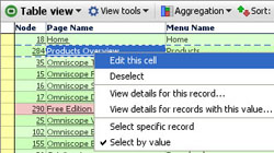
Cell Right-clickRight-clicking on an individual cell displays a selection and viewing options sub-menu:
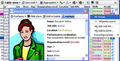
Edit this cell- is the same as double clicking on the cell to place the cursor inside the cell. Deselect- removes this record from the selection set. This is not the same as the global Deselect on the the Main Toolbar which removes all records from the selection set. View details for this record- displays the individual record Details for the selected record. View details for records with this value- launches the pop-up table view containing all records which share the same value in the cell. The pop-up table view will be configured the same as the Table View you clicked on in terms of column order, columns displayed etc. Select specific record- Use carefully!...when ticked, this changes the selection behaviour to select records one at a time, rather than based on common values. If this option is ticked IT APPLIES TO ALL fields (columns). When ticked, the Main Toolbar barometer will only show 1 record selected at a time, unless you drag the mouse to select contiguous records. Resetting the the Table View returns this setting to the default Select by value. Select by value- the default behavior...if you select a cell, all records that share the same value in that cell are selected, as shown in the Main Toolbar barometer in blue. You can then execute power queries such as Moves and Keeps on the selected records. View Toolbar MenuThe Table View Toolbar contains 5 view specific drop down menus; View Tools, Aggregation, Sort, Formulas, Colour-by: and Colour Options in addition to the View Chooser and the Show Details, Add to Basket and [X] Close window icons common to all views:
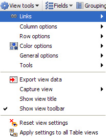
Each of these sections is documented below: View Tools MenuThe Table View tools menu has six sub-menus; Links, Column Option, Row Options, General Options, Aggregation and Tools. The sections below document the commands and options available under each of these sub-menus.
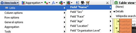
Links sub-menuThe Links sub-menu enables you to select which, if any, links will be associated with clicking on the values in the cells of each field (column) in the Table View.
Fields already associated with links will show on the drop down list in bold, and their values underlined in the cells of the Table View to indicate a live link. Column options sub-menuThe Column options sub-menu enables you to choose which fields (columns) will be shown or hidden (not deleted), and the order in which they will be displayed for that particular Table View (global column order for the file is set at import, but can be changed using Data > Manage fields on the Main Toolbar).
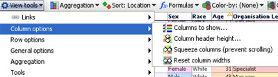
Columns to show- reveals a list of all fields which are ticked (showing) or unticked (hidden) in this Table View. Tick or untick the check boxes to show or hide columns and/or drag the hands up or down to change the order of columns. You can also click and drag the column headers sideways to reorder the columns, and you can hide columns by right-clicking the column header, then selecting Tools > Hide from this view. Suggestion: use the ALL or NONE buttons at the top right of the Columns pick list to reset the columns displayed quickly. Column header height- allows you to add more lines to column headers to accommodate longer names on narrower columns. Squeeze columns (prevent scrolling)- turns the column header text vertical (if necessary) and narrows all the columns/cells to display in the window available with a minimum of horizontal scrolling. Cell values are concatenated by default, but full cell contents will show as the mouse hovers over the cell. Reset column widths- (not shown when Squeeze columns is ticked)- resets the display of the columns on display based on the space available and number of columns being displayed. Columns can be widened or narrowed by dragging the edges of the column headers. This command provides a reset to defaults. Note: The settings that you make for a given Table View will not be applied to the Show details pop-up table unless you also choose Apply these settings to all Table Views. Row options sub-menuThe Row options sub-menu is used to manage the display of records (rows)
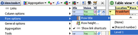
Row title- can be used to select a value to display in the row header. The default is the record number assigned by Omniscope, but if there is a more meaningful identifier in the data set, you can choose to display it instead. Alternatively, you can choose (None) and the row header will be narrow and blank. Row height- used to increase the number of lines in a row. The default is one, but if you wish to display images in cells, you may want to increase the number of lines using the slider. Display an image in one column, then increase the row height and width of the column. The images will expand to fill the space and the text will wrap. Show link shortcuts- by default, shortcuts to the various configured links are accessible from an icon on the row footer at the far right of each row. Unticking this option hides the row footer, which may not be needed by file users and frees up a small amount of horizontal space. General options sub-menuThe General options sub-menu contains options related to cell display.
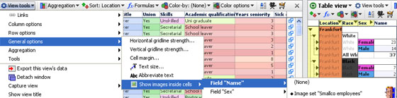
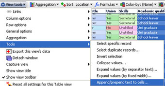
Horizontal/Vertical gridline strength- removes or emboldens the lines defining the rows, columns and cells. Cell margin- increases the white space around the edges of the cells from the default of none, to as much as 10 pixels. Can improve legibility, especially if used in conjunction with increased text size (see below) Text Size- increases the size of the font used in the headers and cells of this Table View. Abbreviate text- allows you to turn on and off cell text abbreviation. Abbreviation is useful when cells contain long text.. making columns too wide. With abbreviation turned on, you will still see what the cell contains in a much smaller space. Abbreviation is turned on by default. Show images inside cells- allows you to chose an associated image set to display as a zooming image in a particular field (column). Note: the images will obscure the underlying values, so it is best to use a column containing the image references, which are often cryptic image file names, or else a blank column added specifically for the purpose of displaying the images. Tools sub-menuThe Tools sub-menu provides some powerful functions to manage the format and layout and otherwise improve the quality of your data sets.
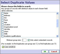
Select specific record- turns off the default common value-based selection i.e. clicking on any cell selects only the record that contains that cell rather than all the records sharing that value in the field (column). This makes the table behave a bit more like a spreadsheet and enables you to select rows to Move, Keep or Add to the Basket individually. Select duplicate records- displays the Select Duplicate Values wizard that for selected fields, isolates all records that have more than one identical value elsewhere in that field (also works for multiple fields). This is useful for eliminating duplicate records in large datasets. The Select Duplicate Values wizard allows you to select which fields to check for duplicates, or triplicates etc. If you select more than one field (column) then records duplicated in either column (but necessarily both) will be selected.
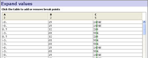
Invert selection- If you have selected a complex pattern of records, and wish to quickly select all other records not currently selected, use this command. Collapse values- used to combine some of all of the values currently in more than one column into a single column, with a space or some other separator you specify in between the values. You must have selected a range of columns and rows to collapse before clicking on this command. Used to reduce column count and to create tokenized fields, which contain more than one value per cell and are used to to capture many-to-one relationships in tabular data. For more information, see Tokenized Data. Note: You cannot select a group of columns using the column headers. To select all or part of a range of columns, select the first cell in the first column, then drag the mouse across to the right to select more columns and downward to select more rows. If you need to select many more rows than are visible, hold the Shift key and use the vertical scroll bar to bring the bottom right hand cell of your range into view. Click on that cell with the Shift key still depressed and the entire rectangle of columns and rows will be selected. Expand values (by separator text)- used to replace a single column of data containing compound elements (e.g. First and Last Name with a space between) with multiple columns each containing a single element, such as First Name Column and Last Name Column. Before using this command, you must select the compound (separated value) column you wish to expand and create new blank column(s) adjacent to the right of that column. Be sure to select the entire column to be expanded using the Shift + scroll down method to ensure you have selected all the way to the bottom of the column- assuming the expansion should include all the cells in the column. Click on the command and you will be asked to specify the text separator defining the elements to be expanded, such as a blank space, which must be entered. Note: create the new, blank columns using the Data > Manage Fields > Add new field button (at the bottom) then drag the new column into place below (right of) the column to be expanded, making sure to tick the new column in the Columns to show list of you are in Reports Mode. The existing column will be used for the first element, so to split two elements you need only add one new column. Expand values (by fixed width)- used to break a single column of data into more than one column based on defined break points you set using the Expand Values wizard:
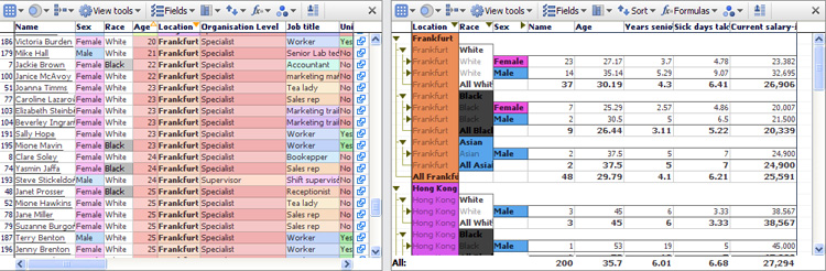
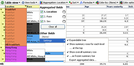
Before using this command, you must select the column of values you wish to expand and create sufficient new blank column(s) adjacent to the right of that column. Be sure to select the entire column to be expanded using the Shift + scroll down method to ensure you have selected the column all the way to the bottom - assuming the expansion should include all the cells in the column. Append/prepend to cells- used to add specified characters before or after the existing values in the cells. Note: sometimes when exporting numeric identifiers with leading zeros to Excel, such as Bloomberg Excel spreadsheets using SEDOLs, Excel does not recognise the incoming values as text and drops the leading zero, rendering the identifier incomplete. To stop this, use the Prepend function to add a text character such as an apostrophe ' in front of the numeric identifiers to force Excel to treat the values as text. View Tools: Aggregation settingsThe Aggregation sub-menu controls the display when aggregation is set for a given Table View. Aggregation groups rows together based on common values. You specify the fields (columns) on which aggregation is based in sequence. For example, if you have a data set in which each record (row) is a person, you might choose a Table View display which aggregates the rows first by Location, and then by the values in other fields, like Race or Sex (grouping the males and females in each location). You set the aggregation sequence using the Aggregation pick list on the View Toolbar. If you have more than one aggregation set, use the hands to drag aggregated fields into the order in which you want the aggregations presented top to bottom = from left to right. Note: Many different aggregation functions are availabe, and they can be different for each column. Right-click on the column header to see which aggregation function is specified for each column in the Table View.
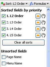
Expandable tree- when ticked, displays a navigational 'tree' in the far left row header. Clicking on the black triangular arrows either expands or collapses the view of the rows at a particular level of aggregation. Show summary rows for each level- when ticked, displays a summary row for each aggregated set of rows. The summary row calculates a value based on the function you select in each column by right-clicking on the column header and selecting the aggregation function to be used for that column. ...at the top- when ticked, displays the summary row for each set of aggregated rows at the top of the grouping rather than at the bottom Show overall summary row- when ticked, shows a summary row for all rows, using the function specified for each column by right-clicking on the column header and selecting the aggregation function to be used for that column. ...as frozen summary row- when ticked, keeps the overall summary row visible at the bottom of the Table View window. Export aggregated data... creates a new .IOK file where the rows reflect the values selected for aggregated rows in the source file. View Tools: Sort SelectionSorting for each Table View is set using the Sort drop-down menu. Tick the check box of any field to sort the table by this field. Click the orange arrow next to each field name to reverse the direction of the sort. Drag the hands next to each field to change the order of primary, secondary and subsequent sorts.
Use the Clear all sorts button to remove all sorts from this Table View. Note: It is common to set sorts accidently by clicking on column headers. Always keep an eye on the Sort: field to ensure you have not inadvertently added a primary sort at the top of the list. If you have, simply untick the unwanted sort on this list and it will be removed...no need to use Clear all sorts. View Tools: Add Formulae/VariablesOmniscope can calculate values based on values in other columns, using a standard menu of functions (plus some additional Visokio DATASET functions) and the same syntax as Excel.
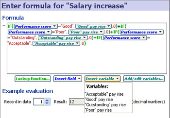
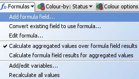
Add formula field- creates a new field (column) of values calculated as a function of the values found in other columns, together with any variables whose ranges have been defined (see discussion of variables below). Use the Add formula field wizard to define the calculation you want Omniscope to perform when populating the new column. For more detail on using the Add formula wizard, see the section on Formulas and Variables.
Convert existing field to use formula- use this command to substitute any values that may be in an existing column with calculated values based on a formula you specify using the Add formula field wizard. Edit formula- allows you to select the already-defined formula you want to edit, and displays the current formula definition in the Add/Edit formula field wizard for editing. Formulae are specified by selecting columns and typing in arithmetic operators and selecting functions from the the functions library. The functions library contains all the standard spreadsheet functions, plus special Visokio DATASET functions documented in the Functions Guide. For more detail on using the Edit formula wizard, see the section on Formulas and Variables. Formula calculations and aggregation options (see below) can interact. The precedence settings determine (for each Table View) whether the fields with formulae defined are calculated at individual record level, then aggregated, or aggregated first: Calculate aggregated values over formula field results- the default behaviour (aggregation of row values happens after formulae are calculated) Calculate formula field results for aggregated values- this option changes the precedence of the calculations, such that a formula such as =[USD Volume] / [Deal Count] in an aggregated table using aggregation function Sum, is evaluated as Sum (USD Volume) / Sum (Deal Count) for the aggregate rows. Notice that with this option set, two "sum" concepts at play: inside a formula, SUM(Column A, Column B, Column C...) calculates the SUM of multiple fields within the same row. In the aggregated table, the aggregation function Sum calculates the vertical sum of all record values within the same field (column) in the aggregated row. Add/Edit variables: Variables are input assumptions (not fields in the data set) you define by setting a default value and specified upper and lower ranges. Variables are used as flexible input assumption values so that dynamic sensitivity analyses and real-time modelling options will be available to users of the file. If you define Variables, the input values can be set by devices which appear on the Side Bar. These sliders must be visible (ticked in the Devices drop-down menu on the Side Bar) in order for you and your users to 'flex' the assumptions by adjusting the current value of the Variable(s). Any Variable(s) whose current value is different from the default will show an orange device panel, the same as for set filter device panels. For more detail on defining and using variables, see the section on Formulas & Variables.
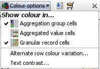
View Tools: Colour-by selectionColour-by: {Field Name} or (None): This drop down menu allows you to select the field (column) by which to colour the rows in the Table View. If you select a field, it overrides the default colouring based on field data type (white for text fields, ranges from red (low) to green (high) for numeric fields, etc.) to colouring that defines records by the value and assigned colours of any any field (column) you select. You can set the colour associated with each category in the field (column) using Data > Manage Fields > Configure > Field Options > Change value order, colours and shapes. You can also access the Field Options command from the Column Header right-click Tools sub-menu shown above. View Tools: Colour Options menuThe Colour Options sub-menu is used to change the colouring behaviour of each Table View.
Granular record cells - if you find even the unaggregated cell colouring distracting, and want to return to black and white, untick this option to turn colouring off altogether.
|