- Features by Edition
- Latest Features
- Licensing/Activation
- Installation
- Getting Started
- Data Sources
- Deployment/Publishing
- Server Topics
- Integration Topics
- Scaling/Performance
- Reference
- Specifications
- Video Tutorials and Reference
- Featured Videos
- Demos and screenshots
- Online Error Report
- Support
- Legal-Small Print
- Why Omniscope?
|
|
|||||
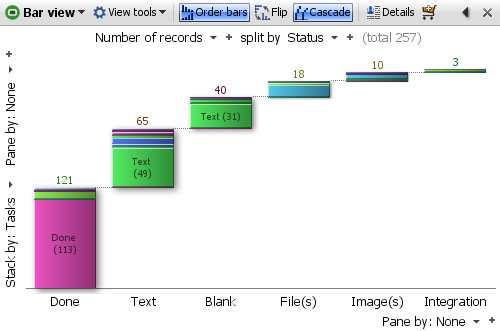
Bar ViewUsing the Bar ViewThe Bar View is one of the most flexible views. It can be used to display either Category, Date and Time or Numeric data and calculated values like sums and averages. Both positive and negative numeric data can be compared in the same view. Bars can be displayed vertically or horizontally, and you can configure one or more splits (breakdowns) of selected values, with sub-breakdowns within the bars (stacked bars) and paning to create multiple displays in a single window.
All segments displayed in the Bar View are selectable, and can be used for power queries using the Bar View ToolbarIn addition to the View Chooser and the View Tools drop-down menu, the View Toolbar contains a series of options for modifying how the bars display; Order bars, Flip, Cascade, 100% bars, Normalise panes, and Swap panes, plus the Show details, Slide show and Add to Basket commands common to all views and documented under View Toolbar commands.
View Tools- in the Bar View, all the view-specific commands are located on an Options pull-out menu accessible from this menu, and also accessible from the < arrow on the View Toolbar just left of the [X] close view command. All View Tools commands in the Bar View other than the link to Options (see below) are common to all other views and documented here. Order bars- sorts the bars in order of the values displayed, clicking again reverses the sort order, and again removes the sort. Flip- changes the layout between horizontal and vertical bars Cascade- displays the bars on a rising, progressive 'stair-step' base, rather than a single level. 100% Bars- normalises the height of each bar so that proportional differences in the stacked sub-segments inside each bar can be compared across the bars. Normalise panes- normalises the height of the tallest bars in each pane, so that big differences in the absolute numbers do not minimise the height of the bars in some panes. Swap panes- changes between horizontal and vertical paning. See the Options sections below for more detail on the configuration options available.
Bar View ControlsControls within the Bar View are located around the edges of the view. The Value and Split by menus are at the top, with Stack by and vertical Pane-by commands along the left side, and horizontal Pane-by menu at the bottom. Bar View configuration options are so numerous they have been put on a series of 6 drop-down menus accessed from a pull-out Options tab that appears whenever you hover your mouse along the right side of the display window.
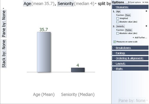
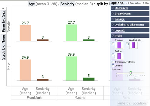
Value/+ Add field Selector- left-most above the display, this drop-down menu allows you to select the quantity to be represented in bars. The default is the number of records, but you can change or add to the value field(s) being shown from this drop-down menu. You can toggle the field pick list to show all fields, numeric fields only or date fields only. Clicking on the '+' after the selector allows you to add another field as a quantity to display as an additional, separate bar next to the bar representing the first quantity. If you want to show the composition of each bar using the Stack-by option menu at left, you may want to select the 100% option to normalise the height of all the bars such that the stacked segments show comparable proportions. You can also specify the fields/values to represent on the Options > Measures menu (see below), which also offers additional sub-menus to specify the function being applied (sum, mean, standard deviation, etc.). Split by/+Field Selector- drop-down menu allows you to specify one or more category, numeric, date or text fields to define how to break down the fields being plotted. You can also specify one or more fields to break down the values displayed using the Options > Breakdown menu (see below). Note:Split by selections are applied before Pane by selections. Stack by Field Selector- (left side)- specifies the field to be displayed inside of each bar to create a 'stacked' bar chart. You can also access this command using the Options > Breakdown menu (see below). Pane by/+ Add another Selectors- (left side & bottom)- paning creates separate sub-windows within a single display, which can be used to further break down the bars being displayed. You can also access these commands from the Options > Paning menu (see below). Note: Pane by selections are applied after Split by selections. Options Tab MenuThe Options tab menu contains 6 sub-menus; Measures, Breakdown, Paning, Ordering & alignment, Layout and Style. Options > MeasuresThe Measures sub-menu is used to specify the values to represent as bars. In the example below, the Age and Seniority of employees is being plotted. Both of these are Numeric fields measured in the same units, years, so we use the Function sub-menu to specify that we want to plot the Mean (average) of the Ages and the median (most common value) for Seniority.
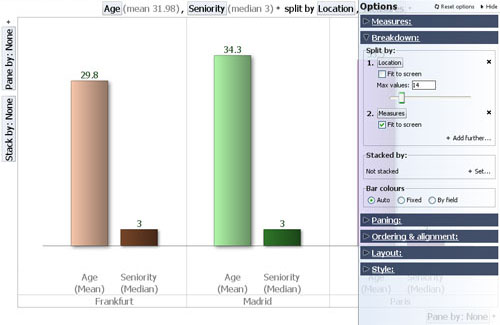
Value+ Add further fields- same as the field selector at the top left of the view, the Options dialog offers more options to specify functions, etc. Function- only visible if you select numeric value fields (other than the Record count default). In the example above, the functions sub-menu is used to select average for the Ages (the sum would not be meaningful). The mean (average) age of the workers will not be weighted by the values in another field, so the Weighted option is not ticked. For the Seniority field, the median value, rather than the mean, will be displayed. There are no negative numbers in the Age or Seniority fields, so we will not need the Absolute value function either. Measures on the same scale- since both values being plotted are in comparable units (years), we tick this option. Options > BreakdownThe Breakdown sub-menu allows you to plot additional bars by splitting the display according to other fields (columns) in the data set. In the example below, we split the display of average age and median seniority of employees by location.
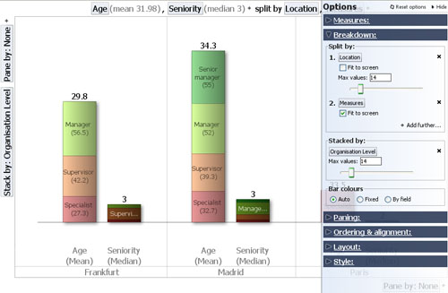
Split by: same as the field selector at the top of the display, the Options dialog offers additional options to control how the increased number of bars is displayed. If you choose a Split-by field with numerous values, you are also given a choice of displaying a bar for each value, grouping the splits into ranges (histogram), or grouping the bars by sign (positive or negative). +Add further splits... allows you to specify further fields to sub-divide the bars by Fit to screen- tick this option if you want all bars to display in the view window, no matter how compressed the width of the bars. Max values- use this slider to manage the number of bars displayed individually. If the total number of bars is more than the viewable maximum, the remainder of the bars will be shown aggregated into an 'Others' grouping. The 'Others' grouping will be disaggregated only if filtering reduces the number of bars to be displayed to less than the maximum. Stacked by: same as the field selector on the left, you can select only one field to display inside the bars, and you cannot mix positive and negative values.
Max values- use this slider to manage the number of stacked segments displayed individually. If the total number of stacked segments is more than the viewable maximum, the remainder of the segments will be shown aggregated into an 'Others' grouping. The 'Others' grouping will be disaggregated only if filtering reduces the number of stacked segments to be displayed to less than the maximum. Bar colours- use these options to control the colouring of the bars and bar segments.
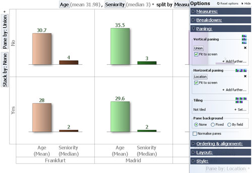
Options > PaningThe Paning sub-menu is used to further sub-divide the display vertically, horizontally, or both. Paning sub-divisions are applied after Split-by selections. In the example below, the view display has been paned vertically based on the values in the Union membership field (column), which contains the values 'Yes' or 'No' for each employee. The resulting bar chart display indicates that Union members in this organisation are on average younger and most commonly less senior than non-union members, in both locations, London and Madrid.
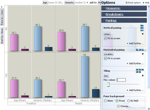
Vertical paning- same as the selector on left of display window, however the Options dialog offers more controls over how many panes to display unaggregated y if the number of values to panes by is large relative to the space available. To see all panes unaggregated, tick Fit to screen. Horizontal paning- same as the selector on the bottom of display window, however the Options dialog offers more controls over how many panes to display unaggregated. Notice in the example above that the Split-by: 'Location' choice has been replaced by a horizontal Pane-by: 'Location' setting (faintly visible under the Options dialog panel at lower right). To see all panes unaggregated, tick Fit to screen. Note: Pane-by selections are applied after Split-by selections. Tiling- adds multiple plots within each pane, showing the values further sub-divided. In the example below, we have left the display paned horizontally by 'Location' (values= Frankfurt, Madrid, etc.) and vertically by 'Union Membership' (values= 'Yes' and 'No'), and added Tiling by Sex (values: 'Male' in light and dark blue and 'Female' in light and dark pink):
Note: Split-by and Pane-by choices are applied before Tiling. To see the values represented by the bars in each sub-plot (cluster) within the panes, hover on the bar with your mouse and the values are displayed in the Tooltip. Pane background- use this command to set the background colour of the panes, which can be all the same or different.
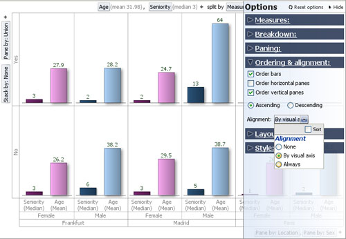
Normalise panes- typically used in conjunction with stacking, sets the height of the (first) bars in all panes to be the same, regardless of their relative magnitudes, so that the proportions of the sub-segments representing the Stack-by values will be comparable across panes. Options > Ordering & AlignmentThe Ordering & alignment sub-menu allows you to control the relative positioning of bars both within and across panes. The example below has the same settings as the one above, except that Order bar and Order vertical panes options are ticked, and the ordering is now set to 'Ascending'. Notice that in example below, the bars representing median seniority and average age have now changed positions, and that the Union='Yes' panes are now on top of the Union='No' panes:
Order bars- sorts the bars within panes/tiles in either Ascending or Descending order. In the example above, the bars are in comparable Years units and the lower value, median Seniority, is displayed before the higher value, average Age. Changing the sort order to Descending will reverse the order of the bars within the panes/tiles. Behaviour of this option can be influenced by the Alignment settings (see Alignment below). Order stacks- whenever a Stack-by field is specified ('None' is specified in the example above), ticking this option will sort the sub-segments within each bar in either ascending or descending order. Order horizontal panes- when ticked, this option will order the panes horizontally, Ascending or Descending, based on the ranking of the values. In the example above, this option is not ticked. Behaviour of this option can be influenced by the Alignment settings (see Alignment below). Order vertical panes- when ticked, this option will order the panes vertically, Ascending or Descending, based on the ranking of the values. In the example above, this option is ticked, and the Union='Yes' vertical panes are displayed above the Union='No' vertical panes. Behaviour of this option can be influenced by the Alignment settings (see Alignment below). Alignment: comparison of bars across panes is facilitated by keeping the bars in a consistent order, especially looking vertically for a vertical bar orientation and looking horizontally for a horizontal bar orientation (see Options > Layout > Bar orientation below).
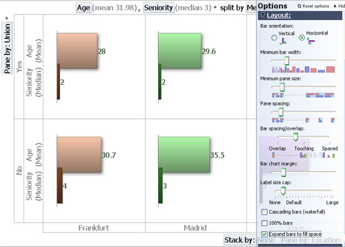
Options > LayoutThe Layout sub-menu is used to manage the appearance of each Bar View display. Most of the visual aspects , such as orientation, width and spacing of the bars, etc. can be managed from this dialog. In the example below, we have changed the bar orientation to horizontal, increased the minimum bar width and reduced the bar spacing to slightly overlap the bars:
Bar orientation- changes the bars between vertical and horizontal directionality. Note that in vertical orientation, the Stack-by field selector moves from the left side to the bottom of the display Minimum bar width- changes the minimum width of each bar in order to display more or fewer bars Minimum pane size- changes the minimum width/height of panes in order to display more or less panes Pane spacing- changes pane margin/spacing allocating more or less space in the pane to the bars. Cluster spacing- {being revised} Bar spacing/overlap- changes the space between the bars, which can overlap (see above), touch or be spaced apart Bar chart margin- changes the margin space around the outer edges of the display Axis label size cap- sets the maximum length of the labels, which can cause them to wrap or display vertically to save space. Warning: Setting Axix label size cap to 'None' (meaning no label) will suppress labels display completely. Start with the Axis label size cap set to 'Large' and reduce...working in conjunction with Style/Font Size (see below). Measure/Axis font size - Allows you to control the font size of the measure labels and of those that are shown on the x or y axis. Measure label orientation - Allows you to control how measure labels are shown (auto/vertical/horizontal). By default this is set to auto which means that bar view automatically calculates what is the best orientation of measure labels i.e. if there is not enough space to show all the labels horizontally fully then it will show them vertically. However, the auto behaviour may not be always be accurate in all situations in which case you can manually set the orientation. Measure label spacing - Allows you to control how much space is allocated to measure labels when they are displayed. This option is particulary useful when measure labels orientation is vertical and you have big values, and you want to show the full value and don't want to truncation of the values to take place. Cascading bars (waterfall)- same as the option on the Toolbar, displays the bars on a rising, progressive 'stair-step' base, rather than a single level. 100% Bars- same as the option on the Toolbar, normalises the height of each bar so that proportional differences in the stacked sub-segments inside each bar are comparable across the bars. Expand bars to fill space- sets the bar widths so as to use all available space after allowing for settings governing margins, spacings, maximum bars and panes to show disaggregated, etc. Options > StyleThe Style sub-menu allows you control the visual effects applied to the individual bars. In general, we suggest that you use the default effects for best visualisation. Turning off the defaults will display the bars with no visual effects:
Shadows- adds a shadow effect to the side of each bar Gradient fills- varies the colouring of each bar to give the impression of a more solid, reflective surface Outlines- draws a solid border around each bar Transparency effects- {being revised} Gridlines- unticking this option will remove the border lines between panes Font size- allows you to increase or decrease the label font size for best legibility |