- Features by Edition
- Latest Features
- Licensing/Activation
- Installation
- Getting Started
- Data Sources
- Deployment/Publishing
- Server Topics
- Integration Topics
- Scaling/Performance
- Reference
- Specifications
- Video Tutorials and Reference
- Featured Videos
- Demos and screenshots
- Online Error Report
- Support
- Legal-Small Print
- Why Omniscope?
|
|
|
|||||
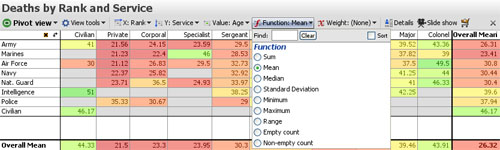
Pivot ViewUsing the Pivot ViewAnalyse the intersections of two columns The Pivot View is used to display aggregated or summarised values at the intersections of fields (columns) in your datasets. Only Category fields are available on the drop-down menus, so if you want to create a pivot on a Text field, you should first either convert it (or a duplicate) to a Category field, assuming there are not too many discrete values. See Data > Manage Fields for more detail on changing data typing and limits on the number of Category values. Note: Pivot Views using Dates and Times and Numeric columns may be supported in future. When you open a Pivot View and define two Category columns, Omniscope creates a pivot ( intersection grid of summary values) using the Sum of the number of records in two Category fields by default. You can easily change the Category fields to be displayed on the horizontal (X:) and vertical (Y:) axes using the View Toolbar options. At any time, you can exchange the( X:) and (Y:) axes by clicking on the curved arrow at the corner to the left of the horizontal titles.
Value: the default value for the cells in the Pivot View is the sum of the records, so each cell will display the number of data points. You can change the value displayed to another field using the Value: drop-down menu. Depending on the type of field you select, a Function: menu will appear, allowing you to chose whether to display the sum, the mean, or some other transformation of the data points in each cell. Note: the Range function displays the difference between the maximum and minimum values in the cell. The example above shows the average age of military casualties by service branch and rank. If you choose a function such as mean, a Weight: menu will appear, allowing you to specify another field to calculate weighted averages of the values in each cell. You can select one or more cells to perform View Toolbar CommandsThe Pivot View tools drop-down menu provides some options to change the display.
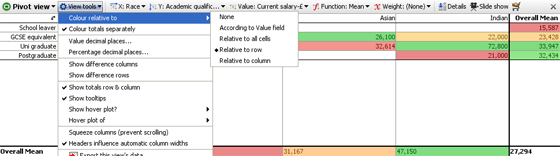
Colour relative to - Colour totals separately- unticking this option changes the colouring scheme to include Overall totals columns values. Value decimal places- use slider to set the number of decimal places to display fro absolute values Show difference columns- when ticked, displays the differences between adjacent columns in a separate column (see below)
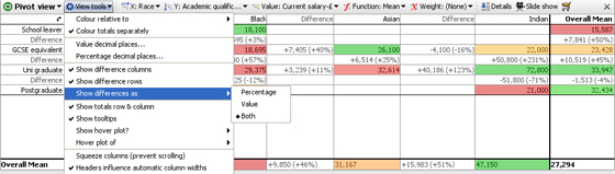
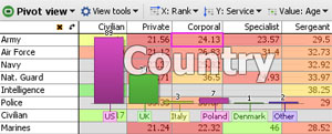
Show totals row - untick this option to hide the totals row that is shown at the bottom of the view. Show totals column - untick this option to hide the totals column that is shown the right hand side of the view. Show difference as - ( Percentage; Value; or Both) - allows you to select how the values in difference columns and rows are displayed Show tooltips - temporary displays of record counts and other underlying cell information on mouse hover can be hidden by unticking this option. Note: Pivot Table tooltips are summaries of the values underlying each cell, not the record-level tooltips configured under Main Toolbar > Settings > Tooltips. Show hover plot - ( None; Bar; or Pie) - a temporary graphical breakdown of the contents of a cell can be configured, either a Pie or a Bar chart display. Hover plot of - (field list-Category & Numeric data types) - if a graphical cell hover display is selected, an additional option to specify the value to be plotted appears. In the example below, a Bar chart plotting the field Country has been configured. Hovering on the intersection cell Service:Army & Rank:Corporal, displays a Bar Chart of Countries losing one or more Army Corporals (average age: 24.13 years) plotted as vertical bars in descending order:
Squeeze columns (prevent scrolling) - keeps the column widths set to a distance that permits all columns to be seen/selected without horizontal scrolling of the view. Combined with row and column colouring options, this can convert the Pivot Table into a type of 'heat map' encompassing a large number of cells at a glance. Headers influence automatic column widths - when ticked, re-sizing one column header re-sizes all of the other column headers to match. The remaining commands on the View tools drop-down are common to all views and are documented here. |