- Features by Edition
- Latest Features
- Licensing/Activation
- Installation
- Getting Started
- Data Sources
- Deployment/Publishing
- Server Topics
- Integration Topics
- Scaling/Performance
- Reference
- Specifications
- Video Tutorials and Reference
- Featured Videos
- Demos and screenshots
- Online Error Report
- Support
- Legal-Small Print
- Why Omniscope?
|
|
|
|||||
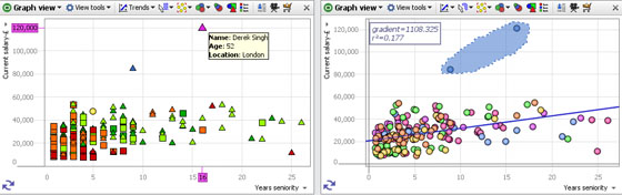
Graph ViewUsing the Graph ViewThe Graph View (or scatter plot) is ideal for finding and illustrating relationships in the data. In addition to plotting two selected fields (columns) on the familiar orthogonal Cartesian axes, X (horizontal) and Y (vertical), you can colour, size and shape the markers to represent multiple dimensions in the data set. Markers can be clustered to group data points for large data sets, or displaced slightly to make coincident points distinct and selectable. Powerful statistical analysis is available, and various selection and display modes can be chosen to suit any combination of fields plotted. |
 | Marker options- see discussion of sub-menu below Add background image-click to browse to an image to set as a faded background for the graph. Does not obscure gridlines. Useful for putting logos and branding into the display. The same option is available in the Pie, Bar and Details View and is fully documented here. |
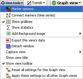
The other Graph View > View Tools commands are common to all views and fully documented here.
Marker options sub-menu
Marker Options- click to launch the Marker options sub-menu, which has both Simple and Advanced display modes:
Marker Options: Heat Map, Clustered or Displaced- tick one to select from 3 different ways of displaying plotted points in each Graph View:
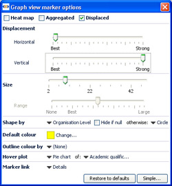 | Heat Map- shows density plot of records on the grid. Useful for plotting very large numbers of records that overlap a great deal. |
Displacement- changes the amount of displacement vertically and horizontally to improve access to data points for selection and linking.
Size slider- changes the absolute scale for marker sizing to increase or decrease all marker sizes
Range slider- (greyed-out unless the Size option is set to a field) changes the magnitude of relative sizing (see Size below)
Shape by: selects the field (column) whose values will determine the shapes plotted (same as Shape: toolbar pick list below) with additional options to specify the display of markers of records which are null (blank, not zero) in the selected Shape by field. In Simple mode, the Default shape to use when no Shape-by field has been chosen can be set.
Default colour- selects the default colour of markers when no other colouring options are set.
Outline colour by: adds an outline of another colour, based on another filed. For example, if Sex is used, this command would put a blue outline on the dots representing males and a pink outline on the dots representing females- assuming that you have assigned the those colours to the values 'Male' and Female'.
Hover plot- sets a pop-up display of either a pie or a bar chart whenever the user hovers on a marker, clustered or not. When set, you can select the field (column) to be charted using the pick list at right, which is otherwise greyed-out.
Marker link- selects a link to display when markers are clicked (one record only). Pick either (None), Details, or one of the links already configured in the file using the Settings > Links wizard accessed from the Main Toolbar.
Connect markers sub-menu
Connect Markers (time series)- clicking this option expands the View Tools menu to display additional options used to configure connected series, usually time series. In order to display one or more time series curves, the data set should contain at least one field (column) for a date, and one or more columns for values that make up the time series. To display multiple curves in one graph, there should also be a category field (with relatively few unique values) containing the names of each curve to be drawn.
Note: if your time series data is not in 'vertical' Omniscope layout (with the repeated observations vertical in a column) but instead in a pivoted 'horizontal' table (dates as columns and one row for each curve's values), you can use the Data > De-pivot the data option on the Main Toolbar to change the layout. For more on how to lay out your data for display as time series, see Data Layout-Time Series.
Once your data layout is correct, to display the curves, switch the X axis to the date field, and the Y axis to the value you want to graph, then select Connect markers (time series)'. Warning: to see multiple lines, you must use the Show line for each... option and select a Category field that distinguishes the lines you want to separate. The additional time series sub-menu options allow you to show the markers along the curves, change the curve thickness, display the curve names, smooth the curves, etc. For more detail, see Displaying Time Series.
Trends
The Trends option menu enables you to access powerful statistical analysis of your data set, and to display the most significant relationships.
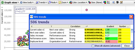
Clicking on this menu reveals two options:
Show line of best fit-plots a blue line of regression 'best fit' through the data points with the R-squared (measure of correlation) and gradient values displayed in the top left corner.
Find trends-analyses and sorts all correlations and other advanced statistics across all columns in the data set. Click to calculate the first 100 best fits between all possible axes. These will show in a pop-up window with R-squared for each axis pairing. Clicking on a pairing in the window will load the corresponding graph into the view. Too see all standard calculations for all potential X/Y axis pairs. tick the Show all columns (advanced) option.
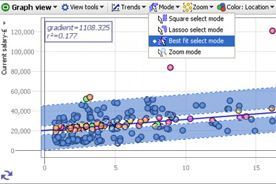
Mode
The Mode options menu enables you to choose how to navigate and select points and groups of points on the display. You can define one or more selection areas/shapes in order to exclude or isolate records using Move and Keep power query commands on the Main Toolbar. You can also use the mouse in navigational mode to define and explore specific zones in the display in maximum detail.
Square select mode- the mouse defines one or more rectangular selection area(s)
Lasso select mode- the mouse defines one or more free-form shaped selection area(s)
Best fit select mode- the mouse defines selection areas along the line of best fit. Useful for selecting data points inside/outside of confidence intervals in distributions.
Zoom mode- a navigational mode, the mouse defines a rectangular zone and the display zooms to show only that area. Holding the right mouse button down in zoom mode and moving the mouse up and down will zoom in and out continuously
Pan mode- (only visible when zoomed in manually) a navigational mode, the mouse 'hand' cursor is used to 'grab' the screen and move it to frame the desired area.
Zoom
The Zoom options menu provides fine-grained control over the magnification of the display, and they way the display adapts to power queries and Side Bar filtering which change the distribution of the data points being displayed. Unless disabled (see below) when zooming, zoom bars will appear along the vertical and horizontal axes, which can be moved or stretched to display desired area on-screen.
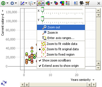
X zoom slider;Y zoom slider; Zoom out/in- used to expand the view along the right/left 'X' or up/down 'Y' axis, or to magnify (zoom in) or de-magnify (zoom out) the display.
The zooming options below are used to define how the display updates, with no manual zooming active
Zoom to fit visible data- display sizes to show only the points still in the target universe
Zoom to fit original data- display sizes to show the range of all the data in the data set
Zoom to fixed region- allows you to define a region of interest with the mouse, to which the display will revert, regardless of the data points in the target universe.
Note: the target universe for a given view is indicated by the colour of the view icon, green means IN universe, gold means BASKET, etc. For more detail, see Data Universes.
Show zoom scrollbars- when ticked, zoom scrollbars are visible even if the display is not zoomed, When unticked, the zoom scrollbars only show when zooming is active.
Warning: any manual navigation will take the display out of the default Zoom to fit visible data mode in favour of the Zoom to fixed region. You must manually change the setting in the Zoom menu to restore a default view of all the data in the target universe.
Extend axes to show origin- when ticked, the display is altered to make the 0,0 point where the axes cross visible in the display, regardless of the range of values in the fields (columns)
Enter axis ranges- used to define the range to be displayed numerically, based on the maxima and minima reported for the selected fields
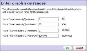
Depending on the size settings for the markers, you may need to 'pad' these ranges up or down somewhat to accommodate the marker sizing and achieve the optimal display.
Size
The Size options pick list menu allows you to select the field used to calculate relative sizing of the markers in the display, regardless of the shape or the default size setting. The extent of the sizing effect is controlled by the Size and Range sliders available on the advanced Marker Options sub-menu.
When
clustering is active, where each marker represents more than one
record, you can choose the measure function (sum, mean, etc.) from the
bottom of the Size drop-down (2.5).
Colour
The Colour pick-list menu allows you to select the field to be used to colour the markers. If no colour is specified, a single uniform default colour is used (which can be changed (see above).
You can also use the application-wide Colour button on the main toolbar to enable colouring in all relevant views.
Shape
The Shape options pick list allows you to specify which field (if any) you would like to use to determine the shape of the marker to use on the plot. You can also set the Shape-by field in the Marker options sub-menu, as well as specify the treatment of null values in the plots.
Colour & Shape Key
If you configure colouring or shaping, the Key button appears, which will open a key showing the values and associated colours/shapes for that field (column).
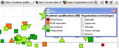
Note: At any time you can change the colours/shapes assigned to the values in a given field (column) using Data > Manage Fields > Configure > Field Options > Change value order, colours and shapes.