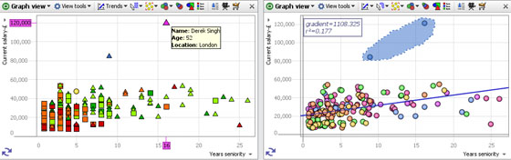
The Graph View (or scatter plot) is ideal for finding and illustrating relationships in the data. In addition to plotting two selected fields (columns) on the familiar orthogonal Cartesian axes, X (horizontal) and Y (vertical), you can colour, size and shape the markers to represent multiple dimensions in the data set. Markers can be clustered to group data points for large data sets, or displaced slightly to make coincident points distinct and selectable. Powerful statistical analysis is available, and various selection and display modes can be chosen to suit any combination of fields plotted.
Axis Selectors (X and Y)- use these pick list menus on the left side and bottom of the window to choose appropriate fields (columns) to plot on the X and Y axes. Only numeric, date and category fields will be present in the pick list. Text fields cannot be plotted unless the values are converted to categories and ideally given a meaningful sort order using Data > Manage Fields. Use the Sort option to sort the available fields alphabetically and the Find/Clear tool to select from long field lists. Note: hiding fields (columns) from the axis selector lists is not currently supported.
Switch Axes- the double arrow at the lower left of the plot exchanges the X and Y fieldsThe Graph View Toolbar features a View Tools drop-down menu, plus Trends, Mode, Zoom, Colour, Size and Shape options:
![]()
Each of these Graph View Toolbar elements is discussed below
The Graph View > View Tools drop-down menu includes various options for changing the display:
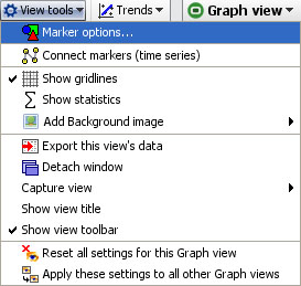 | Marker options- see discussion of sub-menu below Add background image-click to browse to an image to set as a faded background for the graph. Does not obscure gridlines. Useful for putting logos and branding into the display. The same option is available in the Pie, Bar and Details View and is fully documented here. [1] |
The other Graph View > View Tools commands are common to all views and fully documented here. [2]
Marker Options- click to launch the Marker options sub-menu, which has both Simple and Advanced display modes:
Marker Options: Heat Map, Clustered or Displaced- tick one to select from 3 different ways of displaying plotted points in each Graph View:
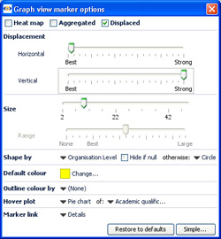 | Heat Map- shows density plot of records on the grid. Useful for plotting very large numbers of records that overlap a great deal. |
Displacement- changes the amount of displacement vertically and horizontally to improve access to data points for selection and linking.
Size slider- changes the absolute scale for marker sizing to increase or decrease all marker sizes
Range slider- (greyed-out unless the Size option is set to a field) changes the magnitude of relative sizing (see Size below)
Shape by: selects the field (column) whose values will determine the shapes plotted (same as Shape: toolbar pick list below) with additional options to specify the display of markers of records which are null (blank, not zero) in the selected Shape by field. In Simple mode, the Default shape to use when no Shape-by field has been chosen can be set.
Default colour- selects the default colour of markers when no other colouring options are set.
Outline colour by: adds an outline of another colour, based on another filed. For example, if Sex is used, this command would put a blue outline on the dots representing males and a pink outline on the dots representing females- assuming that you have assigned the those colours to the values 'Male' and Female'.
Hover plot- sets a pop-up display of either a pie or a bar chart whenever the user hovers on a marker, clustered or not. When set, you can select the field (column) to be charted using the pick list at right, which is otherwise greyed-out.
Marker link- selects a link to display when markers are clicked (one record only). Pick either (None), Details, or one of the links already configured in the file using the Settings > Links wizard accessed from the Main Toolbar.
Connect Markers (time series)- clicking this option expands the View Tools menu to display additional options used to configure connected series, usually time series. In order to display one or more time series curves, the data set should contain at least one field (column) for a date, and one or more columns for values that make up the time series. To display multiple curves in one graph, there should also be a category field (with relatively few unique values) containing the names of each curve to be drawn.
Note: if your time series data is not in 'vertical' Omniscope layout (with the repeated observations vertical in a column) but instead in a pivoted 'horizontal' table (dates as columns and one row for each curve's values), you can use the Data > De-pivot the data option on the Main Toolbar to change the layout. For more on how to lay out your data for display as time series, see Data Layout-Time Series [3].
Once your data layout is correct, to display the curves, switch the X axis to the date field, and the Y axis to the value you want to graph, then select Connect markers (time series)'. Warning: to see multiple lines, you must use the Show line for each... option and select a Category field that distinguishes the lines you want to separate. The additional time series sub-menu options allow you to show the markers along the curves, change the curve thickness, display the curve names, smooth the curves, etc. For more detail, see Displaying Time Series [4].
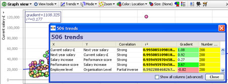
The Trends option menu enables you to access powerful statistical analysis of your data set, and to display the most significant relationships.
Clicking on this menu reveals two options:
Show line of best fit-plots a blue line of regression 'best fit' through the data points with the R-squared (measure of correlation) and gradient values displayed in the top left corner.
Find trends-analyses and sorts all correlations and other advanced statistics across all columns in the data set. Click to calculate the first 100 best fits between all possible axes. These will show in a pop-up window with R-squared for each axis pairing. Clicking on a pairing in the window will load the corresponding graph into the view. Too see all standard calculations for all potential X/Y axis pairs. tick the Show all columns (advanced) option.
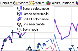
The Mode options menu enables you to choose how to navigate and select points and groups of points on the display. You can define one or more selection areas/shapes in order to exclude or isolate records using Move and Keep power query commands on the Main Toolbar. You can also use the mouse in navigational mode to define and explore specific zones in the display in maximum detail.
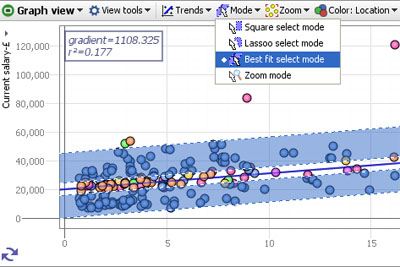
Square select mode- the mouse defines one or more rectangular selection area(s)
Lasso select mode- the mouse defines one or more free-form shaped selection area(s)
Best fit select mode- the mouse defines selection areas along the line of best fit. Useful for selecting data points inside/outside of confidence intervals in distributions.
Zoom mode- a navigational mode, the mouse defines a rectangular zone and the display zooms to show only that area. Holding the right mouse button down in zoom mode and moving the mouse up and down will zoom in and out continuously
Pan mode- (only visible when zoomed in manually) a navigational mode, the mouse 'hand' cursor is used to 'grab' the screen and move it to frame the desired area.
The Zoom options menu provides fine-grained control over the magnification of the display, and they way the display adapts to power queries and Side Bar filtering which change the distribution of the data points being displayed. Unless disabled (see below) when zooming, zoom bars will appear along the vertical and horizontal axes, which can be moved or stretched to display desired area on-screen.
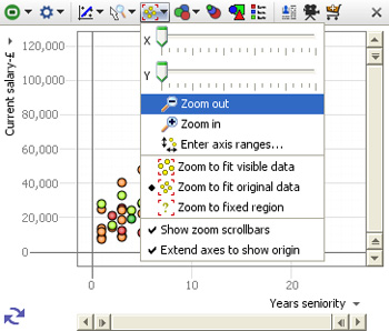
X zoom slider;Y zoom slider; Zoom out/in- used to expand the view along the right/left 'X' or up/down 'Y' axis, or to magnify (zoom in) or de-magnify (zoom out) the display.
The zooming options below are used to define how the display updates, with no manual zooming active
Zoom to fit visible data- display sizes to show only the points still in the target universe
Zoom to fit original data- display sizes to show the range of all the data in the data set
Zoom to fixed region- allows you to define a region of interest with the mouse, to which the display will revert, regardless of the data points in the target universe.
Note: the target universe for a given view is indicated by the colour of the view icon, green means IN universe, gold means BASKET, etc. For more detail, see Data Universes [5].
Show zoom scrollbars- when ticked, zoom scrollbars are visible even if the display is not zoomed, When unticked, the zoom scrollbars only show when zooming is active.
Warning: any manual navigation will take the display out of the default Zoom to fit visible data mode in favour of the Zoom to fixed region. You must manually change the setting in the Zoom menu to restore a default view of all the data in the target universe.
Extend axes to show origin- when ticked, the display is altered to make the 0,0 point where the axes cross visible in the display, regardless of the range of values in the fields (columns)
Enter axis ranges- used to define the range to be displayed numerically, based on the maxima and minima reported for the selected fields
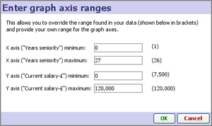
Depending on the size settings for the markers, you may need to 'pad' these ranges up or down somewhat to accommodate the marker sizing and achieve the optimal display.
The Size options pick list menu allows you to select the field used to calculate relative sizing of the markers in the display, regardless of the shape or the default size setting. The extent of the sizing effect is controlled by the Size and Range sliders available on the advanced Marker Options sub-menu.
When
clustering is active, where each marker represents more than one
record, you can choose the measure function (sum, mean, etc.) from the
bottom of the Size drop-down (2.5).
The Colour pick-list menu allows you to select the field to be used to colour the markers. If no colour is specified, a single uniform default colour is used (which can be changed (see above).
You can also use the application-wide Colour button on the main toolbar to enable colouring in all relevant views.
The Shape options pick list allows you to specify which field (if any) you would like to use to determine the shape of the marker to use on the plot. You can also set the Shape-by field in the Marker options sub-menu, as well as specify the treatment of null values in the plots.
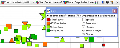
If you configure colouring or shaping, the Key button appears, which will open a key showing the values and associated colours/shapes for that field (column).
Note: At any time you can change the colours/shapes assigned to the values in a given field (column) using Data > Manage Fields > Configure > Field Options > Change value order, colours and shapes.
This section guides you through using the Connect markers (time series) options available in an expandable section of the View Tools menu of the Graph View (download the sample file used to illustrate this section here [7]).
Omniscope manages repeated observations of values over time in vertical columns, rather than horizontal rows often used for time series in spreadsheets. To create a multi-line time series as shown below, first put your data in the following 'vertical' orientation:
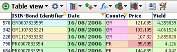
In the above example of a time series data layout for Omniscope, we have various bonds, each with an ISIN identifier, and each issued by one of various countries (GR, FR etc.). We also have repeated observations of Price and Yield over time entered vertically down the columns. Each record (row) in the data file is therefore a separate observation of price and yield which are repeated over time 'vertically' in separate rows
Time series data layout in Omniscope requires at least one field (column) with a natural order, such as Date, and one or more values columns 'Price', 'Yield', etc. for repeated observations of values that make up the time series. In addition, to display multiple curves on one graph, there should be a Category field (with less than about 200-250 unique values) referencing each curve to be drawn. In this example, we have many observations, but only 9 unique ISINs (individual bonds) so the curves can be plotted by the Category 'ISIN' reference field as shown in the example below. Don't worry about the apparent repetition in the data values, outside of the Table View, Omniscope will render the duplication invisible to you and the users of your files.
If your data is arranged differently from the example above, (e.g. 'horizontally' with the dates as columns and each cell in the row representing an observation over time) you may want to use the the tools available under Data > De-/Re-Pivot on the Main Toolbar to transform your data set to the correct 'vertical' orientation in Omniscope. More on Using De/Re-pivot [8].
Checking your data types: After importing and correcting the layout of your data, go to Data > Manage Fields [9] and make sure the Time (here Date) and Observation (here Price, Yield etc.) fields (columns) have the correct data typing. They must be typed Numeric (decimal or integer), or Dates & Times. Also make sure that any fields you want to use to distinguish lines (here the ISIN Bond Identifier number) are declared of type Category. You can convert data types using the Data > Manage Fields dialog or by by right-clicking the column header in the Table View and choosing Tools > Convert field data type.
Once you are sure that your data layout and field (column) data typing is correct, add a Graph View and configure the axes:
You will see an un-connected scatter plot of markers representing your time series data points. In the View Tools drop-down menu, tick Connect markers (time series). A number of new options should appear on an expandable sub-menu below this command on the View Tools menu.
WARNING: This option will be unavailable if the Graph View has been configured with Displaced (randomly offset) markers. Open the Marker options dialog above on the View Tools menu and confirm that the Displaced option is not ticked.
At this point, the display will change from unconnected scatter to connected plot, but with many heavy black lines in a jumble. The expanded sub-menu includes a number of commands used to manage the display of connected markers:
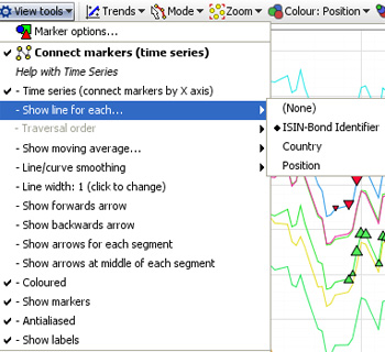
Time series (connect markers by X axis)- when ticked, automatically uses the field (column) selected for the X horizontal axis( here Date) to provide the traversal order, the order in which the dots are connected. This is the most common setting for time series. When this option is ticked, the Traversal order option below is greyed-out.
Traversal Order (showing an omni-directional path) By unticking Time series (connect markers by X axis), you can choose to draw the lines in a different order than dictated by the X axis. If you are plotting data based on criteria other than time, configure the Traversal order field appropriately.
Show moving average: None; Simple & Exponential- If you have many data points in each time series, you may wish to try showing a moving average, by choosing Simple, Exponential or other data smoothing options on the sub-menu.
Line/curve smoothing- By default, lines are turned into curves while preserving data points. In other words, curves are drawn between the data points. Depending on your data, this may be inappropriate. You can disable this using the Line/curve smoothing sub-menu. Alternatively, a second form of curve smoothing is provided, which does not pass through the data points. Untick Curves pass through vertex points to use this option. Both forms of smoothing can be adjusted for amount of smoothing using the Smoothing amount option.
Line width-By default, lines are shown 2 pixels thick. Use the slider to change this any value between 1 and 25 pixels.
Arrows: Show forward arrow; backward arrow; arrows for each segment; middle of each segment-adds different kinds of directional arrow heads to the line segments displayed
Coloured- By default, if you have multiple lines displayed, these are coloured according to the values in the Category field. You can disable this and show only black lines by deselecting this option.
Show markers- Hides or reveals the markers within the plotted lines (to resize markers, see Marker Options on the View Tools menu
Anti-aliased- Smooths the way the line is displayed
Show labels- By default, text labels will be shown beside each line if you have multiple lines. By de-selecting Show labels, these will only be shown as you move the mouse pointer over a line.
When Connect markers (time series) is enabled and lines are showing, the Line select mode becomes available from the Modes drop-down. Select this mode, and the mouse pointer will change to show that you are in Line select mode. Move the mouse pointer over a line, and it will become highlighted.
There are two ways to select records in Line select mode:
If you have made too many configuration changes and can't figure out how to get back, you can reset all settings for the current Graph View, returning to a plain default view with no marker connection settings enabled. From the bottom of the View Tools menu, choose Reset all settings for this Graph view.
Links:
[1] http://kb.visokio.com/node/249
[2] http://kb.visokio.com/node/204
[3] http://kb.visokio.com/node/360
[4] http://kb.visokio.com/node/215
[5] http://kb.visokio.com/node/235
[6] http://kb.visokio.com/node/125
[7] http://kb.visokio.com/files/Resources/OUGuide/125_UsingViews/Graph227/Time Series Example-Bond Yields.iok
[8] http://kb.visokio.com/node/339
[9] http://kb.visokio.com/node/246