Managing Tab Layout Options
Configure each tab like a slide in a presentation
The Main Toolbar: Layout menu groups most of the commands used to manage the elements of a tab outside of the views to be displayed on that tab.
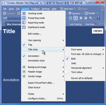 | | Edit modes - you can modify the default settings for layout modes and add you own to a given file.
View Spacing - increases or decreases the space between the views displayed on the tab
Title - adds a title to top of the tab
Title style - options to change the appearance of the title on the tab
Annotation - adds your explanatory text to the bottom of the tab
Annotation style - options to change the appearance of the annotation text
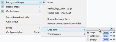
Background image - enables you to specify an image that can be faded and used as a backdrop in text slides and views that feature a blank background, like the Graph View (see below).
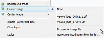
Header image - enables you to specify an image that can be displayed in the title bar opposite the Title, like the Visokio logo in the example at left (see below).
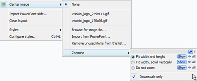
Centre image - enables you to specify an image to be displayed at centre of a page, usually a large image like a photograph (see below).
|
Using Background Images
Using Header Images
Using Centre Images
Importing PowerPoint Slides
Import PowerPoint slide - you can import an existing PowerPoint slide into a tab
Clearing layout and choosing styles
Clear layout - removes all the display elements outside of the views displayed on the current tab
Styles - combinations of settings that can be applied to a specific file, and also shared with other users. You can use standard pre-configured Styles, or create a custom organisational Style to apply to all Omniscope file created by a given organisation. For more information, see Styles & Configure styles and also the KnowledgeBase section on sharing custom styles.