
Mapping: Colour by boundaries-gradient map?
-
Hello - I am trying to build a gradient map for labour costs per country over a period of 12 years.
1. How do I get each country on the map to pick up the right value per yeach year?
2. how do I impose shades of colour which reflect the values?
Thank you - Valentina -
5 Comments
-
You are trying to visualise both spacial and time distribution, so there are two ways to do this:
You can have year on the side bar and use filtering, so you would view the Labour cost comparison for different countries for one year at a time.
Data preparation:
In the Data> Manage fields choose Category for data type for your Year
in the Map View under Colour menu choose Labour Cost
Second option is to enable hover over each country to display a time series with cost presented as a Bar chart...
From Markers menu >Clustered
Tools menu>Other>Hover plot to choose options Type : Bar chart, Value: Labour Cost, Split: Year.
-
Hi Paola,
thank you.
Doing this I manage to obtain a map in which I have a point in each country where the value relevant to that country and my chosen year is stated.
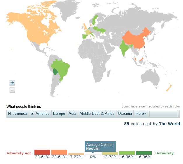
I do not however manage to colour each country with a different shade depending on the value taken by each country in each year. I attach an incomplete gradient map for illustration.
Say in 2012 USA takes a value of 1, Canada 2, Mexico 5, France 7, Germany 8. I would like the map not to show just one point with a circle of different size, but the whole country to take a graded colour. For instance the colour scale could be from green to red, with lowest numbers green, highest numbers red and nnumbers in between taking intermediate shades.
Is this possible?
Valentina Attachments
gradient map.jpg 72K -
-
Please see the 'Internet Usage' example attached to the following post:
http://forums.visokio.com/discussion/2135/map-view-importing-overlays-radial-selection-2.8-
The new Map View overlay functionality supports joining your current dataset to the overlay dataset using a field common to both, e.g. country ISO3 codes.
You can then colour the country areas (defined in the overlay dataset) using values present in your current dataset.


Welcome!
It looks like you're new here. If you want to get involved, click one of these buttons!
Categories
- All Discussions2,595
- General680
- Blog126
- Support1,177
- Ideas527
- Demos11
- Power tips72
- 3.0 preview2
Tagged
To send files privately to Visokio email support@visokio.com the files together with a brief description of the problem.