
Idea: Labelling- Legend limitations
-
Hi - Is there a way to display Legend (e.g. coloured labels) in full? I have attached a snap shot to visualize the idea.
As you can see, there are just two coloured labels, even though there is so much space it is not possible to see the full labels. Attachments
labels.PNG 17K -
7 Comments
-
Darius - This is an example of data typing influencing visualisation options. Continuous value types like Dates/Times and Numeric (Integer and Decimal) are coloured according to the settings found here:
Data > Manage fields {Field name} Options > Value colouring
The options here allow you to define the start and end colours, whether to display a middle colour, and the algorithm used to determine the 'middle' value so as to manage the influence of extreme values of the range colouring. The colour pallette to be used for continuous value data types is chosen here:
Style > Data colours {Continuous} etc.
Current Colour key default behavior for fields/columns typed as continuous is to show only the start, end and middle colour, if configured. One way to address this is to duplicate the x-axis field, re-type it as a discrete Text/Category, and you can then assign any colours you want to each value using Manage fields, and Omniscope will then display every discrete value in the colour key. -
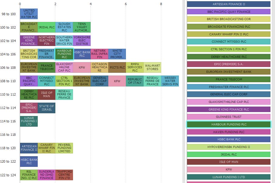
Here is solution that will enable you to have (almost) unlimited number of labels and space...
Add to your Bar/Line View another Bar/line View, and choose to Split, Stack and colour by the same field. Flip the bars to display horizontally. Now you will be able to get rid of the labels on the bars or the colour key in the first View.Attachments
ColourKey BarView.iok 45K ColourKeyBar.JPG 102K -
Hi Paola,
Unfortunately flipping Bar/Line chart is not a solution in my case.
I have this type of chart (see attached)
Do the coloured labels have a limit of 20 characters regardless of the space available?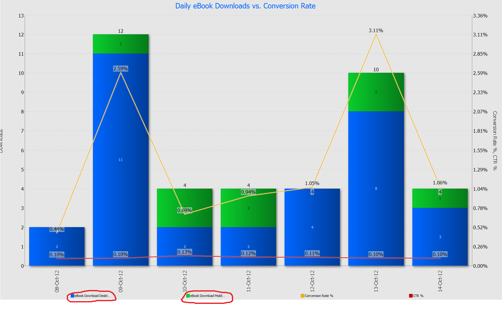 Attachments
Labels limit.png 129K -
It could be one off solution. Imagine that I have 50 charts with similar issue across all the reports I have created. Which means I would have to spend lots of time to do each correction manually.
Wouldn't be simpler to get rid of the characters limitation? -
If you add a formula which would calculate available empty space between labels and apply a limit on the characters based on the maximum value of the formula it would work.
This is just an idea to think of.


Welcome!
It looks like you're new here. If you want to get involved, click one of these buttons!
Categories
- All Discussions2,595
- General680
- Blog126
- Support1,177
- Ideas527
- Demos11
- Power tips72
- 3.0 preview2
Tagged
To send files privately to Visokio email support@visokio.com the files together with a brief description of the problem.