
Graph view: Issues in version 2.7?
-
Hi,
I wanted to plot 3 lines graphs pertaining to same category in one single view. Since I couldn't categorise them seperately, I am using bar/line graph. However, there are certain things I need help with.
1. The bar line view only lets me plot the sum/median/mode etc of the measure I have selected. How I can plot the actual unique values?
2. How can I customise the Y axis values i.e. fix the intervals that I want for each graph.
3. How can I denote that the y axis value is in ($/tonne).
4. Below is a screen shot of one of the bar/line views. How can I hide the pane by measures in the present view. I do not want them to be visible after I distribute this file. I have attached a small screen shot of what I intend to hide.
Kindly help.
Attachments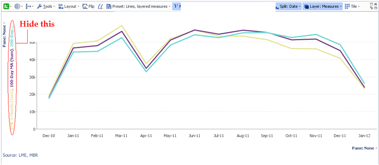
Omni.bmp 743K -
24 Comments
-
pkanther,
Apologies for the delay responding. Please make sure you have the latest version installed before following these answers.
1. If your "Split" field results in single records for each interval, "sum" and "mean" will be the same. But if they don't result in single records, what behaviour do you want?
There is a function "singleton value" available by changing "common functions" into "All functions". This means: use the value for a single record; if multiple records, use null. But I don't think this is necessary.
2. Your options for the Y axis values are:
- Rounded vs. unrounded scale intervals (View toolbar > Scale > Rounded scale intervals)
- Show or hide (View toolbar > Scale > Hidden)
You can't configure the intervals precisely in 2.7. Please post as an Idea, with an example of the situation and the intervals you'd want.
-
3/4. You have several options to choose from as required:
Provide a view header (Toolbars > View headers), then edit the header by double-clicking.
Hide the "Sum" text (Settings > Advanced tab settings > Show function names).
Hide the measure name labels (View toolbar > Scale > Label axes with measure names).
Rename the measures (View toolbar > Measures > [each measure] > Other options drop-down icon > Name).
To hide "Pane: None", hide view toolbars (Toolbars > View toolbars) and show data titles instead (Toolbars > View data titles). Or switch to reporting style mode (Style > Paper report preset).
-
Hi Steve,
Please find the file of dummy data attached.
In the mean while, I will try and implement some solutions that you have suggested.
Attachments
LME - Al Send.iok 415K -
Thank you for the help.
Below are the comments to your suggestions:
1. If you see the bar/line view along with the table view you will notice that while the value of say LME 3 month for Jan 5th is 1803, the value that I see in the bar/line view is 115212. I believe this is because the measure shows the sum.
I want the graph to plot exactly 1803 - not any mean or sum. Thus, the line pertaining to LME 3 M should be exactly depicting the values you see in the table view.
The values on the Y-axis which are right now 50k, 100 K and so on will hence chance to a much smaller number and the behaviour of the series will be seen much more prominently.
I dont think singleton value is the same. -
I found your other post, and realise you want to show unique records as X axis intervals.
You can either do this using "Split: every record" (assumes your data is naturally in the correct order, and doesn't show useful labels).
Or, preferably, fix the "Split" intervals to be correct:
View toolbar > Split > Date
View toolbar > Split: Date > Fit to screen > Fixed interval size: 1 day
Attached.AttachmentsBar3series.iok 9K -
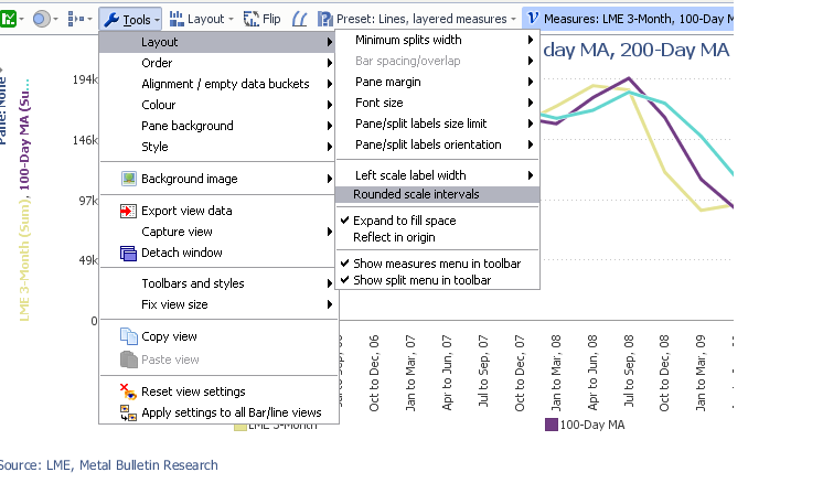
Further, I cant find the scale in a tool bar separately. I did find rounded scale interval but I cant see the difference in selecting/de-selecting it. Attached is the screen shot of the menu. I am using Omniscope 2.7 Galapagos - build 197 (alpha)Attachments
untitled.bmp 958K -
You need to install the latest *Daily* build of 2.7 - sorry for not making this clear - 2.7 b212.
I think you simply want to change the interval for "Split: Date" to "1 day" (View toolbar > Split: Date > Fit to screen > Fixed / 1 day). But there'll be a lot of scrolling. Use "View toolbar > Layout > Advanced > Splits width" to compress it. -
I did try Spilt > Data > fit to screen> fixed interval size to 1 day but as the scale is still big, all I can see are straight lines and no pattern emerges out of this.
I will download the latest build right now.
I dotn mind scrolling but I need the pattern to be clear. -
The bar/line view is designed for an overview of the data, and doesn't allow you to plot more intervals than there are pixels on screen. Even if it did, you wouldn't see all the detail.
You need to aggregate the data at least a little. I suggest using interval size 1 month, "View toolbar > Layout > Narrow intervals", and changing your 3 measures to "Mean". -
I have tried this as well Steve. When I do this, I can see the pattern of the whole series but when I hover over, it takes a lot of effort to see the individual value.
I read your comment about the graph view post that I had.
Is there no way this can be done in graph view without a de-pivot?
De-pivot does seem like a way out if you actually have only 3 series to work with but the actual file I have has around 15-20 series like these and for more than 10 years. If I use the de-pivot view, the end-user who will get my file will get the same view as data when he downloads it to excel. -
The Graph view will be redeveloped most likely in 2.8, with this ability included.
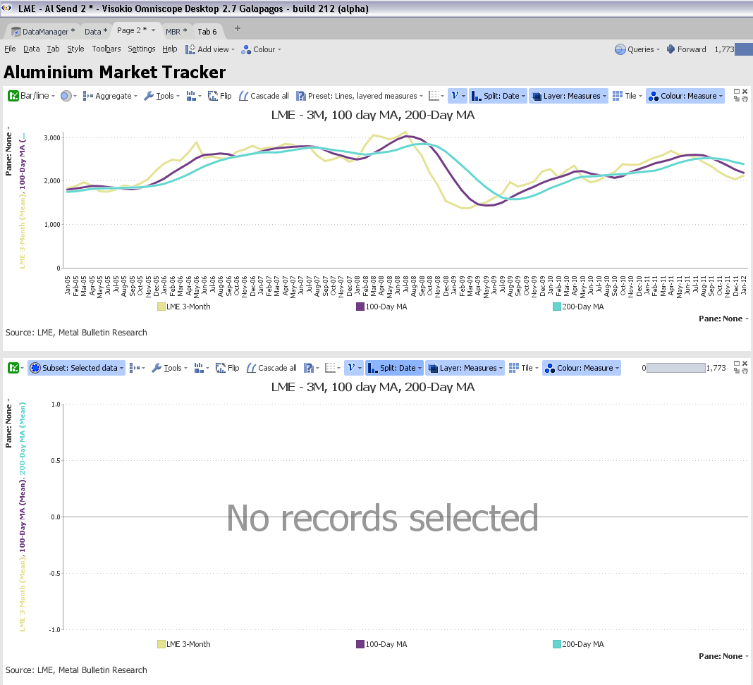
See the attached workaround. Click to select individual markers, or drag a box around several, in the top view (showing monthly means). The bottom view (daily actuals) will show the selected data in more detail. I did this using "Subset: Selected data".AttachmentsLME - Al Send 2.iok 418K -
Thanks. Bullet 4 of the first post is resolved.
The first view without subset data, shows not the actual values too. While the function selected is the mean, it doesnt even reflect the mean of any of the values in the series. I tried calculating it.
The bottom view is blank for me. Attached is the screen shot.
Attachments
untitled.bmp 3M -
Understood why you choose mean but is it not possible for the line to show the actual plot like the graph view i.e. when the end user hover overs, they see the actual values. A mean of the price in the report I am sending is ot useful. The whole point of shifting to omniscope is so people can compare measures for each date
-
Your 5:04 comment - I presume you now understand what I meant? The bottom view should be blank until you select in the top view. The bottom view will then show the actual values in the range selected.
2.8 will be out est. mid 2012.
Your last comment can't be made to work. If your screen is 1000 pixels wide, and you have 3000 intervals, it is not possible to show all values with their actual values without scrolling. We are forced to perform some kind of aggregation. Mean is the most useful in this case. If you like, you can configure "First" or "Last" value instead of "Mean", which will show the first or last actual values under the pixel on-screen you're pointing at. -
Hi,
Another query about the same file and view.
I need to plot a graph view with 2 y axis. One y axis on the left hand side needs to show the total and another needs to show percentages. I have attached a screen shot.
Apart from the method adopted above, I have two files one in which i have di-pivot my whole data and am now working on graphsAttachments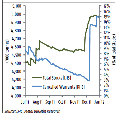
untitled.bmp 459K -
Purnima - Alpha Partner is an upgrade to your Forum membership for experienced users that allows them to participate in the daily development of the latest 'use with caution' features. Given your status as a major publisher of time series data sets, I have upgraded your account. Log out and log in again and you should see some additional categories labelled Alpha Partner.


Welcome!
It looks like you're new here. If you want to get involved, click one of these buttons!
Categories
- All Discussions2,595
- General680
- Blog126
- Support1,177
- Ideas527
- Demos11
- Power tips72
- 3.0 preview2
Tagged
To send files privately to Visokio email support@visokio.com the files together with a brief description of the problem.