Bar/Line View: Negative numbers and Mean values?
-
Hi Guys,
I am doing a relatively simple bar diagram to show the expected change in use of a substance in the next 6 months.
Each record (doctor) has a number which can be positive to show an increase or negative to show a decrease in use.
I have taken the mean value without any weight to show the overall expected change.
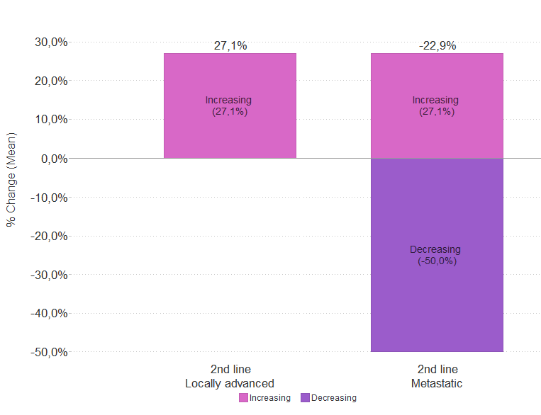
However, here is the problem - the positive values are being calculated and the average taken and it appears as if the negative values are being calculated separately. This means I have one doctor with a -50% and his value is shown as -50% whilst the other 13 doctors have positive values where the mean of all their values is taken at 27%.
I now have a total value of -22.9%, which is not correct. I have tried aggregating but can't seem to get rid of the -50%.
Am I overlooking something?
Thanks for any help.
Phillipa
-
3 Comments
-
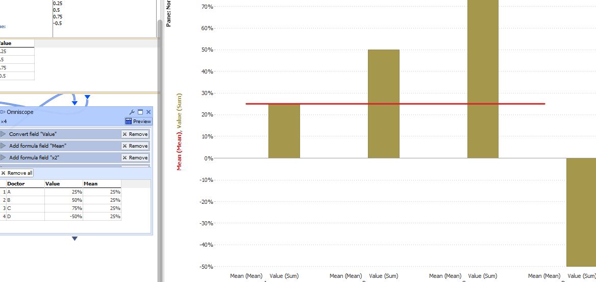
Not sure what method you used to calculate the mean? Formula in the DataManager, Table in Data Explorer, or Formula as a measure in the Bar/Line view?
It is better to use a formula field, in which case I cannot reproduce the issue. Attachments
MeanBars.JPG 65K -
Hi Paola,
Thanks for the answer. My mistake....
The problem was that I was using a stacked bar chart.
Omniscope was giving me mean values for each stack and then stacking the mean values.
Phillipa
Attachments
Mean values.PNG 15K
Welcome!
It looks like you're new here. If you want to get involved, click one of these buttons!
Categories
- All Discussions2,595
- General680
- Blog126
- Support1,177
- Ideas527
- Demos11
- Power tips72
- 3.0 preview2
Tagged
To send files privately to Visokio email support@visokio.com the files together with a brief description of the problem.


