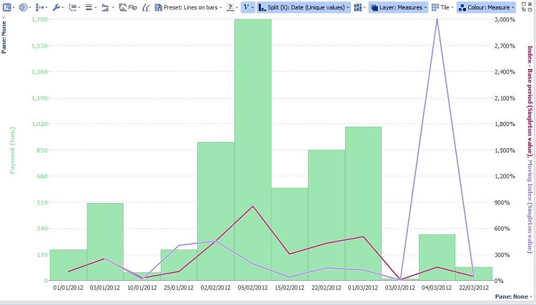
Bar/Line & Graph View: Time Series with multiple lines
-
4 Comments
-
Please see the demo file attached, then make sure your date field is formatted as Date/time (use Field Organiser block in the DataManager workspace) or, alternatively,
Data>Manage fields if needed.
Your Split menu choice will be Date field (exact date/time or month),
the Measures should be value fields e.g. sales, clicks etc, and
your Layer choice will be either a measure or category field (e.g. salesperson, campaign).
In the Measure menu you can select which function to apply to each value field (sum, mean etc),
which scale to use (left, right, hidden),
plus which measures to be represented with lines or bars.
You can experiment by changing the Preset options (all lines, lines on bars, markers on bars...).
Colour menu offers number of options to colour the lines /bars. Attachments
Index Numbers.iok 22K 
BarLineView.JPG 75K -
Hi
Thanks a lot for the quick reply. However that's not exactly what I meant.
I want to plot something similar to this: http://www.visokio.com/display-time-series.
However I can't apply it in the new version of visokio since some features are changed. -
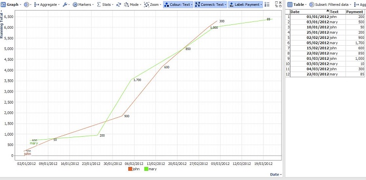
It is possible to create similar effect by using the Graph view - see the new demo.
On the X scale choose a Date field, for Y the value field, connect on category field.
There are multiple colouring, marker, line, stats options, so please clarify which particular features you're after or what was missing from the previous demo... Attachments
Index Numbers.iok 23K 
GraphView.JPG 81K
Welcome!
It looks like you're new here. If you want to get involved, click one of these buttons!
Categories
- All Discussions2,595
- General680
- Blog126
- Support1,177
- Ideas527
- Demos11
- Power tips72
- 3.0 preview2
Tagged
To send files privately to Visokio email support@visokio.com the files together with a brief description of the problem.


