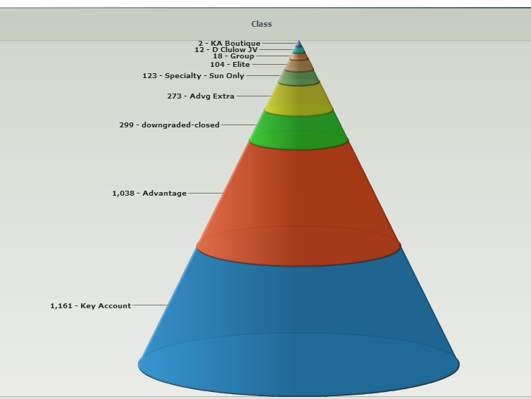
Bar/Line View: Funnel or Pyramid Chart?
-
Any plans to add a Pyramid chart like the attached please?Attachments

cone_chart.png 45K -
6 Comments
-
Funnel chart is a mode in Bar/Line View, please see a simple demo attached. Cone can be rotated sideways or upside-down. Select 'reflect in origin' option under the Layout menu .Attachments

Simple Funnel.iok 11K -
Graham - Most data visualisation experts are very against funnel or pyramid/cone charts like the one you show because the smoothed shape creates bulk that actually distorts reality.
Just search on "Funnel Chart distort", and you will see many entries, like this one:
http://peltiertech.com/WordPress/sales-funnels/ -
I see what you say Thomas and this is a good breakdown on thought and interpretation.
I guess in the end its down to the end recipient of the information - a marketer probably does not understand analytics and true shape representation but can get the idea from a pretty picture.
Also, the author is right in that a funnel is not always appropriate as at each stage of the flow through the funnel there is two or more outputs. There will be for example a separate flow of information out to a separate funnel or process. eg.
Take responders to an advert.
Some will be interested in product a and others product b. So the first split.
Then of these some will need to go to telesales and others to field sales. So another split.
Then of these some will go to high value, high frequency, others low value, and so on.
Do you have any other charts or analyses that would handle this?
Welcome!
It looks like you're new here. If you want to get involved, click one of these buttons!
Categories
- All Discussions2,595
- General680
- Blog126
- Support1,177
- Ideas527
- Demos11
- Power tips72
- 3.0 preview2
Tagged
To send files privately to Visokio email support@visokio.com the files together with a brief description of the problem.


