Color Key
-
Hi,
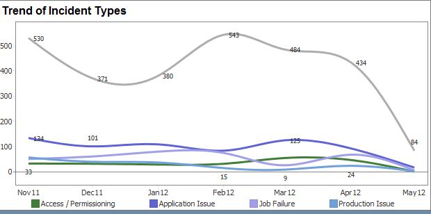
I have turned color keys on a standard "Graph" view. At the bottom of the chart you will see 4 boxes, however there are 5 lines. Please refer to the picture attached.
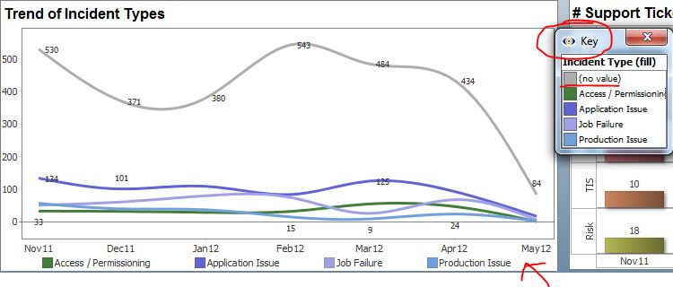
When I turn on the "key" option it will open a pop up with the color key. You will see 5 bars now. Please refer to the picture below:
I would like the 5 bars to show in the standard color key at the bottom. I am not sure why there is a difference. In this instance some of the data is no value, but I want end users to know that the line is no value. As you can see in the picture it would be easy to confuse with end users what this line represents as it is not labled.
Thanks for the help,
Brian -
4 Comments
-
Is there any way to fix this in 2.7? I am just trying to give a realistic time frame to my client. I will be glad to help with the Alpha partners testing, however I don't plan to roll this out to the user base immediately. So we are more or less looking to have this stable in 3 months? Thanks for confirming.
Brian
Welcome!
It looks like you're new here. If you want to get involved, click one of these buttons!
Categories
- All Discussions2,595
- General680
- Blog126
- Support1,177
- Ideas527
- Demos11
- Power tips72
- 3.0 preview2
To send files privately to Visokio email support@visokio.com the files together with a brief description of the problem.


