Bar/Line View: Avoiding Overlapping Labels?
-
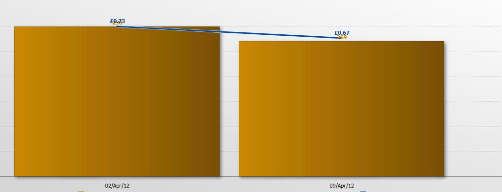
Is there a way to shift overlapping labels?
 Attachments
labels.PNG 61K -
15 Comments
-
I have two axes with labels option configured already as I need to show all values and it doesn't help. If there were label position options (e.g. Next, Above, Centre etc) that would be great. Thanks
-
Hi - Has the label issue been sorted?
-
It brings many complaints from our Clients as it is very difficult to read values.
 Attachments
labels.png 18K -
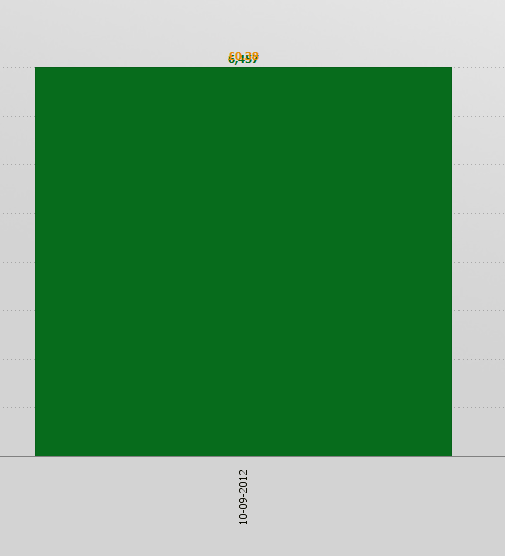
Client wants to see both values. To rely just on the Axes scales is not practical especially in the situation where we have many bars which don't fit in the screen. In this case to see a value we have to slide the view left and right to see what's on the Left/Right axes.
-
There is no orange line because it is just one week data (one value for each of the metrics)
-
This is a difficult problem to solve. You could conceivably have many markers, lines or bars requiring labelling at very close positions.
One idea is to drop labels that can't be placed in their current position. In the case above, you'd only see a green label.
Another is to offset labels, so the first measure (bars) shows labels to the left of center, and the other (lines) to the right of center. This would prevent them overlapping, but might look weird and would only work for 2 measures.
Another is to raise and lower labels as far as needed to ensure they don't overlap. If you had many layers, this wouldn't work, and you'd need to colour by measures to permit labels and lines to be clearly associated.
Offsetting labels is the easiest solution; would this be acceptable? -
How do I offset labels? Where is this option located?
How do I raise and lower labels? -
The best solution would be if I could manually correct the layout of the labels (as it is in Excel for example)
Or at least give some options where to locate the labels: below the line/ above the line/ inside the bar/ outside the bar/ at the bottom of the graph/at the top of the graph etc. If there are more than one measure involved then it would have to be possible to manipulate them individually.
This is how I see it. -
Dariusz,
A solution we believe to be good has been implemented in tonight's build of 2.8 (b312). See example screenshot, attached.
The front layers/lines are labelled as a priority.
Subsequent layers behind are labelled if a label fits either above or below the marker or end-of-bar.
On mouse-over, any labels hidden due to other labels reappear and "pop" to the front.
Let us know what you think.
SteveAttachments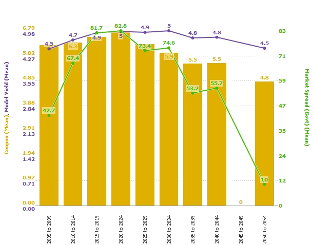
bar line labels.jpg 213K -
Hi Steve,
Thanks for solving the problem. As long as it does the job I am happy with it
Dariusz
This discussion has been closed.
← All Discussions Welcome!
It looks like you're new here. If you want to get involved, click one of these buttons!
Categories
- All Discussions2,595
- General680
- Blog126
- Support1,177
- Ideas527
- Demos11
- Power tips72
- 3.0 preview2
Tagged
- Bar/Line_View102
- labelling40
To send files privately to Visokio email support@visokio.com the files together with a brief description of the problem.


