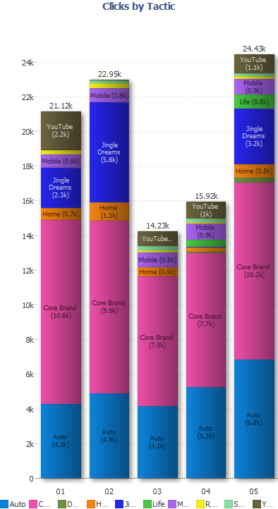
Idea: Color Key-e.g. formatting multi-line,etc.
-
Is there a way to wrap the color key when there are multiple splits/stacks on a bar/pie chart?
Also, when using Data Effects: Gradients - why doesn't the color square shade along with the rest of the page?
Thanks!Attachments
color key.png 53K -
5 Comments
-
Summary of this idea: multi-line / wrapped colour key. Also the option to change position (left/right/top).
See also:
Shared colour key -
http://forums.visokio.com/discussion/comment/2950/#Comment_2950
Font size -
http://forums.visokio.com/discussion/1520/adjust-font-size-for-labels-colour-keys-axes.../p1
Welcome!
It looks like you're new here. If you want to get involved, click one of these buttons!
Categories
- All Discussions2,595
- General680
- Blog126
- Support1,177
- Ideas527
- Demos11
- Power tips72
- 3.0 preview2
Tagged
To send files privately to Visokio email support@visokio.com the files together with a brief description of the problem.


