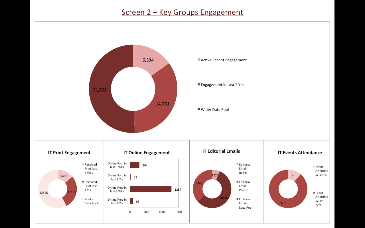
Idea: Pie View - improved labelling?
-
I'm having a problem showing labels on pie charts even if the option is selected. When a wedge gets too small, it cuts out the label (too small might mean less than 40%). Anyone have any suggestions? Is there a way to have it label the chart outside of the pie slices rather than overlay?
-
4 Comments
-
Labelling inside the slices could do a better job of fitting more text. But you're always going to have slices that are too narrow. Labelling outside the pies uses up a vast amount of screen space and is unsightly; with lots of segments it doesn't work well either. Another solution might be to include the % values in the colour key, instead of labelling. I'll class this as an idea, so you and others can comment and vote.
-
Any development on this would be really good.
The category labels are shown outside the pie anyway, so adding the %age value along with the category value would be useful. For almost all cases, the %age shown would be much smaller in size than the category values.Indranil Datta
Invizua Limited - www.invizua.com - Dedicated to Media, Marketing Services and Market Research Organisations
M: +44 7956 470 046 | E: indranil.datta@invizua.com | Skype: indranildatta1 | LinkedIn: www.linkedin.com/in/indranildatta | Twitter: @indranildatta
Address: Studio 6, 36-42 New Inn Yard, London EC2A 3EY -
Hi guys
Is it possible to have the labels (category names) of pie charts appearing as a legend on the side rather than bottom? this could help when views are small. See example in the attached image mock up.
Thanks!
Elite Attachments
Screen Shot 2013-09-14 at 12.15.11.png 105K
Welcome!
It looks like you're new here. If you want to get involved, click one of these buttons!
Categories
- All Discussions2,595
- General680
- Blog126
- Support1,177
- Ideas527
- Demos11
- Power tips72
- 3.0 preview2
To send files privately to Visokio email support@visokio.com the files together with a brief description of the problem.


