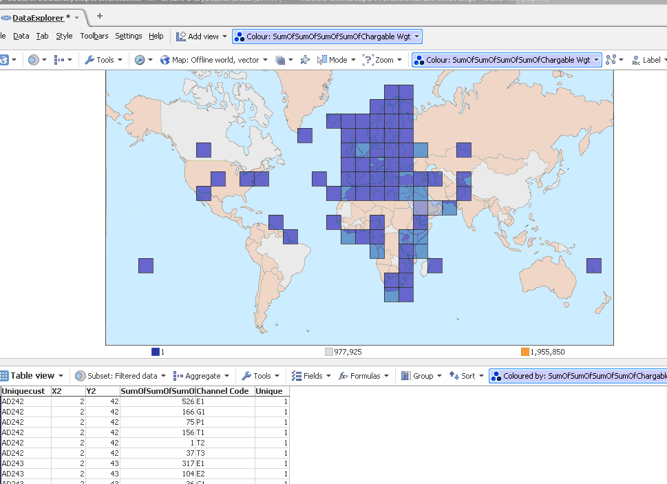
Heat maps
-
Hello,
I would like to be able to do a heat map, where each of the squares is a different colour depending on the volume inside the square. So for example, in the image below, where there is a high volume (say above 1000) then the square is red, between 750 and 1000, then it is blue etc etc. The "volume" figure in the picture below is the "sum of sum of" column.
As you can see in the picture, visokio has given me a key with 3 different colours, but these don't seem to appear anywhere on the map and are just the min, average and max values (I think)
Thanks for any help
Andy
Is this possible? If so, could you tell me how to do it?
ThanksAttachments
visokiopic2.gif 41K -
4 Comments
-
When colouring by a field in the graph/map, you see the colour for the mean value, not the sum. This applies whether using heat map or clustering.
I have attempted to work around this by creating a normal (i.e. not heat map) map view, using aggregation (with sum) and formulae to cluster the markers onto a fixed grid. I've only got a few sample data points. See if you can adapt your file to use this method. However the grid is created on the lat/lon values, so is non-linear when shown in the map (due to the mercator projection).
Please post a new forum entry under "Ideas" to allow you to pick Mean vs Sum when colouring, if you need this, so others can see and comment for it (and soon, vote). -
I'm having problems attaching the file. Here's what I did:
- add a variable "grid size", value approx. 20
- add two formula fields: "gridx" as "INTROUND(longitude / gridsize)" and "gridy" as "INTROUND(latitude / gridsize)"
- add two formula fields: "xrounded" as "gridx * gridsize" and "yrounded" as "gridy * gridsize"
- aggregate by both gridx and gridy, with your weight field set to sum
- change coordinate fields (in Map menu) to xrounded and yrounded.
Welcome!
It looks like you're new here. If you want to get involved, click one of these buttons!
Categories
- All Discussions2,595
- General680
- Blog126
- Support1,177
- Ideas527
- Demos11
- Power tips72
- 3.0 preview2
To send files privately to Visokio email support@visokio.com the files together with a brief description of the problem.


