Styling: Colour words in Dashboard Style presets?
-
Hi.
I have been working in the analysis mode and have yes/no/unknown fields in yellow blue and grey.
When I switch to my customised dashboard preset the colours for these fields change to very crass red, green and grey.
Is there any way to standardise these colours in my dashboard preset mode to be the same as in the analysis mode?
Or do I have to go into the individual fields and pick the colours?
Thanks
Phillipa -
3 Comments
-
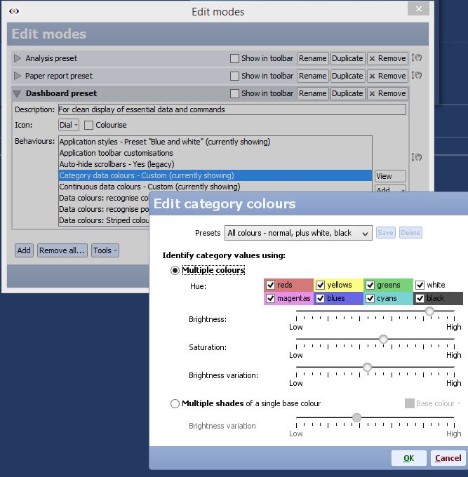
You can edit the style presets, including the appearance and behaviour of your Dashboard mode by going to
Style>Edit style presets
Another alternative is to re-image the whole dashboard via the Application Styles.
Good thing about it is that you have to do it only once per template - once you're finished , you can save the .xml file, then save it or share with others. Once the other users clicks on it, the new styling option will appear under their Application styles.
This will enable multiple analysts to produce reports for a client that will have the same branding and styling. Attachments
EditPresets.JPG 80K -
Hi Paola,
How do the category data colours work?
I see that there is an option under Data colours that is "recognise colour words" - you can click it on or off. How can I always give yes/ no/ unknown a specific colour in the file irrelevant of which preset I use?
Thanks
Phillipa -
You can manually choose the colours for the category fields by going into
Data>Manage fields>Options>Field >Value order,colours,shapes
to select colours for "yes" and "no".
For the numeric fields, you can similarly define the colour range, with min/max and med hue.
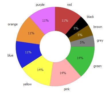
If the values in the field contained colour words, such as "red", "yellow", "green" etc, Omniscope could pick it up and apply in visualisation. Attachments
ColoursRecognise.JPG 13K
Welcome!
It looks like you're new here. If you want to get involved, click one of these buttons!
Categories
- All Discussions2,595
- General680
- Blog126
- Support1,177
- Ideas527
- Demos11
- Power tips72
- 3.0 preview2
Tagged
To send files privately to Visokio email support@visokio.com the files together with a brief description of the problem.


