
Pie View: Splitting by top 10 and 'othering' all other measures?
-
I have a pie chart that includes 53 measures. Is it possible to show the top 10 measures and an "All Others" category for the remaining 43? I can't find the option that let's me do this. ThanksAttachments
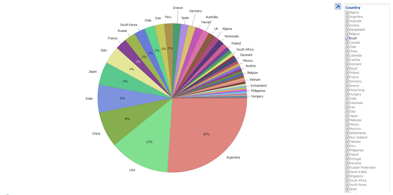
Pie Chart example.jpg 130K -
7 Comments
-
Martyn - First of all make sure you are using Pie View 2:
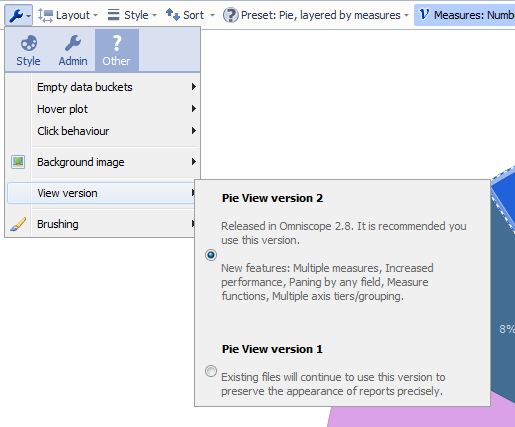
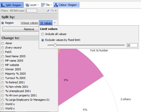
Then use the Split by option below: Attachments
PieView2.png 32K Top 10 Values.png 43K -
Hi Thomas
Version 2 Pie Chart is selected. But when I go to Split> Measures, I do not see the Limit Values option. See file for the options I do have.Attachments
Piechart 2.jpg 183K -
You probably wanted to split by [Country] or another category field, in which case you would get the option to click on the number of n values (default) and adjust this figure.
By clicking on a small arrow menu, next to number of values, you will see further options to display all values, or group those categories not in the top n values as 'others'. -
Hi Paola. Just to explain. I have 53 countries in my data set (country column). For each country I have 53 export columns (Exports to China, Exports to India etc) and 53 Import columns (Imports to China, Imports to India etc).
The pie chart includes the 53 columns (Exports to China, India etc) and shows the distribution of exports to the 53 countries for any given country (using the country column as a filter).
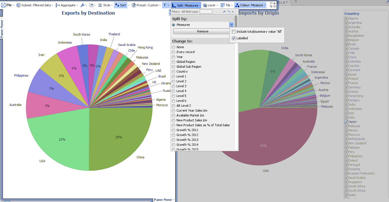
My main problem appears to be that "othering" does not appear as an option when the split is by "measures." Hence your suggested solutions do not appear to work for me. I am using the latest version of 2.9.
-
You might wish to pivot/depivot your dataset, so the field is called [Export to Country], then values are country names, this would work.
Another useful visualisation tool would be a Pivot view, where on one axis you would have country of origin, on other axis country of destination.
In the Pivot view you can similarly limit top N values in the split. -
Hi Paola
Take that to mean that pie chart option isn't available as is. Will try the pivot. Thanks -
Your data structure isn't really suitable for the Pie view, which usually looks at the values in one field (measure) and splits it into slices according to 1-2 category fields, so the slices add up to 100%.
Splitting according to multiple fields, while intending to use same fields as both measure and split will end up in messy result. How will those slices add up to 100% ?
Another interesting way to visualise the relationships would be the Network view, so you can show 2-way flow of goods between pairs of countries?
If you are happy to share a demo data file (100+ rows) with dummy numbers, we could try to re-shape it to fit the requirements...


Welcome!
It looks like you're new here. If you want to get involved, click one of these buttons!
Categories
- All Discussions2,595
- General680
- Blog126
- Support1,177
- Ideas527
- Demos11
- Power tips72
- 3.0 preview2
To send files privately to Visokio email support@visokio.com the files together with a brief description of the problem.