
Idea: Bar/Line View - background guidelines Mean+/- 'n' STDs?
-
Hi Team,
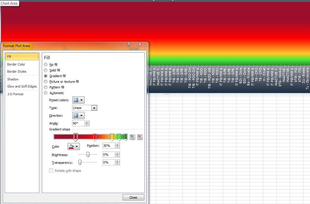
Please find the attached Excel chart format in which the plot area has been formatted with calculated gradient effects.
Can we have this available in Omniscope for one of our important report requirement?Attachments
Chart Area.JPG 103K 
gradient example.xlsx 16K -
13 Comments
-
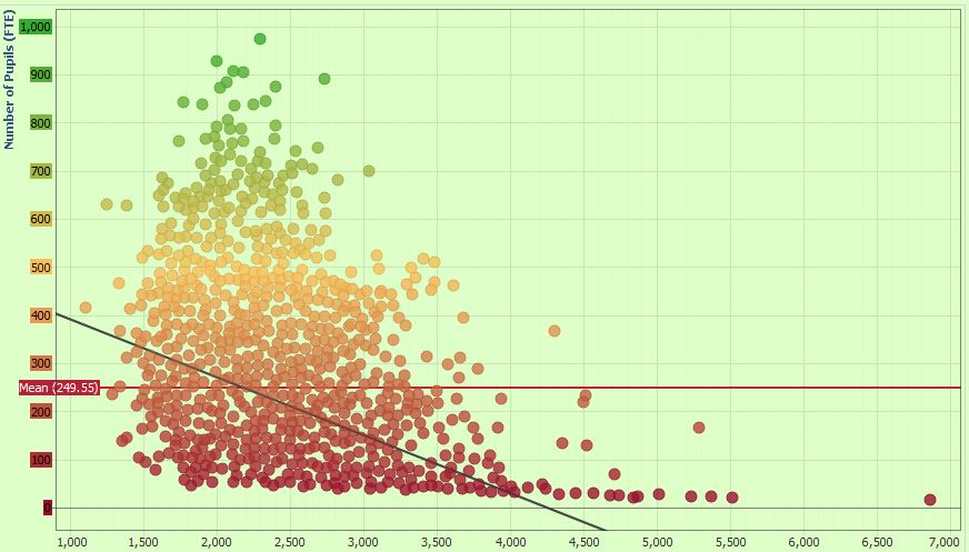
In Omniscope you can specify colour grading for numerical fields, setting the 'ramps' in:
Data>Manage fields>Field options>Value colouring
In the example below I used 'pick' option on the colour palette to 'lift the colours' from your chart, picking the exact shade of red, yellow and green (place the marker over the colour and hit Enter or Space).
We currently have 3 colour grading points, but are considering adding more.
As for the Area chart itself, we do not have this option, and it would be interesting to see whether it has informative side, in addition to its decorative purpose :)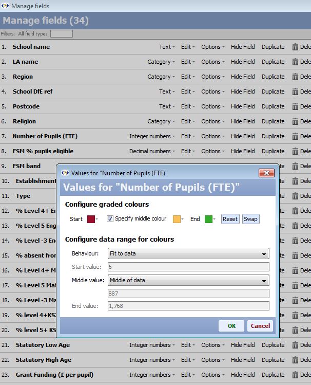
 Attachments
Numerical Colour Grading.JPG 106K Colour Grading chart.JPG 77K -
Thanks for your feedback Paola and Thomas.
@ Paola, Can this be integrated with the configuring color gradient and use under the attached COLOR GRADING IN BAR CHART snapshot as attached?
Note: I have multiple measure which has different value but there should be common coloring scheme for all calculation on a bar chart.
Thanks & regards
Rajesh BAttachments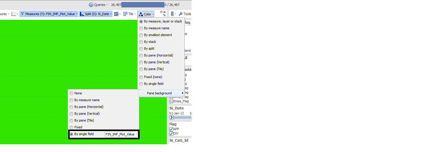
COLOR GRADING IN BARCHART.png 35K 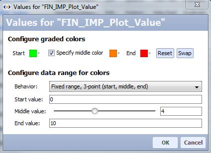
CONFIGURE_COLOR_GRADED.JPG 33K -
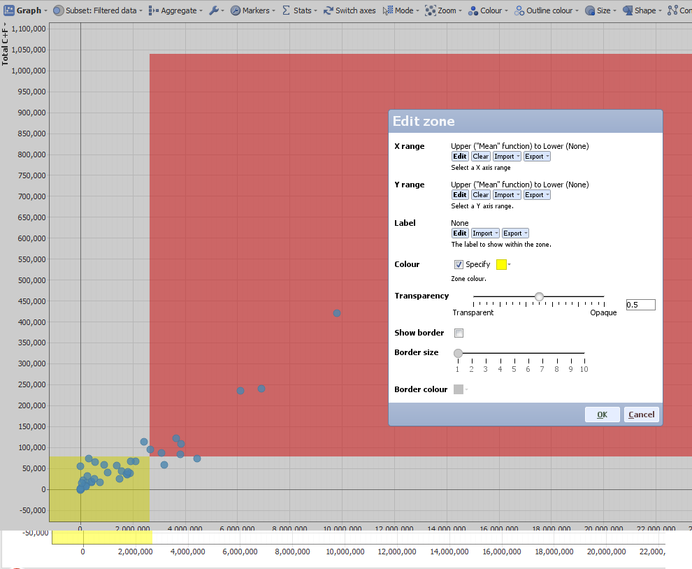
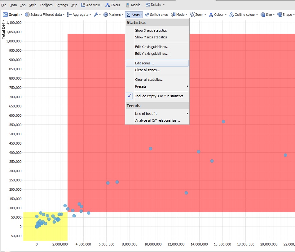
The plot area can be affected using the stats on the graph view where you can define regions by colour, is it possible to actually put the gradient colouring into that interface? Perhaps expand those options for the Bar/line too?

 Attachments
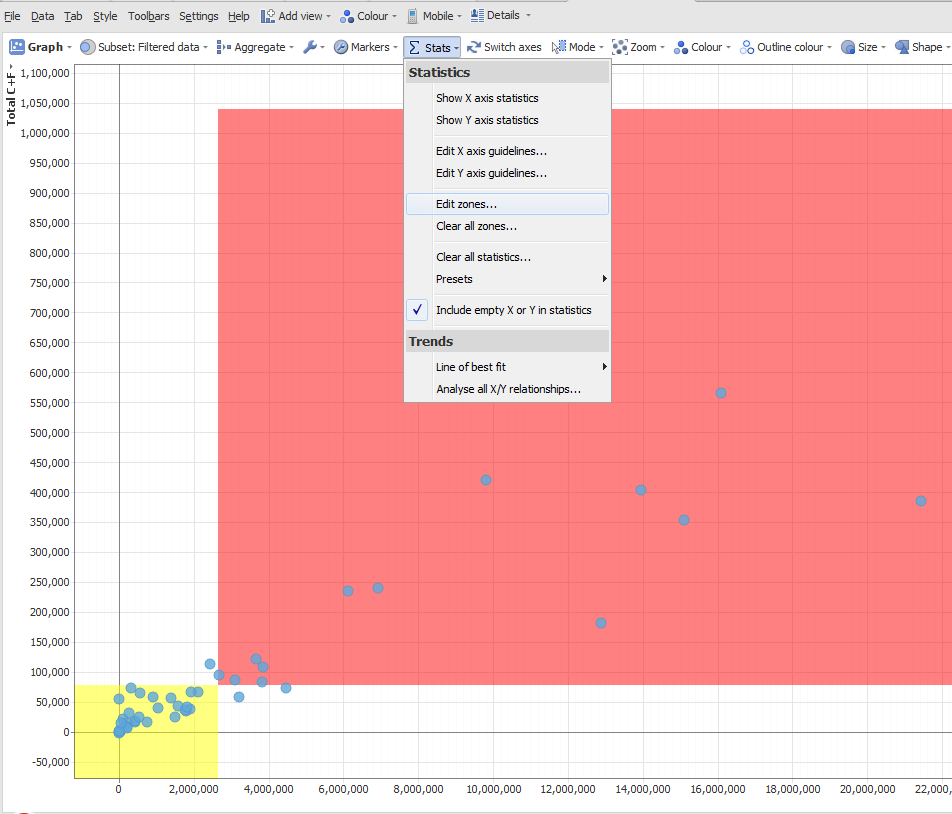
Editzones.png 69K 
Editzones2.png 58K Editzones.jpg 171K Editzones2.jpg 170K -
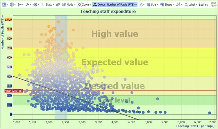
Zones in the Graph view probably come closest to your request, as Daniel suggested, and you can have either custom zones on X / Y axes or both, using the mean, max, min, standard deviations and other functions to define the range, or decide on custom values. Each zone's colour can be customised, labelling and borders too. Please see image below.
 Attachments
GraphViewZonesColouring.JPG 109K -
Brian - The purpose of these Ideas threads on the Forum is to refine and optimise feature requests, as well as gauge interest. Why not post the requirement as you see it, ideally with a sample IOK data set illustrating the type of story you are trying to convey?
So far, this discussion appears to include three discrete proposals
1.) plot area gradient backgrounds like Excel, but with boundaries at +/- sigmas
(why is this better than breaking at zone lines?...see next option)
2.) plot area coloured zones with boundaries at +/- sigmas
(existing feature, see example above) and,
3.) adding a continuous value colouring option with user-definable breakpoints not only at mean (existing) but also at +/- 1 and 2 sigma.
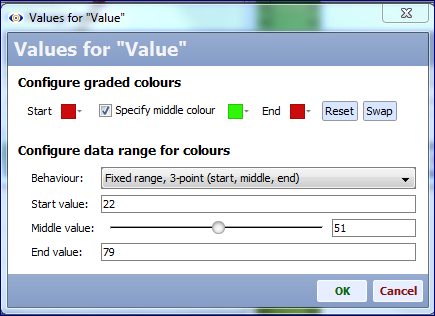
For any numerical field, it is possible to customise the value-colouring behaviour field-by-field from:
Data > Manage fields > {Field} > Options > Value-colouring
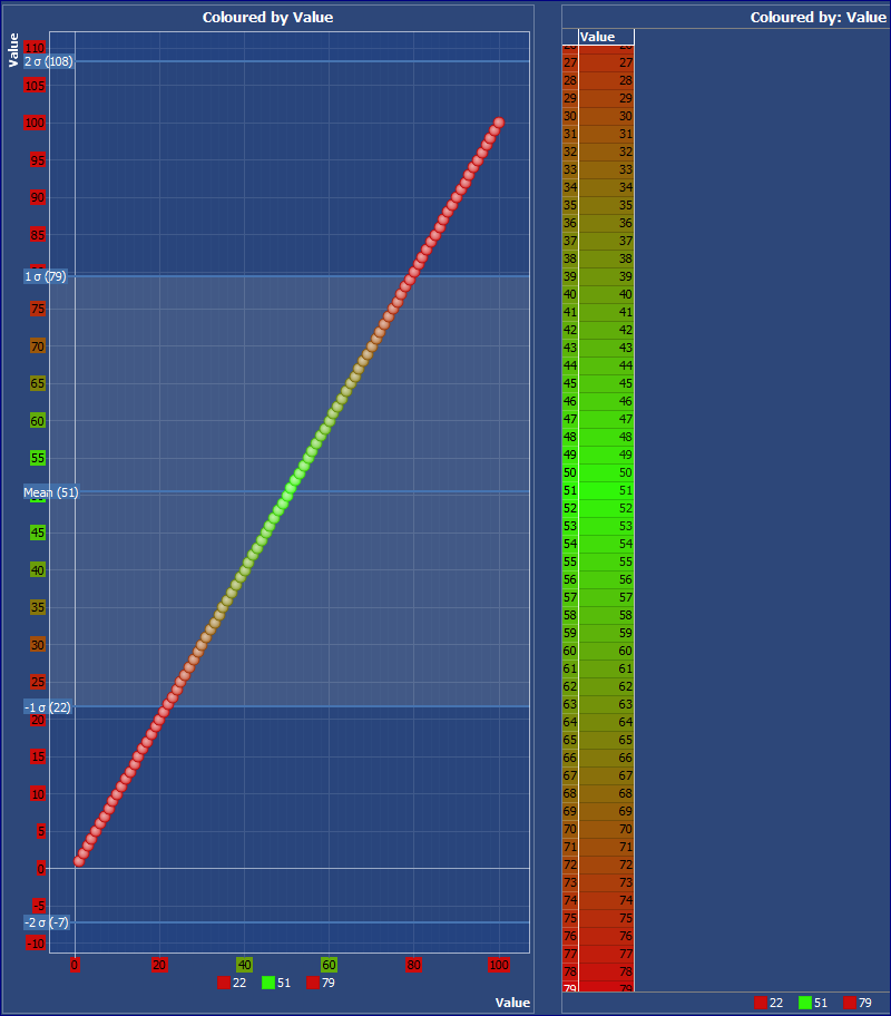
Currently there are many options for controlling start value/colour, end value/colour, choice of 2 or 3 inflection points, middle colours and even adjustments for skewed mean distributions. Is the idea to add an option to define a 6 inflection point option with start, -2, -1, mean, +1, +2 sigma and end as breakpoints for changing graded colouring?
But this is not really gradient colouring, since it seems like you want to assign the same fixed colours to ranges and points beyond internal limit values, i.e. values above & below +/- 2 sigma might be same colour?
You can do something like the below by setting the start and end values to be +/-2 sigma (not the extreme values of the field) with the same start & end colour and a different middle colour...Attachments
ColouringExample.PNG 73K 
ValueColouring.PNG 37K -
Hi Thomas,
Thanks for the updates, but zone colouring works only for Graph View chart and not for Bar/Line View charts.
We have this requirement based on Bar/Lines charts.
-
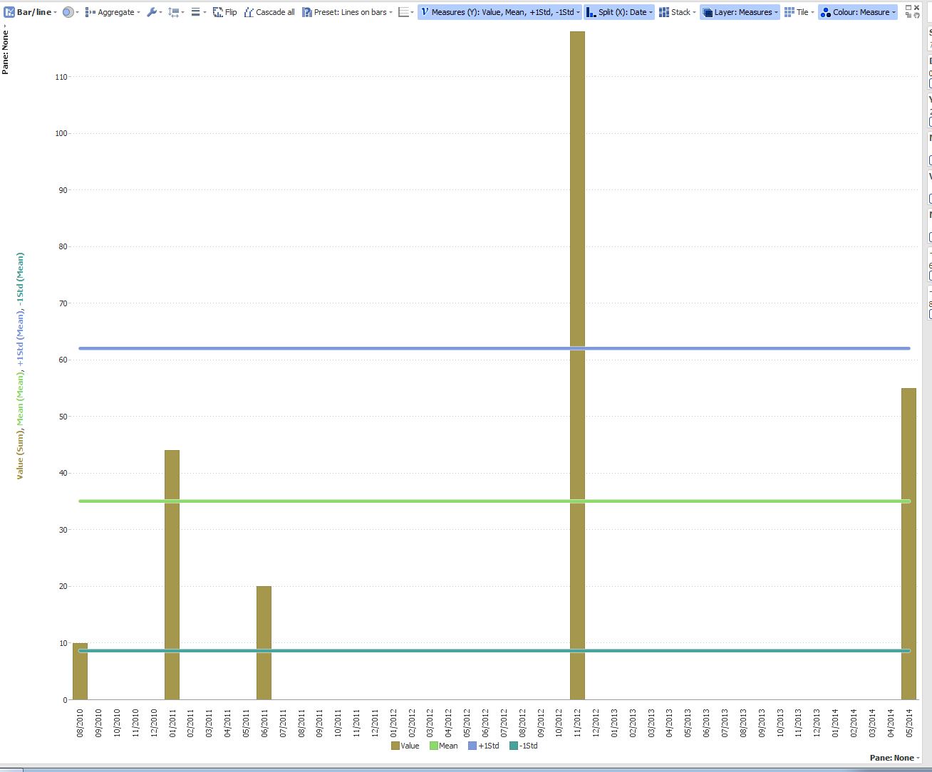
Not sure if this would help as a workaround, but you could add formula fields to create Mean and +/-STD values, then add them as measures to the Bar/line view, creating the zones, similar to Graph view. It will not colour the plot area, but will work as border for other bars/lines, and you will be able to chose the line thickness and colour.
Add formula fields to the dataset, with formulas like this:SUBSET_MEAN([Value])
+
SUBSET_STDDEV([Value])
(chose mean under measure menu in the Bar/line view)
Demo file attached. Attachments
STD zones.JPG 118K STD Zones in BarLine.iok 17K -
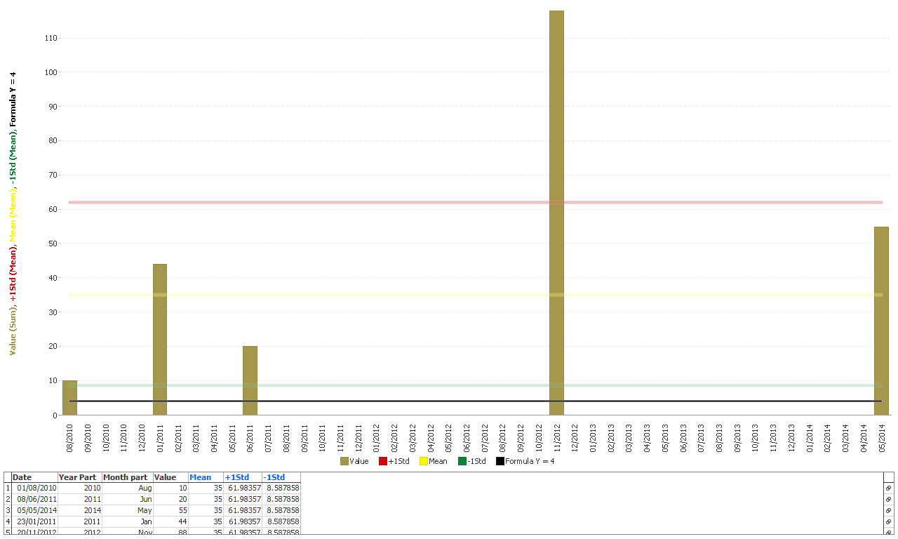
Hi Paola,
Please have a look at current file attached. In this file if I add column formula in measures with a value 4( As I need a straight line at 4). The line is getting combined with -1std line. Cannot we make this independent??AttachmentsCurrent file.iok 16K -
Jagran - You need to use the 'Bars on Lines' layout preset, then use an added formula measure with the simple constant value of 4:
 Attachments
STD Guidelines in Bar-Line.png 31K STD Guidelines in Bar-Line Example.iok 14K -
Jagran - Remember that you can have many views on a tab, and unlimited tabs and (unrelated) datasets in an IOK file. The purpose of interactive visual reporting is to guide the consumers of the report, dashboard or decision support tool through a 'story' that gives them confidence in their decision-making.
It is tempting to pack a lot into one interactive view on one tab trying to create a single 'tool' view that can answer all questions. This is not, however, easy for consumers to digest.
In general it is better to use defined Subsets and Named Queries, Tab and View footers, Tab links and Content View and Helpfile text to 'spread out' the story across multiple tabs and views, some tabs sharing the same filter and Variable settings, so that the consumer is 'guided' through the story.


Welcome!
It looks like you're new here. If you want to get involved, click one of these buttons!
Categories
- All Discussions2,595
- General680
- Blog126
- Support1,177
- Ideas527
- Demos11
- Power tips72
- 3.0 preview2
To send files privately to Visokio email support@visokio.com the files together with a brief description of the problem.