Idea: Custom map markers-image sets, colours and shapes
-
Hi,
I have been asked to produce a Map view report by our marketing team. Basically we wish to show on the map all our locations. We will also show on the same map the locations of a partner of ours. I was able to get this to show by the usual methods. But what the marketing team would like is to show a small graphic instead of the default marker. So for all our locations we show a small graphic and for all the partner we show their graphic (small logos) This was we can show the complementary locations of both our sites.
Can you let me know how I can do this? -
3 Comments
-
Currently you have several choices for marker shape (circles, stars, house, man etc.), but you cannot customise it an have a company logo. You could colour the marker and match the exact colour of a company logo, by 'picking the colour' off the company's website.
Open the Web view next to the Map view, go to your/other website and then in the colour picker for the field (Data>Manage fields>Options>Value order, colours... ) choose Pick. Mouse-over the desired colour and hit space.
This entry is re-classified as idea, so you and other users can vote for it. -
Hi Paola,
Can you let me know how I can display the 2 different colours on the map?
Peter -
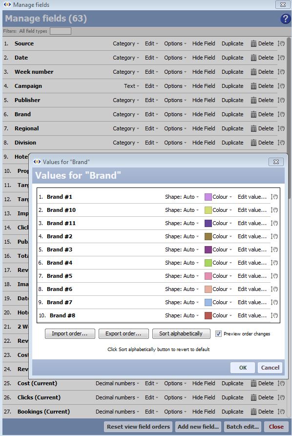
In the Map View colour menu choose [Company] field to colour by. Then from the main toolbar
Data>Manage fields>Options>Value order, colours...
customise the choice of colours and shapes for different values in the [Company] field. Attachments
DataManageFields.JPG 122K
Welcome!
It looks like you're new here. If you want to get involved, click one of these buttons!
Categories
- All Discussions2,595
- General680
- Blog126
- Support1,177
- Ideas527
- Demos11
- Power tips72
- 3.0 preview2
Tagged
To send files privately to Visokio email support@visokio.com the files together with a brief description of the problem.

