Omniscope version 2.5 offers 16 different views. More views are always under development. You can preview/test experimental views available in your version at any time by enabling experimental features on your installation, then re-start your Omniscope: Version 2.5: Settings > Advanced > Show experimental features
View Toolbar [1] - documentation of View Toolbar commands and options common to all views | |||
 | Table View [2] - see all of your data in rows and columns, with aggregation options, grouping for sub-totals, formulae and variables for modelling, and a wide range of powerful data editing tools. | ||
| Chart View [3] - horizontal visualisations of data values in your columns, a powerful view for querying ranges and spotting errors your data. | ||
Pie View [4] - show splits/proportions of values in category, number and date fields, with paning for multiple pies per view. | |||
| Bar View [5] - display relative levels in multiple category, numeric or data fields using horizontal, vertical, stacked, cascaded and proportional bars. | ||
| Graph View [6] - identify relationships between columns with scatter plots or time series [7], using statistical analysis to identify trends, outliers and exceptions. | ||
| Tile View [8] - Show each record as a re-sizable tile or image,useful for 'heat maps', image catalogues and much more. | ||
| Pivot View [9] - displays summary values (sums, means, counts, etc.) at intersections of selected category columns. | ||
 | Network View [10] - depict both grouped hierarchies and relational networks using either dual field or specified multi-field relatonships. Grouped networks can be used to visualise almost any type of data set, while relational networks can be used whenever there is a common relationship between the rows. | ||
| Portal View [11] - text search plus dynamic filtering of categories, numbers and dates and statistical summaries of the target universe. | ||
| Map View [12] - geo-spatial positioning of records, with embedded or web-based maps enabling selection, filtering, and connected markers. [13] | ||
| Venn View [14] - See the overlaps between up to 5 pre-defined subsets of the data ('named queries') corresponding to the filter settings or selections in place at the time you save or add to the named query. | ||
| Web View [15] - use multiple web views to display multiple web pages, and exchange data with remote web services. [16] | ||
Content View [17] - place formatted text annotations with embedded images and formulas in this view window located anywhere on the page. (new in 2.5) | |||
Dial View [18] - adds dial and meter type visualisations with defined alerts and zones for high-impact dashboards. (new in 2.5) | |||
| Details View [19] - see some or all the displayed attributes of each record, with associated image(s) and links. | ||
This section covers the View Toolbar commands which are common to all views. Documentation for view-specific commands on the View Toolbar > View Tools menus of each view are discussed view-by-view in the Views Reference [20] section.
Every View has a View Toolbar at the top. The View chooser, Data Subset query selector, Aggregation options, View Tools, Fields chooser, show Details and [X] Close View button at the far right end are present on most View Toolbars. Exceptions: Details View only shows the details for a single record, the Web and Content Views.
 View Chooser - the selected view name and icon always appear at the far left of the View Toolbar. Click on the drop-down View Chooser to change the view displayed in the window.
 Data Subset - the data set or filtered/defined subset to be displayed is selected here. By default, the Filtered data (IN) subset is selected. If no filters are set, this will be the same as All Data. If you have defined Named Queries [21], they will be added to the bottom of this menu in each view.
 Aggregation - most views enable you to select various options for defining and visualising aggregated data sets, and specifying the functions to be applied to each field (column) in the aggregated displays. For more detail, see the section on Aggregation & Grouping.
 View Tools - drop-down menu present on all View Toolbars, but most of the commands on this menu differ by view. The commands which are common to almost all views are discussed below. View-specific commands are discussed in the section on using each view.
Fields - you can choose the fields (columns) displayed or hidden, and the order in which the columns are displayed on a view window-basis. Use the 'All' or 'None' buttons to show or hide all columns, and change the order by dragging the 'hands' up or down to order the columns.
Details - This button, next to right-most in all View Toolbars, displays a pop-up table (with the same settings as the Table View) showing all records currently visible in the view. If you have made an active selection before clicking on Details, you will be asked if you want to display only the selected records. The first column in the pop-up table will have underlined values, which are links to the individual records. Click on the underlined record to display that single record in a Details window. Alternatively, double-click the row number ("row header") to see the details for a record. For more detail, see Viewing Details. [22]
 Close View - clicking on this icon will close each individual view.
 You can re-open/return to a given view at any time using the Add View chooser drop-down from the Main Toolbar:
This discussion of the View Toolbar > View tools drop-down menu covers only those commands common to all or most views. Most of the commands under View Tools are specific to each view. These commands are discussed in the sections on each view, accessible for the links on the Views Reference [20] page.
The bottom-most section of commands in the View Tools drop-down menu is the same for all views:
Background image - see discussion below
Export view data - takes you to the Export Data wizard (also accessible from the Main Toolbar File > Export > Export files menu). Opening the Export Data wizard using the View Toolbar > View Tools > Export view data command pre-selects the data set of the current view as the set/subset of data to be exported. The Export Data wizard allows you to add or remove fields from the file to be exported, set the column order to match the view and to decide which export file format to use, either .IOK or .CSV or Excel .XLS for spreadsheets, or .XML for other applications).
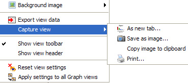
Capture view - provides 4 options for capturing the visible aspects of each individual view:
Show view toolbar - this option determines whether the View Toolbar is revealed or hidden. When creating report tabs, for example, it is often desirable to hide the View Toolbar if users do not need to alter the view settings. If you have saved the tab in default format the View Toolbar will be hidden...to reveal it for just one one view, say a Web View, tick this option.
Show view header - this option reveals an editable text title space above the View Toolbar each view
Reset view settings - allows you to reinstate the default settings for the view if you have changed the row heights, field order, etc.
Apply these settings to all {view name} views- extends the settings you have configured for the view to all other views of the same kind. For example, if you have set a particular column order for a Table View, this command copies the settings to all other Table Views you have configured thus far. If you have configured Table Views in saved report tabs, you will be asked if you want to change those settings as well.
The Pie, Bar, Graph, Portal and Details View Toolbar menus also contain the option to specify an image to be shown as a background to the view.
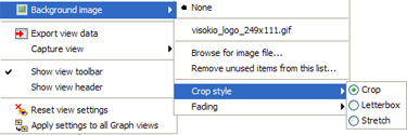
Image files such as logos, etc. of any size in .JPG or GIF format can be added as background, sized to fit using the Crop, Letterbox or Stretch options, then faded to create an unobtrusive backdrop for selected views. For more on working with background images, see the section on the Layout Menu [24].
The Table View displays your tabular data as it was imported into Omniscope from a spreadsheet tab or a database view/table. The Table View shows the underlying data values by row and column cells for selection, sorting and editing. Double or right-clicking on a cell allows you to edit the contents, and you can import large tables of data from other sources by cutting and pasting the data into the Table View. The Table View displays colour-coded values with instant aggregation and sorting, plus displays of zooming views of images associated with the data set.
Like spreadsheets, you can specify formula fields (columns) calculated according to formulae you specify using values in other fields (columns). Each record (row) also has a links menu on the row footer (far right end of the row) enabling you to insert dynamically-generated local and web links, or select from a menu of pre-configured links to free web services. Use the View Tools menu commands to check for duplicates, expand and collapse text values into more or fewer columns, and many other data management and correction tasks.
The Table View is highly-configurable, enabling you to drag columns to re-order. To hide (not delete) a field (column), right-click on the column header, select the Tools sub-menu, and select Hide from this view. The Reset all settings for this Table View command at the bottom of the View Tools menu restores all columns to the view, resets the column order to the original import order, and clears all record sorts, aggregations and colouring options. It does not affect Formula field or variable declarations.
The Table View control menus are available via left and right-clicks on the column and row headers, and right clicking on individual cells. These menus are discussed below.
Left clicking on column headers places a primary sort on the data set using the values in that column, and clicking again reverses the sort direction. Small orange triangles pointing up or down indicate that an ascending or descending sort has been set using the values in a column. The primary sort column triangle is solid orange, the other secondary sorts are unfilled. To see or clear sorts that have been set, use the Sorted Fields by Priority drop-down on the View Toolbar (see below).
Sorting-sets the primary sort for the display ascending/descending on values in the field (column). You can remove a sort on this menu, or change the order or direction of sorts. To see and manage all sorts, use the Sorted Fields by Priority drop-down on the View Toolbar (see below).
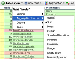
Aggregation function- When you have Aggregation set, the function to be applied to the record (row) values taken collectively for each filed (column) can be different field by field. The aggregation functions available on each column header sub-menu will depend on the data type of the field (column). For example, text columns minimum and maximum values are based on character counts. Note: Range gives the difference between the minimum and maximum values in the field. (See Table View > View Toolbar > Aggregation below for more on configuring aggregation.)
Options- You can choose to display related image sets in any column, or to display configured links, either to the details display of the record, or another link you have configured using the Settings > Links wizard on the Main Toolbar.
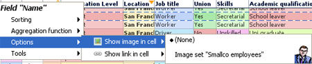
Show image in cell- allows you to insert an image into each cell of a column, regardless of the value in that cell. Choose from the list of image sets which you have previously configured using Settings > Images wizard on the Main Toolbar. Multiple image sets can be displayed this way since several columns can show different or the same images.
Show link in cell- this option will display a sub-menu of links to display when the value in the column cell is clicked. You can link the values in any column to either the Details display, or other links which have been configured for the file using Settings > Links wizard on the Main Toolbar. You can link the values in more than one cell to the same link, or the Details display.
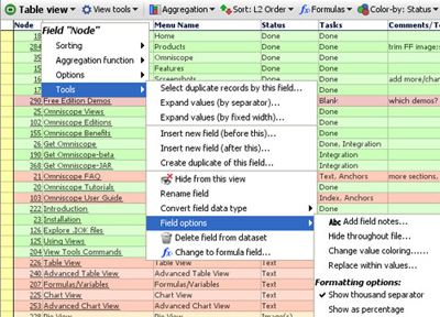
Tools- these column header sub-menu options mirror those available in the bottom section of the View Tools drop-down menu (documented in the View Tools section below). Some of these options (Hide, Rename, Convert field data type, Field options, etc.) mirror those available in Data > Manage Fields on the Main Toolbar documented here [25].
Warning: When using the Expand values commands, you need to create new, blank columns adjacent to the column being expanded to receive the separated values. If you do not, you will be warned about values in the adjacent columns being overwritten. Create new blank target columns and drag them into position to the right of the column to be expanded using Data > Manage Fields > Add new field (at the bottom). See more discussion of using the expand and collapse commands under View Tools commands below.
Warning: Be careful when converting the field data type, as this will delete all non-compatible cell values in the field (e.g. text values will be deleted from a field converted to number field). see more discussion of changing field data types in Data > Manage Fields [25] menu section.
Change to formula field- changes a non-formula field to a formula field. Any values in the column will be replaced by calculated results.
Convert to static values- changes a formula field with calculated values to an input colmun with static values, which you can overwrite. All formula logic will be lost.
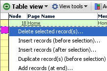
The rectangular space at the far left of each row is called the row header. Left clicking on the row header selects the row, such that you can apply power query filtering operations like Move or Keep to exclude or focus on that record (row). Double-clicking on the row header brings up the Details display. Right-clicking on the row header displays a menu of options for managing the rows in the data set:
Note: If you have sorting or aggregations set, you may not see new blank rows where you expect them. Often it is best to clear all sorts and aggregations when adding or deleting rows.
The rectangular space at the far right of each row is called the row footer. Left or right-clicking on the row footer displays a Links menu which allows you to follow or define additional links using the Add web or local links wizards also accessible from Settings > Links on the Main Toolbar.
Right-clicking on an individual cell displays a selection and viewing options sub-menu:
Edit this cell- is the same as double clicking on the cell to place the cursor inside the cell.
Deselect- removes this record from the selection set. This is not the same as the global Deselect on the the Main Toolbar which removes all records from the selection set.
View details for this record- displays the individual record Details for the selected record.
View details for records with this value- launches the pop-up table view containing all records which share the same value in the cell. The pop-up table view will be configured the same as the Table View you clicked on in terms of column order, columns displayed etc.
Select specific record- Use carefully!...when ticked, this changes the selection behaviour to select records one at a time, rather than based on common values. If this option is ticked IT APPLIES TO ALL fields (columns). When ticked, the Main Toolbar barometer will only show 1 record selected at a time, unless you drag the mouse to select contiguous records. Resetting the the Table View returns this setting to the default Select by value.
Select by value- the default behavior...if you select a cell, all records that share the same value in that cell are selected, as shown in the Main Toolbar barometer in blue. You can then execute power queries such as Moves and Keeps on the selected records.
The Table View Toolbar contains 5 view specific drop down menus; View Tools, Aggregation, Sort, Formulas, Colour-by: and Colour Options in addition to the View Chooser and the Show Details, Add to Basket and [X] Close window icons common to all views:
Each of these sections is documented below:
The Table View tools menu has six sub-menus; Links, Column Option, Row Options, General Options, Aggregation and Tools. The sections below document the commands and options available under each of these sub-menus.
The Links sub-menu enables you to select which, if any, links will be associated with clicking on the values in the cells of each field (column) in the Table View.

Fields already associated with links will show on the drop down list in bold, and their values underlined in the cells of the Table View to indicate a live link.
No links (None) is the default for all fields except the first column on first opening, which is set to Details (which you can change). Any number of different fields can be linked to the Details display. All other links which you have configured for the file (using the Settings > Links menu on the Main Toolbar) will show on the pick list, available for association with any of the fields in the data set.
The Column options sub-menu enables you to choose which fields (columns) will be shown or hidden (not deleted), and the order in which they will be displayed for that particular Table View (global column order for the file is set at import, but can be changed using Data > Manage fields on the Main Toolbar).
Columns to show- reveals a list of all fields which are ticked (showing) or unticked (hidden) in this Table View. Tick or untick the check boxes to show or hide columns and/or drag the hands up or down to change the order of columns. You can also click and drag the column headers sideways to reorder the columns, and you can hide columns by right-clicking the column header, then selecting Tools > Hide from this view. Suggestion: use the ALL or NONE buttons at the top right of the Columns pick list to reset the columns displayed quickly.
Column header height- allows you to add more lines to column headers to accommodate longer names on narrower columns.
Squeeze columns (prevent scrolling)- turns the column header text vertical (if necessary) and narrows all the columns/cells to display in the window available with a minimum of horizontal scrolling. Cell values are concatenated by default, but full cell contents will show as the mouse hovers over the cell.
Reset column widths- (not shown when Squeeze columns is ticked)- resets the display of the columns on display based on the space available and number of columns being displayed. Columns can be widened or narrowed by dragging the edges of the column headers. This command provides a reset to defaults.
Note: The settings that you make for a given Table View will not be applied to the Show details pop-up table unless you also choose Apply these settings to all Table Views.
The Row options sub-menu is used to manage the display of records (rows)
Row title- can be used to select a value to display in the row header. The default is the record number assigned by Omniscope, but if there is a more meaningful identifier in the data set, you can choose to display it instead. Alternatively, you can choose (None) and the row header will be narrow and blank.
Row height- used to increase the number of lines in a row. The default is one, but if you wish to display images in cells, you may want to increase the number of lines using the slider. Display an image in one column, then increase the row height and width of the column. The images will expand to fill the space and the text will wrap.
Show link shortcuts- by default, shortcuts to the various configured links are accessible from an icon on the row footer at the far right of each row. Unticking this option hides the row footer, which may not be needed by file users and frees up a small amount of horizontal space.
The General options sub-menu contains options related to cell display.
Horizontal/Vertical gridline strength- removes or emboldens the lines defining the rows, columns and cells.
Cell margin- increases the white space around the edges of the cells from the default of none, to as much as 10 pixels. Can improve legibility, especially if used in conjunction with increased text size (see below)
Text Size- increases the size of the font used in the headers and cells of this Table View.
Abbreviate text- allows you to turn on and off cell text abbreviation. Abbreviation is useful when cells contain long text.. making columns too wide. With abbreviation turned on, you will still see what the cell contains in a much smaller space. Abbreviation is turned on by default.
Show images inside cells- allows you to chose an associated image set to display as a zooming image in a particular field (column). Note: the images will obscure the underlying values, so it is best to use a column containing the image references, which are often cryptic image file names, or else a blank column added specifically for the purpose of displaying the images.
The Tools sub-menu provides some powerful functions to manage the format and layout and otherwise improve the quality of your data sets.
 |  |
Select specific record- turns off the default common value-based selection i.e. clicking on any cell selects only the record that contains that cell rather than all the records sharing that value in the field (column). This makes the table behave a bit more like a spreadsheet and enables you to select rows to Move, Keep or Add to the Basket individually.
Select duplicate records- displays the Select Duplicate Values wizard that for selected fields, isolates all records that have more than one identical value elsewhere in that field (also works for multiple fields). This is useful for eliminating duplicate records in large datasets. The Select Duplicate Values wizard allows you to select which fields to check for duplicates, or triplicates etc. If you select more than one field (column) then records duplicated in either column (but necessarily both) will be selected.
Minimum group size: use the value of 2 to detect duplicates (or triplicates); use the value 3 to detect triplicates but not duplicates
Only select redundant records- once processing is completed, the default is to leave all rows containing duplicates (or higher) selected. If you tick this option, the first duplicated record will not be selected, so that you can you can perform Moves to eliminate only the redundant records, and Add to Baskets to create correction files.
Case sensitive- requires duplicated values to match case in order to be considered duplicates.
Invert selection- If you have selected a complex pattern of records, and wish to quickly select all other records not currently selected, use this command.
Collapse values- used to combine some of all of the values currently in more than one column into a single column, with a space or some other separator you specify in between the values. You must have selected a range of columns and rows to collapse before clicking on this command. Used to reduce column count and to create tokenized fields, which contain more than one value per cell and are used to to capture many-to-one relationships in tabular data. For more information, see Tokenized Data [26].
Note: You cannot select a group of columns using the column headers. To select all or part of a range of columns, select the first cell in the first column, then drag the mouse across to the right to select more columns and downward to select more rows. If you need to select many more rows than are visible, hold the Shift key and use the vertical scroll bar to bring the bottom right hand cell of your range into view. Click on that cell with the Shift key still depressed and the entire rectangle of columns and rows will be selected.
Expand values (by separator text)- used to replace a single column of data containing compound elements (e.g. First and Last Name with a space between) with multiple columns each containing a single element, such as First Name Column and Last Name Column. Before using this command, you must select the compound (separated value) column you wish to expand and create new blank column(s) adjacent to the right of that column. Be sure to select the entire column to be expanded using the Shift + scroll down method to ensure you have selected all the way to the bottom of the column- assuming the expansion should include all the cells in the column. Click on the command and you will be asked to specify the text separator defining the elements to be expanded, such as a blank space, which must be entered.
Note: create the new, blank columns using the Data > Manage Fields > Add new field button (at the bottom) then drag the new column into place below (right of) the column to be expanded, making sure to tick the new column in the Columns to show list of you are in Reports Mode. The existing column will be used for the first element, so to split two elements you need only add one new column.
Expand values (by fixed width)- used to break a single column of data into more than one column based on defined break points you set using the Expand Values wizard:
Before using this command, you must select the column of values you wish to expand and create sufficient new blank column(s) adjacent to the right of that column. Be sure to select the entire column to be expanded using the Shift + scroll down method to ensure you have selected the column all the way to the bottom - assuming the expansion should include all the cells in the column.
Append/prepend to cells- used to add specified characters before or after the existing values in the cells.
Note: sometimes when exporting numeric identifiers with leading zeros to Excel, such as Bloomberg Excel spreadsheets using SEDOLs, Excel does not recognise the incoming values as text and drops the leading zero, rendering the identifier incomplete. To stop this, use the Prepend function to add a text character such as an apostrophe ' in front of the numeric identifiers to force Excel to treat the values as text.
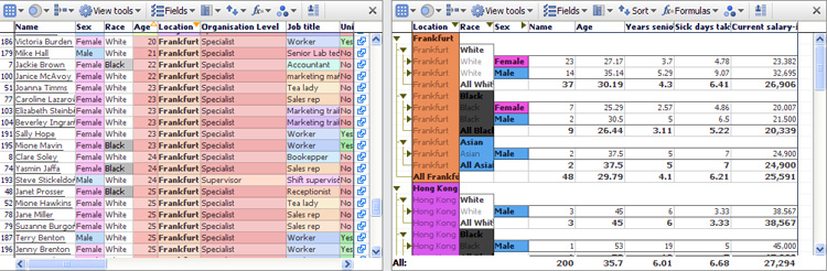
The Aggregation sub-menu controls the display when aggregation is set for a given Table View. Aggregation groups rows together based on common values. You specify the fields (columns) on which aggregation is based in sequence. For example, if you have a data set in which each record (row) is a person, you might choose a Table View display which aggregates the rows first by Location, and then by the values in other fields, like Race or Sex (grouping the males and females in each location). You set the aggregation sequence using the Aggregation pick list on the View Toolbar. If you have more than one aggregation set, use the hands to drag aggregated fields into the order in which you want the aggregations presented top to bottom = from left to right.
Note: Many different aggregation functions are availabe, and they can be different for each column. Right-click on the column header to see which aggregation function is specified for each column in the Table View.
Expandable tree- when ticked, displays a navigational 'tree' in the far left row header. Clicking on the black triangular arrows either expands or collapses the view of the rows at a particular level of aggregation.
Show summary rows for each level- when ticked, displays a summary row for each aggregated set of rows. The summary row calculates a value based on the function you select in each column by right-clicking on the column header and selecting the aggregation function to be used for that column.
...at the top- when ticked, displays the summary row for each set of aggregated rows at the top of the grouping rather than at the bottom
Show overall summary row- when ticked, shows a summary row for all rows, using the function specified for each column by right-clicking on the column header and selecting the aggregation function to be used for that column.
...as frozen summary row- when ticked, keeps the overall summary row visible at the bottom of the Table View window.
Export aggregated data... creates a new .IOK file where the rows reflect the values selected for aggregated rows in the source file.
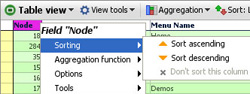
Sorting for each Table View is set using the Sort drop-down menu. Tick the check box of any field to sort the table by this field. Click the orange arrow next to each field name to reverse the direction of the sort. Drag the hands next to each field to change the order of primary, secondary and subsequent sorts.
Use the Clear all sorts button to remove all sorts from this Table View. Note: It is common to set sorts accidently by clicking on column headers. Always keep an eye on the Sort: field to ensure you have not inadvertently added a primary sort at the top of the list. If you have, simply untick the unwanted sort on this list and it will be removed...no need to use Clear all sorts.
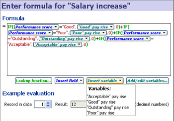
Omniscope can calculate values based on values in other columns, using a standard menu of functions (plus some additional Visokio DATASET functions) and the same syntax as Excel.
Add formula field- creates a new field (column) of values calculated as a function of the values found in other columns, together with any variables whose ranges have been defined (see discussion of variables below). Use the Add formula field wizard to define the calculation you want Omniscope to perform when populating the new column. For more detail on using the Add formula wizard, see the section on Formulas and Variables [27].
Convert existing field to use formula- use this command to substitute any values that may be in an existing column with calculated values based on a formula you specify using the Add formula field wizard.
Edit formula- allows you to select the already-defined formula you want to edit, and displays the current formula definition in the Add/Edit formula field wizard for editing. Formulae are specified by selecting columns and typing in arithmetic operators and selecting functions from the the functions library. The functions library contains all the standard spreadsheet functions, plus special Visokio DATASET functions documented in the Functions Guide [28]. For more detail on using the Edit formula wizard, see the section on Formulas and Variables [27].
Formula calculations and aggregation options (see below) can interact. The precedence settings determine (for each Table View) whether the fields with formulae defined are calculated at individual record level, then aggregated, or aggregated first:
Calculate aggregated values over formula field results- the default behaviour (aggregation of row values happens after formulae are calculated)
Calculate formula field results for aggregated values- this option changes the precedence of the calculations, such that a formula such as =[USD Volume] / [Deal Count] in an aggregated table using aggregation function Sum, is evaluated as Sum (USD Volume) / Sum (Deal Count) for the aggregate rows. Notice that with this option set, two "sum" concepts at play: inside a formula, SUM(Column A, Column B, Column C...) calculates the SUM of multiple fields within the same row. In the aggregated table, the aggregation function Sum calculates the vertical sum of all record values within the same field (column) in the aggregated row.
Add/Edit variables: Variables are input assumptions (not fields in the data set) you define by setting a default value and specified upper and lower ranges. Variables are used as flexible input assumption values so that dynamic sensitivity analyses and real-time modelling options will be available to users of the file. If you define Variables, the input values can be set by devices which appear on the Side Bar. These sliders must be visible (ticked in the Devices drop-down menu on the Side Bar) in order for you and your users to 'flex' the assumptions by adjusting the current value of the Variable(s). Any Variable(s) whose current value is different from the default will show an orange device panel, the same as for set filter device panels. For more detail on defining and using variables, see the section on Formulas & Variables [27].
Colour-by: {Field Name} or (None): This drop down menu allows you to select the field (column) by which to colour the rows in the Table View. If you select a field, it overrides the default colouring based on field data type (white for text fields, ranges from red (low) to green (high) for numeric fields, etc.) to colouring that defines records by the value and assigned colours of any any field (column) you select. You can set the colour associated with each category in the field (column) using Data > Manage Fields > Configure > Field Options > Change value order, colours and shapes. You can also access the Field Options command from the Column Header right-click Tools sub-menu shown above.
The Colour Options sub-menu is used to change the colouring behaviour of each Table View.
 | Aggregation group cells- colours the aggregation headers at the left of tables with aggregations set based on the colours assigned to the categories being aggregated. |
Granular record cells - if you find even the unaggregated cell colouring distracting, and want to return to black and white, untick this option to turn colouring off altogether.
Alternate row colour variation- to increase legibility, Omniscope alternates the intensity of colouring in alternating rows. You can strengthen or weaken this effect using the slider displayed by this command.
Text contrast- you can modify the intensity of the text display to suit your display and lighting/presentation conditions
Note: Formulas and variables can be managed from several places, principally the Data > Formulas menu. Please see Formula Fields [29] for a general guide to using formulas and variables in Omniscope.
Grouping options and formula calculation options can interact. In the Table View's Formula menu, two additional options are provided allowing you to configure the precedence of formula calculation when you are Grouping by fields or using Group > Show overall summary row. These precedence settings determine whether fields with formulae defined are calculated at individual record level, or at Grouped level:
Table View: View Toolbar: Formulas > Calculate group result values over formula field results
This is the default behaviour (grouping/summing of row values happens after formulae are calculated). Formulas are calculated for ungrouped data, then the function chosen (e.g. sum) is applied to the formula results, producing the grouped cell value.
Table View: View Toolbar: Formulas > Calculate formula field results for group result values
This option changes the precedence of the calculations, such that a formula such as =[USD Volume] / [Deal Count] in an grouped table using grouping function Sum, is evaluated as Sum(USD Volume) / Sum(Deal Count) for the grouped rows. Notice that with this option set, there are two "sum" concepts at play: inside a formula, SUM (Column A, Column B, Column C...) calculates the SUM of multiple fields within the same row. In the grouped table, the grouping function Sum calculates the vertical sum of all record values within the same field (column) in the grouped row.
Note: some of the now-deprecated Visokio DATASET functions will not work with grouped table rows in this mode. If you use this option, and you have grouped table rows while using certain DATASET functions, you will see "error" in the grouped cells of any formulae using the unsupported functions. For more information on substituting SUBSET functions for the now-deprecated DATASET functions, see the Functions Guide [28] in our KnowledgeBase.
The Chart View gives the most comprehensive overview of the contents and structure of your data sets. In one display, the entire composition of the file is revealed, enabling you to see relative proportions, ranges, gaps in the data, etc.
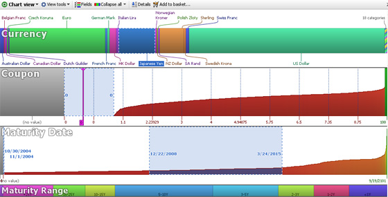
The Chart View shows all the fields (columns) in the data set as horizontal visualisation bar devices, with continuous values like numbers and dates/times plotted smallest to largest, and category values divided into different coloured segments. Text values are shown in devices coloured in ‘alphabet soup’ where the vertical height indicates the number of characters in each text string. Null/blank values are shown as grey segments. Remember that nulls/blanks are not the same as zero values. Zero values will display as a single coloured line at the bottom of a numeric bar device with a white, rather than grey background. In the example below, the field Coupon is numeric and contains both null and zero values. All of the zero values are selected and one is highlighted:
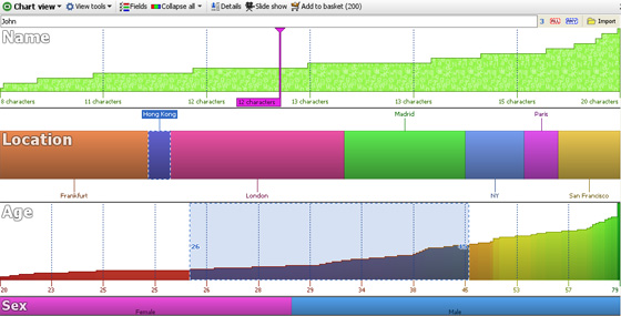
Text devices for text entries with many different values, such as names, comments etc. the Text visualisation bar devices show a 'staircase' curve based on the number of characters in each value in ascending order left to right. Selection inside Text devices is done in one of two ways; either by text input (keywords- the default) or by clicking and dragging. Right-clicking inside a Text visualisation device will display a menu with the option to set Selection to clicking and dragging. Using this setting, you can select suspicious text records based on blank values, or character counts longer or shorter than you would expect for your identification codes, etc. In the example below, the field 'Name' below displays as a Text device. If we select based on keywords, we can enter 'John' at upper left. Notice at the far right of the device that we found 3 'hits' on the name 'John' when entered in the search/filter box at left. Alternatively, if we set selection to clicking and dragging, we could select all the names with less than, say 11 characters using the mouse.
Category devices fields with a limited number (by default, less than 100) of unique values contain text, but Omniscope will also type them as Category fields. Category visualisation bar devices show the proportions of each category in the segmented (or banded) horizontal bar. Each Category value is automatically assigned a different colour, which is the also default for other views. Selection inside Category devices is done by clicking on the bar segment(s) or on the segment labels as required. Clicking on a selection a second time de-selects that segment. The Main Toolbar ‘Deselect’ button will clear all segments. The field (column) Location displays below as a Category device, with 'Hong Kong' selected.
Number devices for numbers, currencies and dates. Numeric visualisation bar devices display the range of values as curves in ascending order from left to right. Selection inside Number devices is done by clicking and dragging to the desired range of values. Multiple ranges can be selected. Right-clicking in the device will display a menu with the command to ‘Enter Selection Range’ which will allow you to specify exactly the range you wish to select. The field (column) Age displays as a Number device below, with the range of ages 25 to 45 selected.
Note: it is currently not possible to change the font used for labelling in the Chart View.
If you click on a collapsed Chart View field (column) device, such as the Sex field device above, it will expand to reveal labels for that field and collapse any other open devices. The second and subsequent clicks within that visualisation device will select groups of records. Clicking on another visualisation device will collapse the previous one, but any selection(s) made will remain and be visible in navy blue with moving dotted lines. The barometer on the Main Toolbar will show how many records have been selected across any number of devices.
If you right-click on a device, the device menu will appear, as shown below:
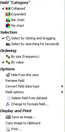 | Field "current field"- 4 options for displaying the field device: |
Note: The preview barometer count in the Text device may differ from the count in the Main Toolbar Barometer because the Text device barometer shows only the hits IN THAT FIELD, while the Main Toolbar Barometer shows the combined result of all selections across all devices.
Options, Display and Print- these commands are common to all views and documented in the sections on Data > Manage Fields [30] and View Tools [31].
| All charts- displays a list of all fields (columns) visible in the Chart View, with the same menu as the device right-click menu (see above) |
The rest of the commands shown above are common to all View Tools menus and are documented here [31]
Fields- used to choose which devices will be visible (ticked) or hidden (unticked). Also used to set the display order from top to bottom. Untick any fields you want to hide (you can bring them back later). Using the hands at the right of the menu, drag the fields in the menu upwards and downwards until you have them in the desired display order.
Collapse All- The Collapse All button on the Chart View Toolbar returns all expanded devices to their collapsed state. Clicking the small drop-down arrow next to Collapse all accesses a menu from which you can choose Expand All, Bar Charts or Analysis display modes.
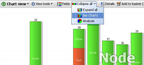
These menu items expand all the Chart View devices to one of their four possible display modes. For Number fields, Bar Chart mode creates a histogram for numerical fields with bands of values displayed both horizontally and vertically. Analysis mode shows a larger version of the plotted curve as well as key statistics on the numerical distribution. These statistics naturally update every time a query is executed. For Category fields, Bar Chart mode shows just that, while Analysis mode shows all the Category fields as pie charts. Selections of records can be made from all display modes directly with the mouse. Text fields do not display differently in Bar or Analysis display modes.
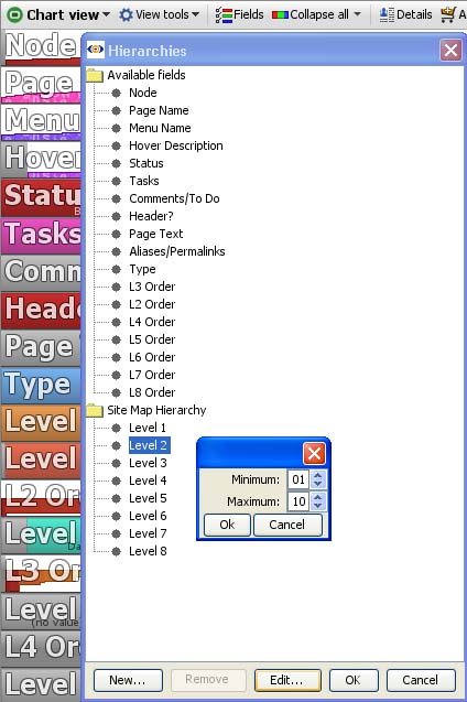
Categories which naturally 'nest' inside others, like Regions, Countries and Cities, can be combined in a hierarchy called, for example "Location". If records from more than one Region are in the IN Universe, the Chart View will display the Regionals in a new device called Location. Once only a single Region is selected, the Location Bar will 'drill down' and show the Countries in that region. If only one country is selected, Location will show only the cities in that country.
Creating a new hierarchy is easy...just give it a name, "Site Map Hierarchy" in the example below...then drag the fields (columns) comprising the hierarchy underneath in the order they belong.
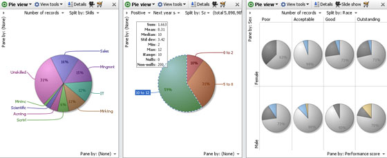
The Pie View shows a proportional breakdown of your data, either categories, or numeric. The default on opening for the first time is to show the breakdown by number of records. You can select the field to display and the field to use to split the pie into segments by using the view controls. If your data set has both positive and negative values, you can specify which to plot. You cannot plot both positive and negative values on the same pie, but you can use two Pie Views side-by-side for this purpose. If you must show both positive and negative values in relation to each other, use the Bar View [32].
You can select subsets of the data set on the pies, then execute  Moves and
  Keeps. You can also pane the Pie View vertically, horizontally, or both to obtain multi-pie views, as shown at right in the example below.
Field selector- shows all the fields whose values can be divided into segments. The default is to display the number of records divided by the field chosen in the adjacent Split-by drop down. You can choose a text field (column) to display, but if you do, the breakdown will be by number of characters in the text string values.
Split by- click on the ‘Split by’ drop down to choose a field to use to create segments within the pie(s).
Pane by- paning means displaying more than one pie chart within the display, horizontally, vertically, or both as shown in the example above right. Pane by field (column) selectors in the upper left and lower right of the Pie View display enable you to select criteria for generating multiple pies within the same Pie View. This is not the same as using two different Pie View windows.
When paning, you can use the 100% panes option in the View tools menu (see below) so that each of the multiple pies shows a breakdown totalling 100%. Use paning sparingly...if there is not enough space around each pie, Omniscope will not be able to display the labels, as shown in the example above.
The View tools drop-down menu offers a number of options
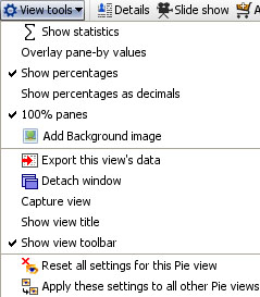 | Show statistics- when ticked, displays a translucent statistics panel, the content of which can be configured using a side menu accessed from the top of the panel. (see below) |
Add background image- provides the option to provide a faded image as a backdrop. See Page Menu [33] for details.
The rest of the commands on the View tools menu are common to all views and are documented in the section on View Tools [31]
The statistics panel display can be configured using the drop-down menu accessed from the upper right corner of the panel.
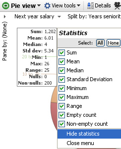 | 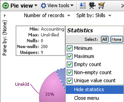 |
If the field (column) displayed is numeric, there will be more types of statistics available. If the field is a category field, summations, means, etc. will not be available.
Right-clicking anywhere on the Pie View window displays a menu of options to modify or export the display:
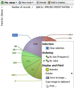 | Selection options: Ordering options: Display options: |
Copy and Print options:
Save as image or Copy image to clipboard- saves or pastes an image of the Pie View display (.JPG, .GIF, .PNG or .BMP depending on Java version) into another document.
Print- launches the Print wizard common to all views and documented in View Tools [31]
The Bar View is one of the most flexible views. It can be used to display either Category, Date and Time or Numeric data and calculated values like sums and averages. Both positive and negative numeric data can be compared in the same view. Bars can be displayed vertically or horizontally, and you can configure one or more splits (breakdowns) of selected values, with sub-breakdowns within the bars (stacked bars) and paning to create multiple displays in a single window.
All segments displayed in the Bar View are selectable, and can be used for power queries using the Move and Keep commands located on the Main Tool Bar.
In addition to the View Chooser and the View Tools drop-down menu, the View Toolbar contains a series of options for modifying how the bars display; Order bars, Flip, Cascade, 100% bars, Normalise panes, and Swap panes, plus the Show details, Slide show and Add to Basket commands common to all views and documented under View Toolbar commands [31].
View Tools- in the Bar View, all the view-specific commands are located on an Options pull-out menu accessible from this menu, and also accessible from the < arrow on the View Toolbar just left of the [X] close view command. All View Tools commands in the Bar View other than the link to Options (see below) are common to all other views and documented here. [31]
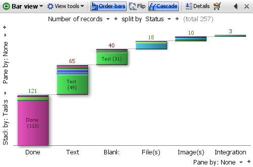
Order bars- sorts the bars in order of the values displayed, clicking again reverses the sort order, and again removes the sort.
Flip- changes the layout between horizontal and vertical bars
Cascade- displays the bars on a rising, progressive 'stair-step' base, rather than a single level.
100% Bars- normalises the height of each bar so that proportional differences in the stacked sub-segments inside each bar can be compared across the bars.
Normalise panes- normalises the height of the tallest bars in each pane, so that big differences in the absolute numbers do not minimise the height of the bars in some panes.
Swap panes- changes between horizontal and vertical paning.
See the Options sections below for more detail on the configuration options available.
Controls within the Bar View are located around the edges of the view. The Value and Split by menus are at the top, with Stack by and vertical Pane-by commands along the left side, and horizontal Pane-by menu at the bottom. Bar View configuration options are so numerous they have been put on a series of 6 drop-down menus accessed from a pull-out Options tab that appears whenever you hover your mouse along the right side of the display window.
Value/+ Add field Selector- left-most above the display, this drop-down menu allows you to select the quantity to be represented in bars. The default is the number of records, but you can change or add to the value field(s) being shown from this drop-down menu. You can toggle the field pick list to show all fields, numeric fields only or date fields only. Clicking on the '+' after the selector allows you to add another field as a quantity to display as an additional, separate bar next to the bar representing the first quantity. If you want to show the composition of each bar using the Stack-by option menu at left, you may want to select the 100% option to normalise the height of all the bars such that the stacked segments show comparable proportions. You can also specify the fields/values to represent on the Options > Measures menu (see below), which also offers additional sub-menus to specify the function being applied (sum, mean, standard deviation, etc.).
Split by/+Field Selector- drop-down menu allows you to specify one or more category, numeric, date or text fields to define how to break down the fields being plotted. You can also specify one or more fields to break down the values displayed using the Options > Breakdown menu (see below). Note:Split by selections are applied before Pane by selections.
Stack by Field Selector- (left side)- specifies the field to be displayed inside of each bar to create a 'stacked' bar chart. You can also access this command using the Options > Breakdown menu (see below).
Pane by/+ Add another Selectors- (left side & bottom)- paning creates separate sub-windows within a single display, which can be used to further break down the bars being displayed. You can also access these commands from the Options > Paning menu (see below). Note: Pane by selections are applied after Split by selections.
The Options tab menu contains 6 sub-menus; Measures, Breakdown, Paning, Ordering & alignment, Layout and Style.
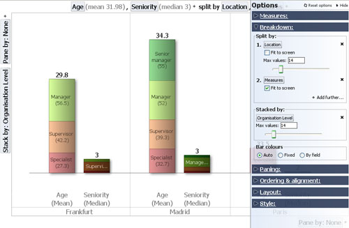
The Measures sub-menu is used to specify the values to represent as bars. In the example below, the Age and Seniority of employees is being plotted. Both of these are Numeric fields measured in the same units, years, so we use the Function sub-menu to specify that we want to plot the Mean (average) of the Ages and the median (most common value) for Seniority.
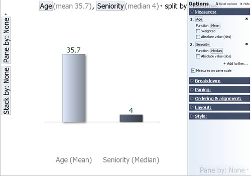
Value+ Add further fields- same as the field selector at the top left of the view, the Options dialog offers more options to specify functions, etc.
Function- only visible if you select numeric value fields (other than the Record count default). In the example above, the functions sub-menu is used to select average for the Ages (the sum would not be meaningful). The mean (average) age of the workers will not be weighted by the values in another field, so the Weighted option is not ticked. For the Seniority field, the median value, rather than the mean, will be displayed. There are no negative numbers in the Age or Seniority fields, so we will not need the Absolute value function either.
Measures on the same scale- since both values being plotted are in comparable units (years), we tick this option.
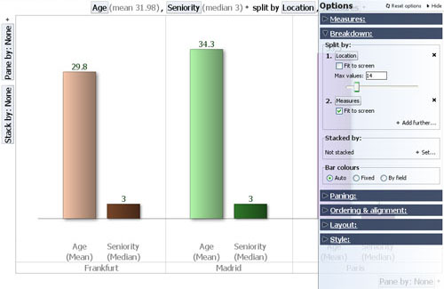
The Breakdown sub-menu allows you to plot additional bars by splitting the display according to other fields (columns) in the data set. In the example below, we split the display of average age and median seniority of employees by location.
Split by: same as the field selector at the top of the display, the Options dialog offers additional options to control how the increased number of bars is displayed. If you choose a Split-by field with numerous values, you are also given a choice of displaying a bar for each value, grouping the splits into ranges (histogram), or grouping the bars by sign (positive or negative).
+Add further splits... allows you to specify further fields to sub-divide the bars by
Fit to screen- tick this option if you want all bars to display in the view window, no matter how compressed the width of the bars.
Max values- use this slider to manage the number of bars displayed individually. If the total number of bars is more than the viewable maximum, the remainder of the bars will be shown aggregated into an 'Others' grouping. The 'Others' grouping will be disaggregated only if filtering reduces the number of bars to be displayed to less than the maximum.
Stacked by: same as the field selector on the left, you can select only one field to display inside the bars, and you cannot mix positive and negative values.
Max values- use this slider to manage the number of stacked segments displayed individually. If the total number of stacked segments is more than the viewable maximum, the remainder of the segments will be shown aggregated into an 'Others' grouping. The 'Others' grouping will be disaggregated only if filtering reduces the number of stacked segments to be displayed to less than the maximum.
Bar colours- use these options to control the colouring of the bars and bar segments.
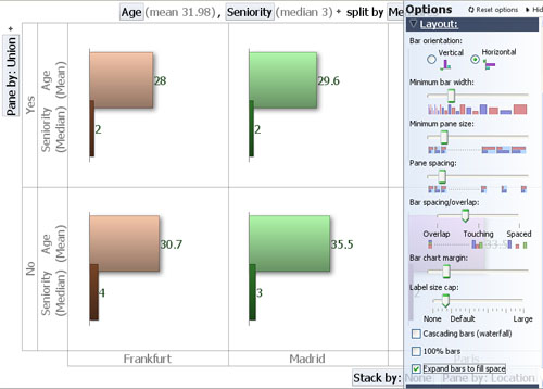
The Paning sub-menu is used to further sub-divide the display vertically, horizontally, or both. Paning sub-divisions are applied after Split-by selections. In the example below, the view display has been paned vertically based on the values in the Union membership field (column), which contains the values 'Yes' or 'No' for each employee. The resulting bar chart display indicates that Union members in this organisation are on average younger and most commonly less senior than non-union members, in both locations, London and Madrid.
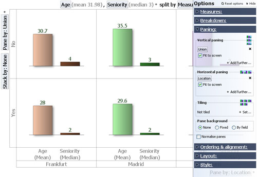
Vertical paning- same as the selector on left of display window, however the Options dialog offers more controls over how many panes to display unaggregated y if the number of values to panes by is large relative to the space available. To see all panes unaggregated, tick Fit to screen.
Horizontal paning- same as the selector on the bottom of display window, however the Options dialog offers more controls over how many panes to display unaggregated. Notice in the example above that the Split-by: 'Location' choice has been replaced by a horizontal Pane-by: 'Location' setting (faintly visible under the Options dialog panel at lower right). To see all panes unaggregated, tick Fit to screen. Note: Pane-by selections are applied after Split-by selections.
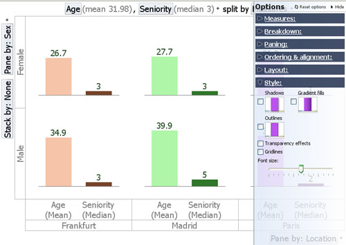
Tiling- adds multiple plots within each pane, showing the values further sub-divided. In the example below, we have left the display paned horizontally by 'Location' (values= Frankfurt, Madrid, etc.) and vertically by 'Union Membership' (values= 'Yes' and 'No'), and added Tiling by Sex (values: 'Male' in light and dark blue and 'Female' in light and dark pink):
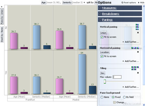
Note: Split-by and Pane-by choices are applied before Tiling. To see the values represented by the bars in each sub-plot (cluster) within the panes, hover on the bar with your mouse and the values are displayed in the Tooltip.
Pane background- use this command to set the background colour of the panes, which can be all the same or different.
Normalise panes- typically used in conjunction with stacking, sets the height of the (first) bars in all panes to be the same, regardless of their relative magnitudes, so that the proportions of the sub-segments representing the Stack-by values will be comparable across panes.
The Ordering & alignment sub-menu allows you to control the relative positioning of bars both within and across panes. The example below has the same settings as the one above, except that Order bar and Order vertical panes options are ticked, and the ordering is now set to 'Ascending'. Notice that in example below, the bars representing median seniority and average age have now changed positions, and that the Union='Yes' panes are now on top of the Union='No' panes:
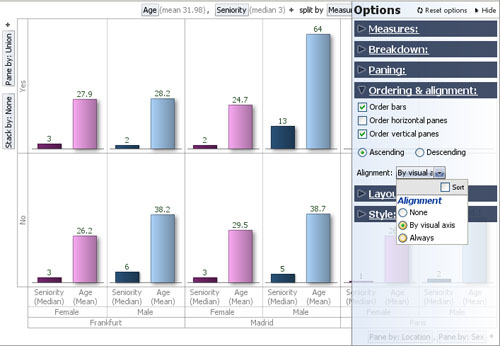
Order bars- sorts the bars within panes/tiles in either Ascending or Descending order. In the example above, the bars are in comparable Years units and the lower value, median Seniority, is displayed before the higher value, average Age. Changing the sort order to Descending will reverse the order of the bars within the panes/tiles. Behaviour of this option can be influenced by the Alignment settings (see Alignment below).
Order stacks- whenever a Stack-by field is specified ('None' is specified in the example above), ticking this option will sort the sub-segments within each bar in either ascending or descending order.
Order horizontal panes- when ticked, this option will order the panes horizontally, Ascending or Descending, based on the ranking of the values. In the example above, this option is not ticked. Behaviour of this option can be influenced by the Alignment settings (see Alignment below).
Order vertical panes- when ticked, this option will order the panes vertically, Ascending or Descending, based on the ranking of the values. In the example above, this option is ticked, and the Union='Yes' vertical panes are displayed above the Union='No' vertical panes. Behaviour of this option can be influenced by the Alignment settings (see Alignment below).
Alignment: comparison of bars across panes is facilitated by keeping the bars in a consistent order, especially looking vertically for a vertical bar orientation and looking horizontally for a horizontal bar orientation (see Options > Layout > Bar orientation below).
The Layout sub-menu is used to manage the appearance of each Bar View display. Most of the visual aspects , such as orientation, width and spacing of the bars, etc. can be managed from this dialog. In the example below, we have changed the bar orientation to horizontal, increased the minimum bar width and reduced the bar spacing to slightly overlap the bars:
Bar orientation- changes the bars between vertical and horizontal directionality. Note that in vertical orientation, the Stack-by field selector moves from the left side to the bottom of the display
Minimum bar width- changes the minimum width of each bar in order to display more or fewer bars
Minimum pane size- changes the minimum width/height of panes in order to display more or less panes
Pane spacing- changes pane margin/spacing allocating more or less space in the pane to the bars.
Cluster spacing- {being revised}
Bar spacing/overlap- changes the space between the bars, which can overlap (see above), touch or be spaced apart
Bar chart margin- changes the margin space around the outer edges of the display
Axis label size cap- sets the maximum length of the labels, which can cause them to wrap or display vertically to save space. Warning: Setting Axix label size cap to 'None' (meaning no label) will suppress labels display completely. Start with the Axis label size cap set to 'Large' and reduce...working in conjunction with Style/Font Size (see below).
Measure/Axis font size - Allows you to control the font size of the measure labels and of those that are shown on the x or y axis.
Measure label orientation - Allows you to control how measure labels are shown (auto/vertical/horizontal). By default this is set to auto which means that bar view automatically calculates what is the best orientation of measure labels i.e. if there is not enough space to show all the labels horizontally fully then it will show them vertically. However, the auto behaviour may not be always be accurate in all situations in which case you can manually set the orientation.
Measure label spacing - Allows you to control how much space is allocated to measure labels when they are displayed. This option is particulary useful when measure labels orientation is vertical and you have big values, and you want to show the full value and don't want to truncation of the values to take place.
Cascading bars (waterfall)- same as the option on the Toolbar, displays the bars on a rising, progressive 'stair-step' base, rather than a single level.
100% Bars- same as the option on the Toolbar, normalises the height of each bar so that proportional differences in the stacked sub-segments inside each bar are comparable across the bars.
Expand bars to fill space- sets the bar widths so as to use all available space after allowing for settings governing margins, spacings, maximum bars and panes to show disaggregated, etc.
The Style sub-menu allows you control the visual effects applied to the individual bars. In general, we suggest that you use the default effects for best visualisation. Turning off the defaults will display the bars with no visual effects:
Shadows- adds a shadow effect to the side of each bar
Gradient fills- varies the colouring of each bar to give the impression of a more solid, reflective surface
Outlines- draws a solid border around each bar
Transparency effects- {being revised}
Gridlines- unticking this option will remove the border lines between panes
Font size- allows you to increase or decrease the label font size for best legibility
The Pivot View is used to display aggregated or summarised values at the intersections of fields (columns) in your datasets. Only Category fields are available on the drop-down menus, so if you want to create a pivot on a Text field, you should first either convert it (or a duplicate) to a Category field, assuming there are not too many discrete values. See Data > Manage Fields [34]for more detail on changing data typing and limits on the number of Category values.
Note: Pivot Views using Dates and Times and Numeric columns may be supported in future.
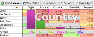
When you open a Pivot View and define two Category columns, Omniscope creates a pivot ( intersection grid of summary values) using the Sum of the number of records in two Category fields by default. You can easily change the Category fields to be displayed on the horizontal (X:) and vertical (Y:) axes using the View Toolbar options. At any time, you can exchange the( X:) and (Y:) axes by clicking on the curved arrow at the corner to the left of the horizontal titles.
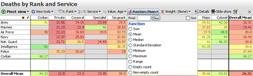
Value: the default value for the cells in the Pivot View is the sum of the records, so each cell will display the number of data points. You can change the value displayed to another field using the Value: drop-down menu. Depending on the type of field you select, a Function: menu will appear, allowing you to chose whether to display the sum, the mean, or some other transformation of the data points in each cell. Note: the Range function displays the difference between the maximum and minimum values in the cell. The example above shows the average age of military casualties by service branch and rank. If you choose a function such as mean, a Weight: menu will appear, allowing you to specify another field to calculate weighted averages of the values in each cell.
You can select one or more cells to perform Moves and Keeps, but only on selections of all cells in one row or column at a time. You can sort the rows and the columns simultaneously; click the row or column header once to sort descending and again to sort ascending. The sorted column and/or row headers will turn orange to indicate sort(s) have been set. Clear your sorts using the [X] button that appears to the left of the switch axes curved arrow when sorts are set.
The Pivot View tools drop-down menu provides some options to change the display.
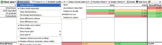
Colour relative to -
None- removes all coloring from cells
According to value field- applies the colouring range specified for the Value field (column) to display in the cells. The colouring range settings (start, middle, end, etc). are those defined for the Value: field in Data > Manage Fields > Configure > Field Options > Change Value colouring. This option will apply the absolute colors for the entire range of values, so applying it to calculated means and medians will not result in enough colour dispersion across the cells.
Relative to all cells- this option applies the colour range specified for the Value: field relative to the range of values appearing in the cells. Use this option to maximise dispersion of colours across reduced value ranges in all cells, typical of means and medians for example.
Relative to row- this option applies the Value: field colour range relative to the values in each row
Relative to column- this option applies the Value: field colour range relative to the values in each column
Colour totals separately- unticking this option changes the colouring scheme to include Overall totals columns values.
Value decimal places- use slider to set the number of decimal places to display fro absolute values
Percentage decimal places- use slider to set number of decimal places displayed for percentage values
Show difference columns- when ticked, displays the differences between adjacent columns in a separate column (see below)
Show difference rows- when ticked, displays the differences between adjacent rows in a separate row
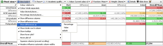
Show totals row - untick this option to hide the totals row that is shown at the bottom of the view.
Show totals column - untick this option to hide the totals column that is shown the right hand side of the view.
Show difference as - ( Percentage; Value; or Both) - allows you to select how the values in difference columns and rows are displayed
Show tooltips - temporary displays of record counts and other underlying cell information on mouse hover can be hidden by unticking this option. Note: Pivot Table tooltips are summaries of the values underlying each cell, not the record-level tooltips configured under Main Toolbar > Settings > Tooltips.
Show hover plot - ( None; Bar; or Pie) - a temporary graphical breakdown of the contents of a cell can be configured, either a Pie or a Bar chart display.
Hover plot of - (field list-Category & Numeric data types) - if a graphical cell hover display is selected, an additional option to specify the value to be plotted appears. In the example below, a Bar chart plotting the field Country has been configured. Hovering on the intersection cell Service:Army & Rank:Corporal, displays a Bar Chart of Countries losing one or more Army Corporals (average age: 24.13 years) plotted as vertical bars in descending order:
Squeeze columns (prevent scrolling) - keeps the column widths set to a distance that permits all columns to be seen/selected without horizontal scrolling of the view. Combined with row and column colouring options, this can convert the Pivot Table into a type of 'heat map' encompassing a large number of cells at a glance.
Headers influence automatic column widths - when ticked, re-sizing one column header re-sizes all of the other column headers to match.
The remaining commands on the View tools drop-down are common to all views and are documented here [31].
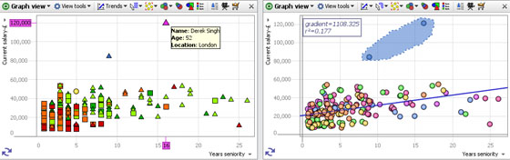
The Graph View (or scatter plot) is ideal for finding and illustrating relationships in the data. In addition to plotting two selected fields (columns) on the familiar orthogonal Cartesian axes, X (horizontal) and Y (vertical), you can colour, size and shape the markers to represent multiple dimensions in the data set. Markers can be clustered to group data points for large data sets, or displaced slightly to make coincident points distinct and selectable. Powerful statistical analysis is available, and various selection and display modes can be chosen to suit any combination of fields plotted.
Axis Selectors (X and Y)- use these pick list menus on the left side and bottom of the window to choose appropriate fields (columns) to plot on the X and Y axes. Only numeric, date and category fields will be present in the pick list. Text fields cannot be plotted unless the values are converted to categories and ideally given a meaningful sort order using Data > Manage Fields. Use the Sort option to sort the available fields alphabetically and the Find/Clear tool to select from long field lists. Note: hiding fields (columns) from the axis selector lists is not currently supported.
Switch Axes- the double arrow at the lower left of the plot exchanges the X and Y fieldsThe Graph View Toolbar features a View Tools drop-down menu, plus Trends, Mode, Zoom, Colour, Size and Shape options:
Each of these Graph View Toolbar elements is discussed below
The Graph View > View Tools drop-down menu includes various options for changing the display:
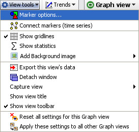 | Marker options- see discussion of sub-menu below Add background image-click to browse to an image to set as a faded background for the graph. Does not obscure gridlines. Useful for putting logos and branding into the display. The same option is available in the Pie, Bar and Details View and is fully documented here. [33] |
The other Graph View > View Tools commands are common to all views and fully documented here. [31]
Marker Options- click to launch the Marker options sub-menu, which has both Simple and Advanced display modes:
Marker Options: Heat Map, Clustered or Displaced- tick one to select from 3 different ways of displaying plotted points in each Graph View:
 | Heat Map- shows density plot of records on the grid. Useful for plotting very large numbers of records that overlap a great deal. |
Displacement- changes the amount of displacement vertically and horizontally to improve access to data points for selection and linking.
Size slider- changes the absolute scale for marker sizing to increase or decrease all marker sizes
Range slider- (greyed-out unless the Size option is set to a field) changes the magnitude of relative sizing (see Size below)
Shape by: selects the field (column) whose values will determine the shapes plotted (same as Shape: toolbar pick list below) with additional options to specify the display of markers of records which are null (blank, not zero) in the selected Shape by field. In Simple mode, the Default shape to use when no Shape-by field has been chosen can be set.
Default colour- selects the default colour of markers when no other colouring options are set.
Outline colour by: adds an outline of another colour, based on another filed. For example, if Sex is used, this command would put a blue outline on the dots representing males and a pink outline on the dots representing females- assuming that you have assigned the those colours to the values 'Male' and Female'.
Hover plot- sets a pop-up display of either a pie or a bar chart whenever the user hovers on a marker, clustered or not. When set, you can select the field (column) to be charted using the pick list at right, which is otherwise greyed-out.
Marker link- selects a link to display when markers are clicked (one record only). Pick either (None), Details, or one of the links already configured in the file using the Settings > Links wizard accessed from the Main Toolbar.
Connect Markers (time series)- clicking this option expands the View Tools menu to display additional options used to configure connected series, usually time series. In order to display one or more time series curves, the data set should contain at least one field (column) for a date, and one or more columns for values that make up the time series. To display multiple curves in one graph, there should also be a category field (with relatively few unique values) containing the names of each curve to be drawn.
Note: if your time series data is not in 'vertical' Omniscope layout (with the repeated observations vertical in a column) but instead in a pivoted 'horizontal' table (dates as columns and one row for each curve's values), you can use the Data > De-pivot the data option on the Main Toolbar to change the layout. For more on how to lay out your data for display as time series, see Data Layout-Time Series [35].
Once your data layout is correct, to display the curves, switch the X axis to the date field, and the Y axis to the value you want to graph, then select Connect markers (time series)'. Warning: to see multiple lines, you must use the Show line for each... option and select a Category field that distinguishes the lines you want to separate. The additional time series sub-menu options allow you to show the markers along the curves, change the curve thickness, display the curve names, smooth the curves, etc. For more detail, see Displaying Time Series [36].
The Trends option menu enables you to access powerful statistical analysis of your data set, and to display the most significant relationships.
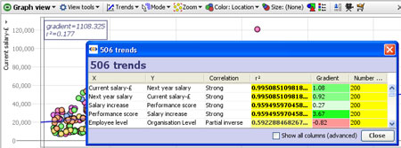
Clicking on this menu reveals two options:
Show line of best fit-plots a blue line of regression 'best fit' through the data points with the R-squared (measure of correlation) and gradient values displayed in the top left corner.
Find trends-analyses and sorts all correlations and other advanced statistics across all columns in the data set. Click to calculate the first 100 best fits between all possible axes. These will show in a pop-up window with R-squared for each axis pairing. Clicking on a pairing in the window will load the corresponding graph into the view. Too see all standard calculations for all potential X/Y axis pairs. tick the Show all columns (advanced) option.
The Mode options menu enables you to choose how to navigate and select points and groups of points on the display. You can define one or more selection areas/shapes in order to exclude or isolate records using Move and Keep power query commands on the Main Toolbar. You can also use the mouse in navigational mode to define and explore specific zones in the display in maximum detail.
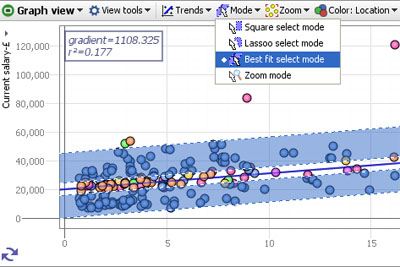
Square select mode- the mouse defines one or more rectangular selection area(s)
Lasso select mode- the mouse defines one or more free-form shaped selection area(s)
Best fit select mode- the mouse defines selection areas along the line of best fit. Useful for selecting data points inside/outside of confidence intervals in distributions.
Zoom mode- a navigational mode, the mouse defines a rectangular zone and the display zooms to show only that area. Holding the right mouse button down in zoom mode and moving the mouse up and down will zoom in and out continuously
Pan mode- (only visible when zoomed in manually) a navigational mode, the mouse 'hand' cursor is used to 'grab' the screen and move it to frame the desired area.
The Zoom options menu provides fine-grained control over the magnification of the display, and they way the display adapts to power queries and Side Bar filtering which change the distribution of the data points being displayed. Unless disabled (see below) when zooming, zoom bars will appear along the vertical and horizontal axes, which can be moved or stretched to display desired area on-screen.
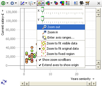
X zoom slider;Y zoom slider; Zoom out/in- used to expand the view along the right/left 'X' or up/down 'Y' axis, or to magnify (zoom in) or de-magnify (zoom out) the display.
The zooming options below are used to define how the display updates, with no manual zooming active
Zoom to fit visible data- display sizes to show only the points still in the target universe
Zoom to fit original data- display sizes to show the range of all the data in the data set
Zoom to fixed region- allows you to define a region of interest with the mouse, to which the display will revert, regardless of the data points in the target universe.
Note: the target universe for a given view is indicated by the colour of the view icon, green means IN universe, gold means BASKET, etc. For more detail, see Data Universes [37].
Show zoom scrollbars- when ticked, zoom scrollbars are visible even if the display is not zoomed, When unticked, the zoom scrollbars only show when zooming is active.
Warning: any manual navigation will take the display out of the default Zoom to fit visible data mode in favour of the Zoom to fixed region. You must manually change the setting in the Zoom menu to restore a default view of all the data in the target universe.
Extend axes to show origin- when ticked, the display is altered to make the 0,0 point where the axes cross visible in the display, regardless of the range of values in the fields (columns)
Enter axis ranges- used to define the range to be displayed numerically, based on the maxima and minima reported for the selected fields
Depending on the size settings for the markers, you may need to 'pad' these ranges up or down somewhat to accommodate the marker sizing and achieve the optimal display.
The Size options pick list menu allows you to select the field used to calculate relative sizing of the markers in the display, regardless of the shape or the default size setting. The extent of the sizing effect is controlled by the Size and Range sliders available on the advanced Marker Options sub-menu.
When
clustering is active, where each marker represents more than one
record, you can choose the measure function (sum, mean, etc.) from the
bottom of the Size drop-down (2.5).
The Colour pick-list menu allows you to select the field to be used to colour the markers. If no colour is specified, a single uniform default colour is used (which can be changed (see above).
You can also use the application-wide Colour button on the main toolbar to enable colouring in all relevant views.
The Shape options pick list allows you to specify which field (if any) you would like to use to determine the shape of the marker to use on the plot. You can also set the Shape-by field in the Marker options sub-menu, as well as specify the treatment of null values in the plots.
If you configure colouring or shaping, the Key button appears, which will open a key showing the values and associated colours/shapes for that field (column).
Note: At any time you can change the colours/shapes assigned to the values in a given field (column) using Data > Manage Fields > Configure > Field Options > Change value order, colours and shapes.
This section guides you through using the Connect markers (time series) options available in an expandable section of the View Tools menu of the Graph View (download the sample file used to illustrate this section here [39]).
Omniscope manages repeated observations of values over time in vertical columns, rather than horizontal rows often used for time series in spreadsheets. To create a multi-line time series as shown below, first put your data in the following 'vertical' orientation:
In the above example of a time series data layout for Omniscope, we have various bonds, each with an ISIN identifier, and each issued by one of various countries (GR, FR etc.). We also have repeated observations of Price and Yield over time entered vertically down the columns. Each record (row) in the data file is therefore a separate observation of price and yield which are repeated over time 'vertically' in separate rows
Time series data layout in Omniscope requires at least one field (column) with a natural order, such as Date, and one or more values columns 'Price', 'Yield', etc. for repeated observations of values that make up the time series. In addition, to display multiple curves on one graph, there should be a Category field (with less than about 200-250 unique values) referencing each curve to be drawn. In this example, we have many observations, but only 9 unique ISINs (individual bonds) so the curves can be plotted by the Category 'ISIN' reference field as shown in the example below. Don't worry about the apparent repetition in the data values, outside of the Table View, Omniscope will render the duplication invisible to you and the users of your files.
If your data is arranged differently from the example above, (e.g. 'horizontally' with the dates as columns and each cell in the row representing an observation over time) you may want to use the the tools available under Data > De-/Re-Pivot on the Main Toolbar to transform your data set to the correct 'vertical' orientation in Omniscope. More on Using De/Re-pivot [40].
Checking your data types: After importing and correcting the layout of your data, go to Data > Manage Fields [34] and make sure the Time (here Date) and Observation (here Price, Yield etc.) fields (columns) have the correct data typing. They must be typed Numeric (decimal or integer), or Dates & Times. Also make sure that any fields you want to use to distinguish lines (here the ISIN Bond Identifier number) are declared of type Category. You can convert data types using the Data > Manage Fields dialog or by by right-clicking the column header in the Table View and choosing Tools > Convert field data type.
Once you are sure that your data layout and field (column) data typing is correct, add a Graph View and configure the axes:
 Add view button on the Main Toolbar
You will see an un-connected scatter plot of markers representing your time series data points. In the View Tools drop-down menu, tick Connect markers (time series). A number of new options should appear on an expandable sub-menu below this command on the View Tools menu.
WARNING: This option will be unavailable if the Graph View has been configured with Displaced (randomly offset) markers. Open the Marker options dialog above on the View Tools menu and confirm that the Displaced option is not ticked.
At this point, the display will change from unconnected scatter to connected plot, but with many heavy black lines in a jumble. The expanded sub-menu includes a number of commands used to manage the display of connected markers:
Time series (connect markers by X axis)- when ticked, automatically uses the field (column) selected for the X horizontal axis( here Date) to provide the traversal order, the order in which the dots are connected. This is the most common setting for time series. When this option is ticked, the Traversal order option below is greyed-out.
Traversal Order (showing an omni-directional path) By unticking Time series (connect markers by X axis), you can choose to draw the lines in a different order than dictated by the X axis. If you are plotting data based on criteria other than time, configure the Traversal order field appropriately.
Show moving average: None; Simple & Exponential- If you have many data points in each time series, you may wish to try showing a moving average, by choosing Simple, Exponential or other data smoothing options on the sub-menu.
Line/curve smoothing- By default, lines are turned into curves while preserving data points. In other words, curves are drawn between the data points. Depending on your data, this may be inappropriate. You can disable this using the Line/curve smoothing sub-menu. Alternatively, a second form of curve smoothing is provided, which does not pass through the data points. Untick Curves pass through vertex points to use this option. Both forms of smoothing can be adjusted for amount of smoothing using the Smoothing amount option.
Line width-By default, lines are shown 2 pixels thick. Use the slider to change this any value between 1 and 25 pixels.
Arrows: Show forward arrow; backward arrow; arrows for each segment; middle of each segment-adds different kinds of directional arrow heads to the line segments displayed
Coloured- By default, if you have multiple lines displayed, these are coloured according to the values in the Category field. You can disable this and show only black lines by deselecting this option.
Show markers- Hides or reveals the markers within the plotted lines (to resize markers, see Marker Options on the View Tools menu
Anti-aliased- Smooths the way the line is displayed
Show labels- By default, text labels will be shown beside each line if you have multiple lines. By de-selecting Show labels, these will only be shown as you move the mouse pointer over a line.
When Connect markers (time series) is enabled and lines are showing, the Line select mode becomes available from the Modes drop-down. Select this mode, and the mouse pointer will change to show that you are in Line select mode. Move the mouse pointer over a line, and it will become highlighted.
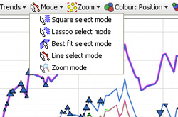
There are two ways to select records in Line select mode:
If you have made too many configuration changes and can't figure out how to get back, you can reset all settings for the current Graph View, returning to a plain default view with no marker connection settings enabled. From the bottom of the View Tools menu, choose Reset all settings for this Graph view.
The Tile View represents each record in the data set as a rectangular tile, which can be grouped, sized, sorted and coloured to display relationships, anomalies and outliers in the data. Tiles can be either image tiles displaying images associated with each record, or solid tiles displaying text and coloured and sized to represent various attributes of each record. The Tile View can be used as an image browser (see Open Image Set [41]), but it is also a powerful 'heatmap' (treemap) for representing data visually along multiple dimensions. Moving the mouse over the tiles reveals the title for the record. By default, clicking on the tile selects the corresponding record. Double-clicking on the tile brings up the details display.
The example below shows two Tile Views displaying the same collection of shoes. The Tile View on top is set to display an associated image set (the shoe pictures) as tile contents. Note the vertical scroll bar on the right, as the pictures have been up-sized from the default so that not all will display in the open view. The second Tile View below is showing the same collection of shoes using solid tiles coloured to match the colour of of each pair of shoes and sized in relation to price:
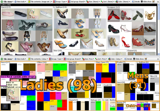
The Tile View is controlled using six configuration options located across the View Toolbar:
Tile Contents: this drop-down menu provides the option to display either data values as solid, text containing tiles, or associated image sets as picture tiles. If you select a data field, the value of that field will display inside the tile representing each record. If you select an image set, it will display the name of the image file on tile select/hover unless you change the ungrouped tile title to the contents of another field (see below).
Group: arranges the tiles into groups by any field. In the example above, the shoes are grouped first by Type: Ladies, Mens and Children's.
2nd Group: within the first grouping, arranges the tiles into sub-groups by the value in the specified field. In the example above, shoes are grouped secondarily by Brand/Designer.
Size: varies the size of each tile in proportion to the value in the specified field. Can be used with both image and solid tiles. In the example above, the solid colour tiles are sized in proportion to Price.
Sort: Sorts the tiles vertically by another field, such as Price.
Colour: determines which field value is used to colour the tile, and can be used with image tiles as a semi-transparent overlay. In the example above, Omniscope recognised and automatically applied the colours to match the all the values in the Shoe Colour field, except for cream, which was set manually. For more on assigning colours to specific values in a given field, see Data > Manage Fields [34].
The Tile View Tools drop-down menu contains several options to change the display and selection behaviour in the view.
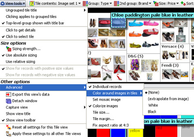
Ungrouped tile title- use this option to specify the value to be displayed on hover/selection instead of the value associated with the tile contents display value. In the example above, the Description text is showing, rather than the file name of the associated image file, which is sometimes not informative.
Clicking applies to grouped tiles- when ticked, this option enables you to select entire groupings, rather than individual tiles.
Top-level group shown with title bar- when ticked, this option displays the field by which the top-level grouping is defined as a nested title as shown in the examples above. When unticked, the title of the primary grouping field is displayed as a large orange text overlay on top of the primary grouped tiles, as shown in the lower Tile View example above.
Click to get details- when ticked, a single left click displays the details window for that record
Click to select tile- when ticked, a single left click selects that record
Sizing strength- this option is used to tune the sizing on a scale of -100% through 0 to +100%. The default is 100%, which means that the sizing calculation uses the default. Lowering the value to 0 eliminates all sizing, and further reducing it to -100% inverts the sizing, so that lower values get larger sizing.
Use absolute sizing- this option calculates the sizing of all tiles based on the entire dataset, and keeps them sized this way regardless of the sub-set of records in the open view.
Use relative sizing- this option re-calculates the sizing of the tiles based only on the records in the open view. Use this setting to accentuate small differences and counter the tendency of increasingly similar records to be sized similarly as the range of interest narrows.
Show for records with positive/negative values- the Tile View can be used either with all positive values being displayed, or all negative values being displayed, but not both. Use two open Tile Views like the example above to show both positive and negative values, or use the Bar View.
Individual records- ticked by default, if the chosen tile contents field is a number or date, unticking this option will aggregate values into ranges and show the tiles for ranges, rather than the individual values per record.
Show image for first token only- if your file has a tokenised image set (multiple images per record), by defaul the Tile View will show only the first image associated with the record. Untick this option to show all the images associated with the record.
Colour around images in tiles- the relationship between the height and width (aspect ratio) of pictures inside image sets is often not uniform, or does not match the shape of the Tile View display. Omniscope creates blank spaces between the pictures to fill the gaps. This option controls the colour of the background fill; none, extrapolate from image (estimated from the colours on the edge of the pictures), black or white.
Set mosaic image- used to create an effect in which a large high-contrast picture is re-created using many smaller images related to records in the data set. Cannot be used with grouping, sizing or sorting enabled.
Colourise images- when ticked, allows semi-transparent colour overlays to cover the entire image tile. When unticked, only the border fill space is colourised according to the values of the files selected in Colour: on the View Toolbar
Tile size- used to over-ride the default tile sizing which tried to ensure that all tiles display in the open Tile View without scrolling. If you increase the tile size, scroll bars will be added to the view as required. Relative or absolute sizing options are not affected.
Use grid layout- only shows when sizing is not active. Changes the allocation of space within groupings to make tile size uniform within each group.
Tile margin- used to increase the amount of background space displayed around the edges of the tiles. Colour around images settings are not affected
Fix aspect ratio at 4:3- used to make image collections appear more uniform and minimise distortion of images with 4:3 aspect ratio.
Right-clicking on a tile brings up a detailed selection menu where you can specify exactly the records you seek, and change the settings for the view.
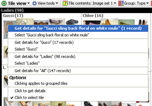
The commands available on the right-click menu under Options are the same as those available in the View Tools menu
The Network View creates a virtual network of interconnecting nodes in your machines' memory to help visualise relationships in your dataset. Each node within a network represents a data subset and lines connecting the nodes indicate the relationships between these subsets. You can use one of many inbuilt layout algorithms to position the nodes within the view, or use your mouse to move the node arrangement around to create a custom layout best suited to your data.
When you first open a new Network View you will be asked to select a network type. The network type determines how the network will be built based on the relationships in your data set. There can be more than one network type used for a given data set using multiple Network Views.
For any given Network View, there are two broad options for specifying the type of network you wish to visualise, Grouped Hierarchies and Relational Networks:
Grouped HierarchiesA grouped hierarchy can be used tovisualise almost any type of data. In a grouped network each node represents a group of records. Once you have selected a grouped hierarchy use the field selector on the Network View toolbar to definethe columns in your data set to be included within the network. Each field (column) chosen will define another 'level' within the hierarchy. At eachlevel, the records will be split by the associated field values. Relational NetworkArelational network can be used to represent any dataset where a commonrelationship exists between the rows. Each row should define a 'key' field and one or more 'linked fields'. The 'key' field should provide a unique identifier for the row entity. For example, for a data set comprised of people, the 'key' field might be the person's name, insurance number or other identifier unique to thatparticular person. The 'linked' fields create the linkage(s) to another entity, defining the key value for the linked entity, thereby allowing the network to determine which entities are connected. |  |
Like the View Toolbar displayed in other views, the Network View Toolbar contains a View Selector, Data Subset Selector and the Aggregate options drop-down menu that function in the same way as they do in other views. The View Tools drop-down contains first the commands specific to the Network View, and then the commands common to all views.
To the right of View Tools drop-down are the options menus specific to the Network View; Appearance options, Node options, Selection Mode options, Zoom options, Fields selector, Layout options, Navigator pop-up and Node Labelling, Colouring, Outlining and Sizing options. These menus are discussed in the sections below.
The Appearance options dialog [42] is immediately to the right of the View Tools drop-down. This is a large, multi-tabbed dialog that allows you to configure the colour, size and shape of the nodes, lines and labels within the network. There are three tabs; Nodes, Lines and Labels, with many options on each tab.
Nodes [43] - options relating to the shape, size, colour and images used to represent the Nodes in your data
Lines [44] - options relating to the display, thickness, colour, arrows and arrow positioning of the Lines between the Nodes
Labels [45] - options relating to the display of labels, field (column) names, empty values, and the spacing, alignment, fonts and background used
All of the Appearance dialog options on all three tabs are documented here [42]The Node Type options allows you to choose how nodes in the network will be portrayed. The Network View currently provides two node shape options: markers for which a range of shapes can be selected, and square/rectangular boxes.
| Marker - a marker consists of an arbitrary shape and a label shown adjacent to the marker. The marker option is particularly useful when visualising networks with a large number of nodes. |
This menu provides users the option to control the behavior of the mouse when navigating and filtering the network. The mouse mode options in the Network View are the same as those used in other views, such as the Graph and Map Views.
 | Square selection - allows you to select and move node. To select one or more nodes hold down the left mouse button and drag the mouse across the view panel. A rectangular shape is created as a result of dragging the mouse. All of the nodes that are enclosed within the rectangular shape are included in the selection. To move a node simply move the mouse over the top of the node, hold down the left mouse button and drag the node to the desired location. You can move several nodes at once by selecting the nodes then moving any node from the selection. Lasso selection - lasso selection is used in the same way as the square selection; the difference is that a flexible lasso shape is used to manage the selection instead of a rectangle. With a lasso you can move the mouse to create a free-form shape, thereby allowing for more complex selections of one or more free-form areas. Pan - The pan mode allows you to navigate the network by moving the screen to frame the desired area. Once you select the pan mode a 'hand' icon will appear. Hold down the left mouse button and drag the mouse to move the window in the corresponding direction. Whilst using the pan mode you can use the mouse wheel to zoom in and out of the network. Zoom - The zoom mode allows you to zoom in or zoom out of the current network. To zoom to a specific area hold down the left mouse button and drag the mouse to create a rectangle highlighting the area to zoom to. To zoom in or out of the map hold down the right mouse button and drag the mouse up (to zoom in) or down (to zoom out). |
Zoom options in the Network View are very similar to those provided in the Graph and Map Views. The slider and the zoom buttons allow you to increase or decrease the magnification level. The following additional controls are provided:
 | Zoom out fully - Zooms the graph out to the full extent. This menu item is highlighted whenever the network is zoomed out fully. Zoom to custom region - Changes the interaction mode to the 'Zoom' mode. This menu item is highlighted whenever the network is zoomed to a custom magnification. Reload and zoom out fully - Reloads the entire graph, applies the current layout algorithm and zooms out to the full extent. Show zoom scrollbars - Indicates whether the zoom scrollbars are displayed. The zoom scrollbars are shown to the right and at the bottom of the view. They allow you to both zoom and pan the view window. |
The Fields chooser allows you to define which fileds (columns) are displayed or hidden, and functions just as it does in most other Omniscope Views
Specifying Layout Options allows you to apply a pre-defined layout algorithm to the current network. The position of the Nodes within the network is determined according to the parameters of the chosen layout algorithm. The Network View currently provides seven layout algorithms:
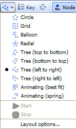 | For examples of each, see Layout Examples
|
Under the Layout selection drop-down is a link to the Layout options dialog, which allows you to modify the behaviour of the various layout algorithms.
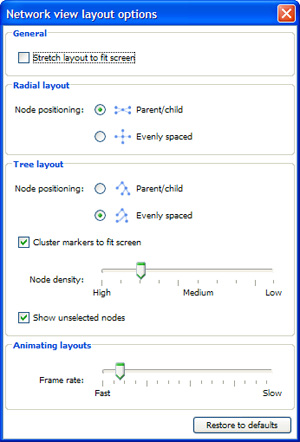 | General: Stretch layout to fit screen - If this optionis checked all of the nodes in the layout will be stretched out so thatthe maximum amount of screen space is used. Stretching is done bydefault in some layouts (Tree, Grid), and this preference will have noeffect if one of these layouts is in use. A good example of the effectchanging this preference can have is to create a network and select the'Circle' layout. Now select 'Stretch layout to fit screen'. You shouldsee the circle of nodes stretch out to form an ellipse. Radial layout: Node positioning - defines how the node position is determined when the radial layout is in use:
Cluster markers to fit screen - when checked, nodes too close together are 'clustered' tocreate a single node. Clustering can only be applied if the network ishierarchical, i.e. it has a root node, and the root has zero or more childnodes that in turn have zero or more child nodes...with each node having asingle parent node. Node density - determines how close nodes have to be to each other before they areclustered. If the density is set to 'High' then the space between eachnode is reduced, therefore allowing for a high number of nodes. If thedensity is set to 'Low' then the space between each node is increased,equating to a small number of nodes. Show unselected nodes - determines whether nodes which have not been selected are shown. Animating layouts: Frame rate -The Network View currently provides two animated layouts:Spring and Best fit. Use this slider to determine how fast thelayouts run. If your network is large and complex, setting a fast speedcould have a detrimental effect on performance. |
Click on the 'Navigator' button to open a small network navigation window. The navigator window will be docked on the right hand side of the view however it can be dragged and placed anywhere on screen.
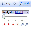 | Zoom slider - Moving the zoom slider or clicking on the Zoom In or Zoom out buttons allows you to increase or decrease the magnification. Navigation arrows - Clicking on the red navigation buttons allow you to shift the view in the corresponding direction Zoom magnifiers - |
Network View Toolbar - Node label
The Node Label drop-down allows you to determine how the label attached to each node is constructed.
The dropdown provides three types of measure:
|
Network View Toolbar - Node colour
The Node Colour drop-down menu allows you to specify the measure used to determine how Node colouring is calculated.
There are currently three types of measure:
|
Network View Toolbar - Node outline
The node outline drop-down menu allows you to specify the measure used to determine how the node outline is calculated. The Node outline option can be used in exactly the same way as the Node colour menu. You might find it easier to identify the node colour outline by increasing the outline thickness. You can modify the outline thickness using the Node options dialog.
The node size drop-down menu allows you to specify the measure used to determine the size of a node in relation to the other nodes on screen.
There are currently three types of measure:
|
The Network View Appearance options dialog has three tabs; Nodes, Lines and Labels
The Nodes tab contains options to configure almost all aspects of how Nodes are displayed, including display of images to represent Nodes.
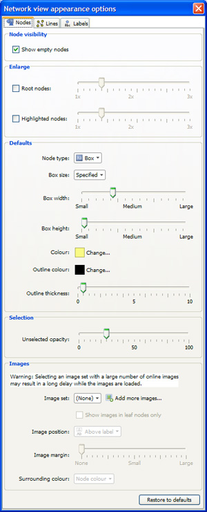 | Node Visibility: untick box to hide empty nodes in the display Enlarge: set the enlargement scales for both Root Nodes and Highlighted Nodes Defaults: Node type - choose either round 'Marker' or square 'Box' Marker options: (only shown when Node Type is set to 'Marker)
Colour - select the node background colour. Selection: Unselected opacityWhen you make a Selection within the Network View all of the selected Nodes appear blue whilst the unselected Nodes appear slightly faded.The unselected opacity slider allows you to define the fading level forunselected Node. A value of '0' means the nodes don't fade at allwhilst a value of '100' means the Node disappears when de-selected. Image set - Allows you to define an image set and display images from that set in the corresponding nodes on the network.
|
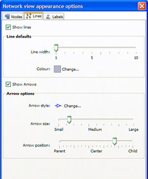 | Show lines -
|
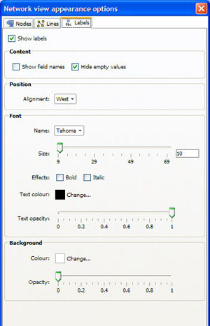 | Show labels -
|
The Portal View summarises most aspects of the data set (it can search but does not display text fields) as either field (column) value breakdowns (left example below), or statistics (right example below), or a mix of both. The optional search box works like a search engine across the entire data set, and the dynamically-generated range breakdowns can be selected for use in power queries using the Move, Keep and Reset commands.
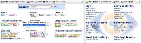
The Portal View features a global Search Box used to select text string values from anywhere in the data set. This is equivalent to the 'Search all' filter device available on the Side Bars. Selection is done by typing into the keyword box (hits are shown in the preview counter on the far right as each character is typed. Multiple words can be entered and the 'and/or' relationship set using the 'ALL' and 'ANY' buttons to the right of the text search box ('ALL' is the default). Note: there is not currently an 'EXACT' option for use with numbers, etc.
The Search Box can be used in conjunction with the individual fields in the Portal View by entering text in the Search Box and selecting one or more value ranges within the view. The keyword 'hits' will be displayed in the Search Box while the overall number of hits (text and other values) will be shown by the blue preview bar inside the green barometer on the Main Toolbar. Note: the blue preview bar is only visible when selections are made. Any combination of text string input and multiple field range criteria can be selected and used to execute power queries using the Move and Keep commands on the Main Toolbar. The Search Box can also be used very effectively in conjunction with other views, such as the Table or Details Views set to display the SELECTION universe.
Field Settings menu- each numeric, date or category field displayed has a small black downward pointing arrow that reveals a Portal View filed display configuration menu with 3 options:
Show value breakdown- displays selectable dynamic ranges of the values in the field. Each field displays up to five categories, ranges, or intervals as a default. Additional categories are grouped into a category named ‘Other’. Numerical fields are broken into intervals necessary to make five groups of records. The fields containing collapsed categories are underlined. Click on any underlined field title to expand that field and see all categories or smaller numerical intervals. Click again to collapse it again.
Expand- expands the number of ranges displayed. If Show value breakdown is not selected, this option is greyed-out.
Show statistics- displays a pick list of statistics available for each field (column). Tick those you want to display, with or without the value ranges:
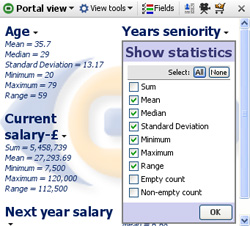
The Portal View tools drop-down menu features a number of options to configure the display. The Fields menu adjacent displays a pick and ordering list used to hide or show fields. Click and drag on the hands to change the order of the fields in the view.
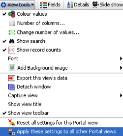 | Colour values- when ticked (the default), colours the values in line with other view colouring. Untick to remove colouring. Number of columns- changes the number of columns in which the field ranges are displayed. The default is two columns. Change number of values- changes how many categories or numerical ranges or intervals are shown under each field title when collapsed. The default is five categories/ranges (intervals) as shown above. Show search- shows or hides the global Search Box Show record counts- shows or hides the number of records per category or interval in each field. The default is to show the counts. Font- allows you to select font name, face and size (not colour). |
Add background image- enables you to add a faded image to the backdrop of the view. Same as the option provided in other views and documented in the Page Menu [46]commands.
The other options on the Portal View Toolbar, Show Details, Slide show and Add to Basket are common to all views and documented in the section on View Toolbar. [31]
The Map View is a powerful and flexible option for displaying spatial data at any level; world, country, city or even exhibition or office floor plans or sports playing fields. Omniscope embeds its own multi-layer vector maps that let you choose to display various geographic map layers (roads, mountains, sea depths, etc.). Omniscope comes with the world map shown below, but you can also download hundreds of other free country, regional and city maps from the Maps Library [47] for embedding in your Omniscope files.
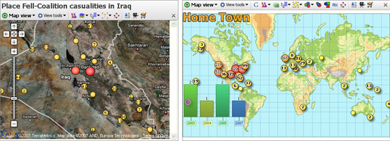
Using any activated edition of Omniscope, use the File > Open map > Download maps option to install and display new maps with blank data sets, which you can either ignore or start populating with your data. To load a scanned image or photograph for use as a backdrop, use the File > Open map > Browse for image or map file command.
Note: Omniscope currently imports Image (.JPG, .BMP, .GIF, .PNG depending on your Java version) plus Visokio's own .VEC, .MAP and .ILF file formats for use as coordinate backdrops in the Map View. If you save an .IOK file containing embedded image map(s), Omniscope will bundle them into the .IOK file so that anyone with the free Viewer will see the file with the correct map(s).
Each record (row) in your data sets can be associated with a marker displayed on the map, as long as the two designated map coordinate columns contain non-null, valid decimal coordinates. Using Place marker mode, you can add coordinates to your data set by opening a map view (or Google Maps), zooming in to show enough detail, then pointing at the location of each record with your mouse. More on Placing Markers [48]...
Details for each record are available by clicking on the marker representing the record or aggregated group of records. Note: if the Details view is not open, groups of four records or less will be displayed as a cascade of individual details windows, one per record, while markers aggregating five or more records will display the pop-up Show details table window showing the selected records with links to display individual details.
The Map View Toolbar includes the View Tools drop-down menu, an option to switch back and forth between vector and Google maps, a Map (Map Type for Google) selector, a Layer pick list, choice of mouse Mode and Zoom navigational controls, plus field (column) pick lists to set Colour, Sizing, Shape and Label options.
The Map View also features a pop-up Navigator overview mini-window, plus the Show Details, Slide Show, Add to Basket and [X] Close View options common to all views and documented here. [31]
Switch to Google/Vector Maps- to the right of the View Tools drop-down menu this option allows you to switch from the default vector map to a Google Map view which uses the same coordinate columns. When you are using Google Maps, this option label changes to Switch to Vector Map.
Suggestion: Placing, moving and correcting coordinates using the mouse in Place Marker Mode using Google Maps works well. However, if you are manually editing, deleting or cutting and pasting coordinate data with an open Google Maps display, make sure that the Zoom setting is NOT Zoom to fit visible data. If you are scrubbing and filtering data and find your Google Map display updating slowly or not displaying properly, switching to the corresponding vector map, then switching back will usually restore the display in Google Maps.
A tutorial on navigating in the Map View is available here. [49]
The Map selector is used to change the map in the view, or add a new vector map to the file. The drop-down menu shows the list of maps already configured in the file, with the currently displaying map ticked. Below that is the option to add another map from those already downloaded onto your machine, or by downloading additional maps from the Maps Library [47]. If you select to add a new, unconfigured map to the file, the Configure Map wizard will appear (see above) so that you can define a title and specify the coordinate fields (columns) to be used with the new map.
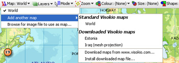
There is also an option to import your own map as an image in formats supported by your version of Java, plus Visokio Map formats (.VEC,.MAP,.ILF). Click on Browse for image file to use as a map, then browse to and select any image you choose. It will appear in the Map selector drop-down map listing menu as part of your growing collection. You can use any kind of photograph or scanned image as a Map View backdrop for placing data points. Typical examples include sporting fields, exhibition hall, office or factory floor plan layouts, banquet seating arrangements etc.
When displaying a Google Maps as a backdrop, the Map selector becomes Map Type, and allows you to chose from 3 options for the Google Map display: Map, Satellite and Hybrid:
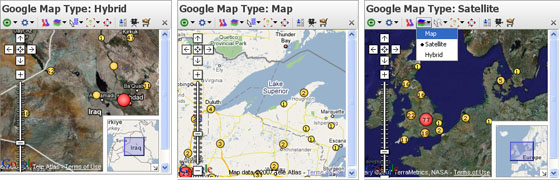
Choose one or more Google Map types that best suits the purpose of each display.
The default map is a Mercator projection world map with physical and political information in a series of configurable layers. With the default world map open, click ‘Layers’ to choose what to display. Click 'Physical' to hide or show physical altitudes and reveal the 'Political' layer. Tick or untick layers until you have the map you want.
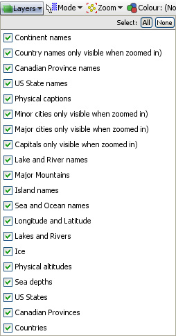
Note: some layers, such as capital, major and minor cities, will not be visible when zoomed out. Omniscope shows map detail progressively, only when the view is close enough to make sense of it. As you zoom in, more and more detail will appear, revealing the layers you have chosen.
If you would like to develop your own layers for distribution in .IOK files for display on vector or Google Maps, please contact us.. [50]
Map View selection Mode options are very similar to those used in the Graph View [51], including mouse-defined Square select and Lasso free-form selection as well as Zooming, and Panning navigational modes.
The Mode options menu enables you to choose how to navigate and select points and groups of points on the display. You can define one or more selection areas/shapes in order to exclude or isolate records using Move and Keep power query commands on the Main Toolbar. You can also use the mouse in navigational mode to define and explore specific zones in the display in maximum detail.
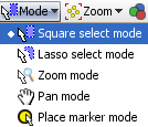 | Square select mode- the mouse defines one or more rectangular selection area(s) Lasso select mode- (not available in Google Maps) the mouse defines one or more free-form shaped selection area(s) Zoom mode- a navigational mode, the mouse defines a rectangular zone and the display zooms to show only that area. Holding the right mouse button down in zoom mode and moving the mouse up and down will zoom in and out continuously Pan mode- (only visible when zoomed in manually) a navigational mode, the mouse 'hand' cursor is used to 'grab' the screen and move it to frame the desired area. |
Place Marker mode- used to place markers for selected records, thereby generating values for the coordinate fields in the data. To do this, open a Table View and select a record with no coordinates/map marker by clicking the row header (or multiple records using the Shift or CTRL keys). Once selected. go to the open Map View, and with Mode set to Place marker mode, click on the point you want to locate the selected records on the map. In the case of the Visokio and Google world maps, the correct decimal longitude and latitude values will be placed in the coordinates columns. In the case of other maps, the coordinates will be relative to the specific map. For more detail, see Placing Markers [48].
The Map View Toolbar Zoom selector is also very similar to that used in the Graph View. The slider and Zoom out or Zoom in controls increase or reduce the magnification, changing the area and amount of detail/layers displayed.
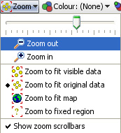 | Zoom to fit:
|
Show zoom scroll bars- when ticked, displays the zoom scroll bars bottom and sides at all times, even when zooming is not active.
Marker Colour, Size and Shape options are all defined with field pick lists available under each of these Toolbar options. If any of these options (or the Marker outline colour by option available in Marker options-see above) are set, the Key display also appears to help the reader relate the appearance of each marker to the underlying data.
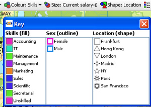
NOTE: You set the colour and shape associated with each different field (column) values using Data > Manage Fields available from the Main Toolbar. The intensity of the relative sizing effect is controlled with the Size and Range sliders in the Marker options Advanced menu (see above).
The Label drop-down selector enables you to choose the field to display next to all unaggregated markers. Aggregated markers show the label (mixed) until zooming or selection results in disaggregation to a single record.
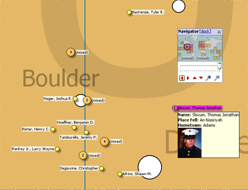
Labelling is displayed for all unaggregated records. Selecting a record can also trigger the display of Tooltips, which cam include associated images. Tooltips are configured for all views using Settings > Tooltips > Fields from the Main Toolbar.
Click the ‘Navigator’ button to show a small map navigation and view control window that can be placed anywhere on screen. Moving the zooming slider, or clicking the (+) Zoom in, or (-) Zoom out icons increases or decreases the magnification, which reduces or increases the coverage area shown in the thumbnail map framing window. Clicking the red vertical and horizontal arrows in the Navigator moves the small framing window around the thumbnail map. The thumbnail map in the Navigator shows a heat map of record density, and selected areas in blue. Click and drag the red thumbnail map framing window in to move around the main map.
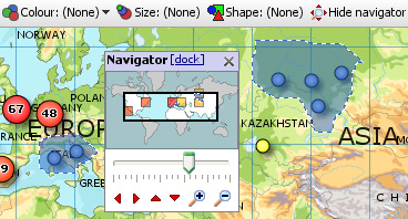
The Map View Tools drop-down menu provides options to define maps and control the display of markers.
Map coordinates and title- displays the Configure Map dialog used to specify the title and coordinate fields (columns) to be used to place records on this particular map. With the correct map displayed in the view, select the fields to use as coordinates.
 | Use existing fields- if your data sets already have columns of decimal coordinates, fully-populated or not. Most Visokio maps, including the default World map, support decimal numeric values available free from Google Earth. |
For more detail on map coordinate systems, and creating/transforming coordinate systems, see the Knowledge Base section on Maps & Coordinates. [52]
Change map projection- (not shown with Google Maps) used to create or refine coordinate systems for maps/backdrops that do not conform to the default Mercator projection decimal latitude and longitude system. This is most commonly the case with scanned images like floor plans, sports fields, some city and road maps, etc.
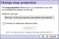 | Override, by setting two reference points- ticking this option launches the Change Map Projection wizard to define or refine the coordinate mapping. The wizard displays the map, with three advanced options to define or re-calibrate the mapping by 1) positioning corner reference points of known location, or 2) distributing the range across the entire map, or 3) using one-to-one mapping of pixels to coordinates (the default). |
For more detail on using these 3 options to determine the display of your data on a given map or image, see the Knowledge Base section on Changing Projections [53].
Extract map image- (not available with Google Maps) allows you to export a copy of the embedded vector map as an image file
Show map title- (not available with Google Maps) when ticked, displays the map title(s) in the upper left the map, in orange font as shown in the examples at the top of the page.
Marker options- clicking launches the Marker options dialog, very similar to that used in the Graph View [51]. This dialog enables you to configure how markers on displayed on the maps/scanned images you are using as backdrops for your data.
 | Heat Map- (not available with Google Maps) shows density plot of records on a grid. Useful for plotting very large numbers of records that overlap a great deal. |
Displacement- (not available with Google Maps) changes the amount of displacement vertically and horizontally to improve access to data points for selection and linking.
Size slider- changes the absolute scale for marker sizing to increase or decrease all marker sizes
Range slider- (greyed-out unless the Size option is set to a field) changes the magnitude of relative sizing (see Size below)
Shape by: (not available with Google Maps) selects the field (column) whose values will determine the shapes plotted (same as Shape: toolbar pick list below) with additional options to specify the display of markers of records which are null (blank, not zero) in the selected Shape by field. In Simple mode, the Default shape to use when no Shape-by field has been chosen can be set.
Default shape/colour- selects the default colour of markers when no other colouring options are set.
Outline colour by: (not available with Google Maps) adds an outline of another colour, based on another field. For example, if 'Sex' is used, this command would put a blue outline on the dots representing Males and a pink outline on the dots representing Females- assuming that you have assigned the those colours to the values 'Male' and Female'.
Hover plot- (not available with Google Maps) sets a pop-up display of either a pie or a bar chart whenever the user hovers on a marker, aggregated or not. When set, you can select the field (column) to be charted using the pick list at right, which is otherwise greyed-out.
Marker link- (not available with Google Maps) selects a link to display when markers are clicked (one record only). Pick (None), Details, or one of the links already configured in the file using the Settings > Links wizard accessed from the Main Toolbar.
Connect markers- (not available with Google Maps) similar to the option available in the Graph View [51], opens and expandable sub-menu. Use of these options with the Map View is documented here. [54]
Colour Effects- (not available with Google Maps) launches an extensive menu of options to modify the display of the map/backdrop:
 | Bleaching- reduces the intensity of the map image, making the markers more distinct.
|
{update to 2.5 on progress}
Omniscope allows you to use embedded vector maps that work offline, or online mapping services, such as Google Maps. Users can change from one zooming map background to the other within the Map View. Omniscope includes a wide selection of freely dowloadable vector maps (world, county or city level) which can be downloaded automatically and added into any file. Coordinate data in your data set is automatically plotted on maps or scanned images, such as floor plans. Markers can also be placed manually and Omniscope will automatically capture the coordinates to your data set. For more information on freely downloadable maps and how to use them, please visit our Maps Library [55].
Omniscope permits you to have multiple map views, using either vector maps (work offline) or Google Maps backdrops (work online only). The example below shows both vector and Google Maps being used to display the same coordinate data, visible in the Table View at the bottom (click image to see larger version in a separate window).
 [56]
[56]
Map Views allow easy zooming, selection and filtering of records (rows) based on location. You can use mouse mode controls and zoom options to manage the display, and then select groups of records on which to perform Move or Keep power queries.
To learn more about navigating, selecting and filtering, see the User Guide section Using the Map View [12], and the KnowledgeBase sections on Maps & Coordinates [57].
You can add embeddable vector maps to your local library and files from the File > Open map command, which is also accessible from the opening desktop Tasks menu. Downloading a map from our Maps Library [55] adds it to your local collection. If you use the map in a file shared with others, and they do not have the map, it will be automatically downloaded for use in the file. It is also possible to embed maps in files if necessary.
 | 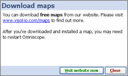 |
You can use any type of scanned image as map- floor plans, sports fields, logistics and supply chain charts, etc. To learn how to calibrate coordinates for display on scanned images rather than map projections, see Changing Projections [58] in the Knowledge Base.
Every map defined in Omniscope requires you to specify two columns to contain the Longitude (X) and Latitude (Y) coordinate values used to plot the records (rows) on the map. There are currently three ways to add geographic decimal coordinate (longitude and latitude) column values to your data for map displays;
1.) Locate your records in Omniscope using the free Visokio world, country and city vector maps- just select each record in the table view and place the markers manually to generate the coordinates in new fields (columns) automatically;
2.) Look up missing coordinates using online sources for finding coordinates such as Google Earth (and often Wikipedia). In Google Earth, look up the missing places, set a placemark, then read off the placemark coordinate values, then type or cut-and-paste the two Longitude and Latitude values into Omniscope columns;
3.) Merge the columns into your Omniscope data automatically using a merge file [59]. To merge in coordinate columns for capital cities or geographic centres of countries, we supply free 'By Countries' [59]merge file containing these columns. We also supply a free 'By Cities' [60]merge file containing coordinates for about 60,000 of the world's largest cities. Free merge files 'By post code' [61]are also available for the UK and the U.S., and a growing number of other countries as well. Other free and licensed reference merge files may be available from data vendors in future.
To learn more, see the User Guide section Using the Map View [12], and the Knowledge Base sections on Maps & Coordinates [57].
Map projections define how the (X,Y) coordinates in your data set are displayed over imported images/maps used in the Map View. Omniscope allows you to calibrate or define coordinate grids on any kind of map, photo or scanned image imported for use as a map. For example, you can use an online mapping service to zoom into a specific area, then take a screenshot and use that image as a map background in your Omniscope file.
The Omniscope Map View [62] Toolbar View Tools menu (or the Configure Map View wizard in DataPlayer View) includes the command Change map projection. If your X,Y coordinate columns in your data set is consistent with the default projection for Omniscope maps (Mercator projections using decimal latitude and longitude coordinates as used by free services such as Google Maps/Earth), you will not need to use this command. However, if you are using a scanned image as a background map, or maps that are not consistent with the Mercator standard projection, you may need to tick the Override, by setting two reference points option.
This dialog allows you to configure and refine how coordinates in the data file will be positioned on your map. There are 3 options:
Option 1. You know the coordinates of specific points on the image - If, for example, you have imported a screenshot image of New York's streets (from Google Maps or other online zooming map service) and you have coordinates in your data set in some form of grid reference (such as latitude and longitude, which on a small scale are linear), and you know the coordinates of reference points, (say, two street intersections) that are diagonally apart (looked up in Google Earth, for example), you would use Change Reference Point Coordinates 1 and 2 to ensure points in your data set will plot in the correct location. Drag the two reference points on your image to where each of your reference crossroads are located, then click the Change Reference Point buttons to enter the correct coordinate locations for each crossroad.
Option 2. You want the points distributed across the image- for example, you might have a data file of events during a game on a soccer pitch, and have imported a picture of the pitch to use as a map. You place corner events in two opposite corners of the pitch image. The coordinate system in your data file could be arbitrary, but assuming events happened across the entire pitch, you would click Distribute data points across map and the application would work out the transformation so as to "normalise" the points correctly.
Option 3. You want the data points to map to the pixels in the image (default). To revert to the default setting, where data coordinates correspond to pixel positions in the image, click 1:1 (pixel coordinates).
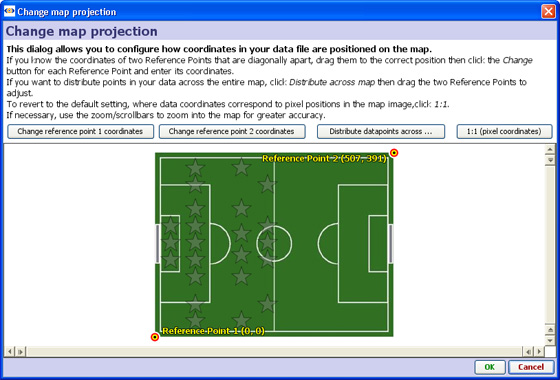
This section demonstrates how to use the Connect Markers option in the Map View to draw a path around the map. You can download this example file showing a holiday around the world here. [63] The various display commands on the expanded sub-menu are documented below.
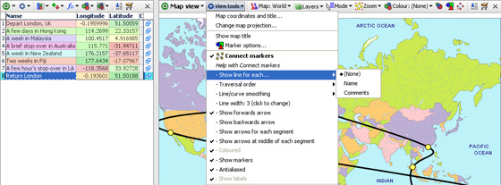
Start Omniscope and select File > Open map, then choose World. A new empty file will be created and opened, showing the Map View and the installed World Map, ready for adding markers.
From the Map View View Tools menu choose Connect Markers. Since you don't have any markers yet, you won't see any change.
From the Mode drop-down in the Map view, choose Place marker mode. The mouse pointer will change to a cross-hair when over the map. Move to the first location in the trip (for example, London in the UK), and click the left mouse button. The Add record dialog will appear. Type in a summary of this location, and press Enter or click OK. For example, 'Depart London, UK'. Move the mouse pointer to 'hover' over this marker. You'll see a Tooltip appear with the text you have entered.
Now click the Map View Navigator button to show the Map Navigator, and use the controls to zoom in and pan around until you can see the next location accurately. Click to add another marker, and enter the description. For example, zoom into Hong Kong and add a marker with the text 'A few days in Hong Kong'.
You'll see a black line joining the marker from the previous point. Carry on zooming into cities and adding markers and text until you've finished the path around the map. You can add more information by adding fields (columns) using Data > Manage Fields [34] to add fields (columns), and then entering data into your new fields from the Table View [64], which you can open using Add View.
Click the Map View Mode drop-down again and change to Zoom mode to avoid accidentally placing markers. Open the Mode drop-down again and click Zoom to fit map. You'll see the entire trip with a black line joining the markers. Hover the mouse pointer over a marker and you'll see the text for that point. If you don't like the "line/curve smoothing", you can adjust or turn this off from within the View Tools menu.
Traversal Order (showing an omni-directional path) By unticking Time series (connect markers by X axis), you can choose to draw the lines in a different order than dictated by the X axis. If you are plotting data based on criteria other than time, configure the Traversal order field appropriately.
Show moving average: None; Simple & Exponential- If you have many data points in each time series, you may wish to try showing a moving average, by choosing Simple, Exponential or other data smoothing options on the sub-menu.
Line/curve smoothing- By default, lines are turned into curves while preserving data points. In other words, curves are drawn between the data points. Depending on your data, this may be inappropriate. You can disable this using the Line/curve smoothing sub-menu. Alternatively, a second form of curve smoothing is provided, which does not pass through the data points. Untick Curves pass through vertex points to use this option. Both forms of smoothing can be adjusted for amount of smoothing using the Smoothing amount option.
Line width-By default, lines are shown 2 pixels thick. Use the slider to change this any value between 1 and 25 pixels.
Arrows: Show forward arrow; backward arrow; arrows for each segment; middle of each segment-adds different kinds of directional arrow heads to the line segments displayed
Coloured- By default, if you have multiple lines displayed, these are coloured according to the values in the Category field. You can disable this and show only black lines by deselecting this option.
Show markers- Hides or reveals the markers within the plotted lines (to resize markers, see Marker Options on the View Tools menu
Anti-aliased- Smooths the way the line is displayed
Show labels- By default, text labels will be shown beside each line if you have multiple lines. By de-selecting Show labels, these will only be shown as you move the mouse pointer over a line.
The section on Time Series [36] also covers advanced options for the Time Series > Connect Markers functions, most of which are the same in the Map View.
All Visokio applications come with embedded world maps (Mercator projection) and will plot records (rows) according to decimal latitude and longitude coordinates contained in two selected fields (columns) of your data sets. If your data does not yet contain map coordinates, you may be able to add them automatically using a Merge File, or you can populate the fields manually using Visokio maps and the Place Marker process [48].
This brief tutorial explains how to:
|
|
Opening MapsChoose File > Open map and choose any map from the list to create a new, empty .IOK file showing only the chosen map. You can add maps to your list from the Maps Library [47]. |
Zooming inInitially, the Map View opens in Zoom Mode,indicated by the magnifying glass mouse cursor. In Zoom Mode, you can click and drag the mouse to zoom in and out on selected areas of the map. To zoom in, click on a central point of interest, or click and drag (press and hold a mouse button while moving the mouse) to draw a rectangular 'zoom' box over an area. To zoom out, right-click anywhere on the map and use the slider or the (-) Zoom out |
| Viewing layersOmniscope maps have many layers that can be either hidden or shown. Layers contain feature-specific detail available on the maps, such as 'Capitals' or 'waterways'. Note: some of the details in some layers are only visible |
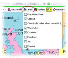 | Managing layers Tick or untick the boxes next to any layers you wish to display or hide. For example, at left we've removed the physical layer (which includes relief shading). The result is to display the map coloured by political boundaries rather than topology. |
| Using the Map NavigatorClicking on the Map Navigator icon launches a floating tool that speeds focusing on specific areas of the map. The slider and magnifying glass tools manage zooming in and out. You can grab the sides of the mini-frame to move it and change the scope of the display. The four red arrows below move the focus frame in the direction they point. |
| Placing MarkersMissing map coordinates associated with a given record (row) can be added/changed manually. On the View Toolbar, click on the
|
Use | |
| Selecting RecordsClick on the |
| Viewing DetailsSelect an area on the map containing one or more data points. The area will be framed in blue. Click on Clicking on a single marker will display details for just that record |
The Venn View is based on the familiar Venn diagram. This view enables visualisation and filtering on overlaps between up to 5 different named query data sets or subsets, which must first be pre-defined as Named Queries [21]. Notice that the number of records (or other measure specified in Value/Function) not included in any selected set/subset is displayed upper left after the heading 'Outside'. In the HR example below right, the median age of all the staff not included in one of the selected subsets is 42.
Venn View Toolbar View picker, Data Subset selector, Aggregate options drop-down and the show Details all function the same as they do in all the views. View Toolbar options unique to the Venn View include the upper-pane View tools options, the Value: menu to specify the values to be used, and the Sets: menu to specify the existing Named Query data subsets (maximum 5) for which Venn shapes will be displayed.
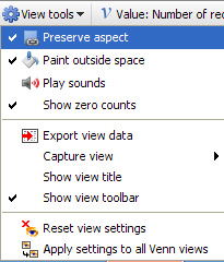 | Venn View > View tools Preserve aspect - (default) locks the shape of each circle to remain a circle. Unticking this option allows the Venn shapes to distort to reflect the intersections. Paint outside space - colours the background outside the Venn shapes, which can improve visual impact especially if there are unselected records being displayed upper left under the heading 'Outside' Play sounds - try it, you might like it Show zero counts - displays set names and intersection counts even if zero.
The rest of the options in the lower panes are common to the View tools menus for all views and are documented here [1]. |
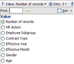 | Venn View > Value: {Function} Use this menu to select the values for which the counts are displayed inside the Venn shape representing each data set/subset. Notice that text columns are not shown. Counts only are available for category values. If you select numeric value, an additional Function menu appears allowing you to specify the calculation applied. (see example of average age above right)
Find: shows subsets of field (column) names to shorten the list Sort: orders the field (column) names to speed selection |
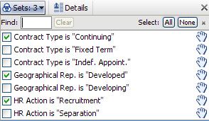 | Venn View > Sets: (number of sets selected) All of the Named Queries which define subsets are available here for selection and display as Venn shapes, up to a limit of 5. Drag the hands at right upwards or downwards to re-order the list. |
The Details View can display all of the information about a record in Omniscope, with very flexible branding, text formatting and image display options. Can also be used as an editing form, allowing data entry and corrections by anyone with basic keyboard skills. Whenever a Details View is open, the Details display for individual records will show in the open view, rather than the pop-up or Side Bar panel details displays.
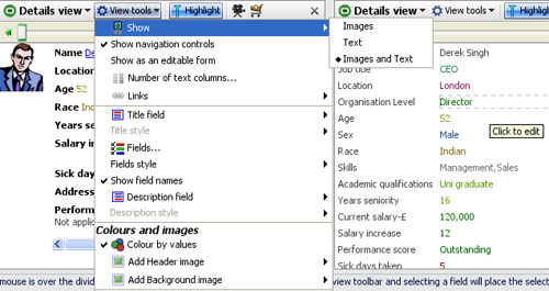
The Details View toolbar contains a View Tools drop-down, a Highlight button (used to turn record highlighting in other views off and on) and the Slideshow, Add to Basket and [X] Close view commands common to other views. For more detail on highlighting and configuring slide shows, see Viewing Details and Highlighting [65].
Warning: If you have global record cycling enabled, and you turn off the Highlighting option, the record cycling will stop. To re-start record cycling, hover your mouse on the barometer to expose the global automatic record cycling menu, and click on the green forward arrow to re-start.
The View Tools drop-down menu contains many flexible options for configuring the Details View display:
Show - defines what to display; images only, text only or both. When there is more than one image set configured, you can select which images to show (they appear horizontally).
Show navigation controls - when ticked, displays a manual record-cycling slider only for the Details View. This is different from the automatic record cycling which affects all views. Drag the slider forwards and back, enter a record number or use the green forward/back arrows. When ticked, the Sync(hronisation) option keeps the record cycling in the that Details View on the same record as the global record-cycling.
Show as an editable form - when ticked, for each record, all fields are displayed in a single column with the values in individual text editing boxes, as shown in the example above right. This mode is used to facilitate data entry and correction using a single, easy-to-understand interface that anyone can use.
Number of text columns - drag the slider to the number of columns you want to use to display the text/field values you wish to show. The default is two columns with coloured values following field names as shown in the example below:
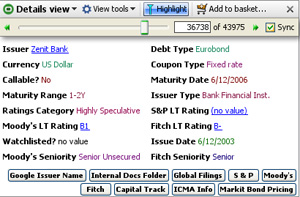
Links - similar to the command used in other views, this displays a pick list is used to assign which values will be underlined and launch associated links from the Details View. In the example directly above, the 'Issuer', 'S&P', 'Moody's' and 'Fitch' field values have been assigned links, and therefore show underlined. In the Details View, at the top the top of the links menu is a Configure links buttons option:
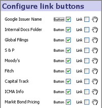 | As shown in the example above, for each link where the 'Button' option is ticked, and action button is displayed in the Details View. Ticking on the 'Link' option adds an underlined link bearing the link name to the bottom of the display, as an alternative to the button. Use the 'hand' drag handles to move Buttons/Links up or down, re-ordering them in the display from left to right as shown above. |
Title Field - selects a field (column) value to display in the upper left-hand corner of the view window. If you display a field as a Title, remember to untick the Title field in the fields pick list (see below) to avoid displaying the values twice.
Title Style - enables you to apply text styling (fonts, font face, colour and alignment) to the Title field display.
Fields - a pick list appears allowing you to tick/untick fields you wish to show/hide; drag the hands up or down to change the order (Note: you will only see these when ‘Text’ or ‘Images and text’ is chosen in the ‘Show’ menu).
Show field names - when ticked (default) displays the field (column) names prior to the values. Untick to suppress the filed names.
Description field - selects a field (column) value to display at the bottom of all other fields. Used to display longer text entries that do not wrap well if displayed in the columns with other, shorter field values. If you display a field as a Description, remember to un-tick the Description field in the fields pick list (see above) to avoid displaying the values twice.
Description style - enables you to apply text styling (fonts, font face, colour and alignment) to the Description field
Colour by values - when ticked, colours category values according to the colours assigned to each value, and numbers/dates by the scale reflecting the range of values (default : low=red to high = green). Text fields are always displayed in black.
Add Header/Background Image - used to include logos and other faded backgrounds in the display.
The other commands on the Details View Tools menu are common to all views and documented under View Tools. [1]
The layout and sizing of the image and text spaces in the Details View is controlled using a divider line which you can find by hovering the mouse over the divider between image and text. When you do this, the frame divider will appear. Click and drag the divider to get the proportion of image to text area you want. Click the frame divider switch button on the right when the divider appears and the orientation will switch between horizontal and vertical.
Suggestion: Omniscope has powerful image re-sizing and management features. Be sure to experiment with allocating more space to the images to optimise the display in the Details View
The Web View is one of the 12 standard views available in Omniscope. It differs for the other views in that it is not intended to depict all of the data in the data set. Instead, it is intended to broaden the reach of the Omniscope file to other related content and services available on the web.
As with other views, you can add a Web View to the display by switching one or more existing views to be Web Views (by clicking the view name and choosing Web View in the View Chooser) or by adding a new Web View to the display using Add view on the Main Toolbar
You can have any number of Web Views open, with each pointing to a different address (URL) on the web:
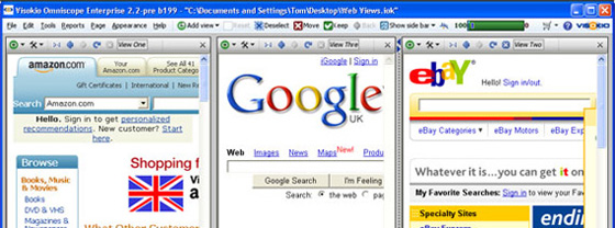
The first time you open the Web View, it will show the Omniscope default static page (the Google homepage). "Static" means this view won't update when you filter or navigate in Omniscope. Omniscope Web Views work just like web browsers. You can enter a different address in the address bar, or follow the links on the page displayed to change the current page. You can resize the windows to be quite small. Omniscope can switch the screen display of the web page to a style intended for small screen devices.
If you save the .IOK file and later re-open it, any static Web Views will re-open showing the same page that was showing when you saved the file. There is no such thing as a "home page" with the Omniscope Web View. Instead, Google is the default page if you've never opened a Web View before, and each Web View will re-open as it was saved.
A dynamic Web View is one that is automatically synchronised with the rest of Omniscope. When you select specific data in another Omniscope view, the Web View will reload to show a relevant page as defined by the selected link. You can't enter a different web address into a dynamic Web View. To change a dynamic Web View back to a static one, change Link or Web service to "(none)" in the View Toolbar.
There are two types of dynamic web view: link-based and web service-based. Both are used for showing web pages containing information about a single record (link-based) or groups of records (web-service based). When you highlight a record in Omniscope, an open link-based Web View will update to show the linked page for the highlighted record. If there is no record selected/highlighted in any Omniscope view, link-based dynamic Web Views will remain blank.
In Omniscope, a highlight is set whenever you select a single record, such as a single row in the Table View. In the example below, selecting the record of a specific casualty in Iraq displays a personal memorial page for that soldier in the link-based Web View:
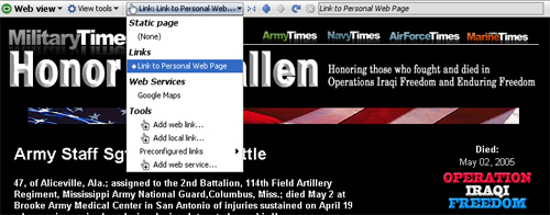
To create a link like this in an Omniscope file, choose Web View> View Toolbar > Link > (Tools)/Add web link. This allows you to define the link and associate that link with that Web View. You can administer all the links in your file from the top-level Settings > Links [66] menu.
It is possible to define much more complex data-driven links. For example, you can use two or more field values as parameters in a link like this one:
http://myIntranetServer/addressBook?firstName=[First Name]&lastName=[Last Name]
where 'First Name, and 'Last Name' are fields in the data set.
Omniscope has a number of preconfigured links built in, which saves you having to figure out the link syntax for common websites offering free web services. See Using Web Services in the Web View [67]
Web views are also used to display the results of dynamic requests for web services. Some free web services, such as YouTube and Google Maps, are already configured. If your file includes a collection of video clip identifiers recognised by YouTube, selecting a clip from your Omniscope 'video jukebox' will play the corresponding clip in a Web View as streamed from YouTube:
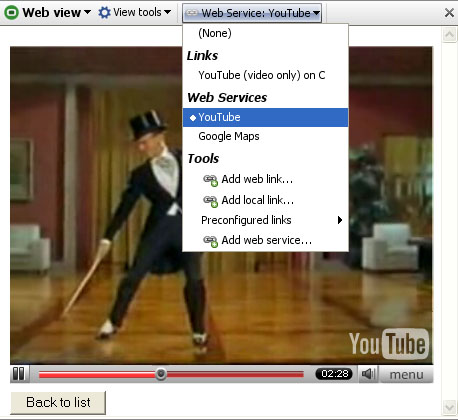
You can also add any custom Web Service to your file. As with Links, you must pre-define custom Web Services configurations using the Main Toolbar Settings > Web Services menu, then use the Web View selector drop down to the right of the View Tools drop-down to link that Web View with the selected web service.
Connections to web services that accept a series of inputs (or a table), rather than a single value/text string, are less easy to implement, since they require a specific web server page implementation. Examples of multi-record Web Services already defined in Omniscope include popular mapping services, such as Google Maps.
Multi-record web services links to Omniscope work by submitting an HTTP POST to the web service page containing a series of record IDs. This is equivalent to submitting a form listing all the record IDs. This functionality allows you to program server pages that accept a list of record IDs in an HTTP POST request and provides any further information associated with those records in HTML, in the HTTP response. You can also configure the maximum number of records in a web service post (the default is 100). This allows you to restrict access to the server page to only moderate requests, especially useful if allowing users to retrieve 50,000 price graphs at a time might be undesirable. At present, you can only configure a single-parameter web service post. If you envision a solution that requires a tabular, multi-field post, please contact us.
We provide a simple example 'echo' page which can be used to test your configuration and to understand the results. This is the default page when adding a Web Service. To see the test echo service, go to Settings > Web Services > Add web service and click OK without making any changes to the defaults.
After adding a web service, depending on how it was configured, you may need to select it in the Web View using the Link > Web Service selector to the right of the View Tools drop-down.
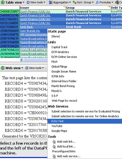
Web Views pointing at Web Services rather than links will show all records currently included by your filters. If you then make a data selection in another view (such as the Pie View), the Web View will show only the selected records. When you clear your selection, the Web View will return to showing all the records included by your filters.
To use the Echo test, first filter down to, or select, no more than 100 records using Side Bar filters and/or using Select, Move & Keep power query sequences in other views. Once the selected number of records falls below the threshold, Omniscope creates a form submission with form keys "RECORD0", "RECORD1", "RECORD2" (etc.) and posts the form values to the configured server for the selected Web Service. You will normally see the results of the POST returned in the Web View.
The Web View, like other views, is configurable using Report Pages. You can, for example, create a Report Page with 3 Web Views, and another Report Page with just a Table View and one Web View, then switch between the two. Omniscope supports opening any number of views and managing the positioning of these views through flipping individual panes using the 'flip' icon command on the view divider.
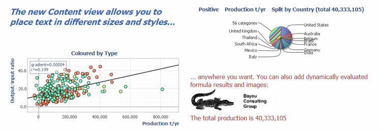
Like other View Toolbars, the left-most part of the Content View Toolbar contains the View and Data Subset selectors, and the Aggregate options drop-down. The View Tools drop-down begins with commands unique to this view, followed by commands common to all views.
To the right of the View Tools menu are the Format and Edit options drop-downs specific to the Contetn View. Use of these is discussed in the sections below.
| Insert - Click to enter Edit mode, which reveals the Insert drop-down containing options to insert a wide variety of content inside the view display using the wizards to assist you Commit - Once you have completed inserting content, click to make your changes persistent in the file. You can still change the formatting of the content you have inserted. Cancel - Reverts the content to the last committed state.
|
Edit Annotation [68]
Web and File Link [69]
Formula [70]
Aggregate [71]
Subset: Filtered data [72]Aggregate [71]
Subset: Filtered data [72]
Content is available from Add view on the toolbar menu.
To see how to edit /change the font/ insert image .... to the Edit box please click on this link: Text Editor [73].
 | The user can link any web page or file into the Content window. |
Here is an example of how a user can create a link :
| Select a link (Link to tab for example) a pop up with all tab’s name will appear on the screen:
The user can select any tab wanted ( DataManager), then press OK to validate. A new pop up will appear asking to enter the text that you want to display. Omniscope keep the name set by default. The user can at any time click on it, and change the name of the link. After pressing OK, the link will appears in the content window, you will have to click on the link to be redirected to the Tab. Same Principal if you want to create a link for: Web page, files, or create a command list.
Back to the Top [74]
|
 | The user is able to insert a formula in the content view by clicking The user can set value by selecting: Function /Variable /Record Count /All Record Count / Formula The user can also display the value as Plain text / Styled text or with Indicator
Back to the Top [74] |
Tools gives also the possibility to the user to Create:
-Header/ Footer …
-Modify the edge
-To export the data-Save a copy into the clipboard
The user can reset all modification at any time by selecting: Reset view setting’s option.
The user can apply the setting created to all Content views created in any tab by
selecting: Apply to all Content view’s option.
Back to the Top [74]
(Tools menu's option) | 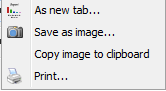
(capture view's option) |  (Toolbars and style's Option) |
The user can aggregate any data when selecting the option Aggregate.
Back to the Top [74]
The user can aggregate any data when selecting the option Filtered Data.
Back to the Top [74]
Dial View allows you to create three different kinds of interactive dashboards. Provides familiar representation of relative magnitude of values drived from specific columns in the data set. This makes it easier for end users to view the results at a glance. Dial view itself is highly customisable. For example, you can specify the maximum/minimum range, create coloured zones etc.
Please note that dial alerts, range and zones settings are set for each individual value field. For example, if you set your dial alerts, ranges and zones and then switch your value field to something different than your settings will disappear. However, when you change your value field back to a field that previously had alerts, range or zones set, then the Dial view will restore them.
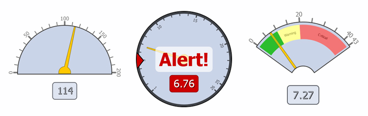
Dial View toolbar has generic options just like other views such as View changer, Subset, Aggregate and the View tools.
Dial View toolbar also contains options and settings which are specific to the view itself. These are described below.
The view tools is available in all other views and contains general options which are available in other views, but also options specific to Dial View.
|
| Margin: The slider allows you to adjust the space between the a particular dial and the view edges. This can allow you to make the dial smaller without having to adjust the dividers between the view. Show label: Ticking this option shows the quantity value based on the Value field. Show percentages: Ticking this option allows you to show the dial range in terms of percentages. Animated alert: This option only takes effect, if alert has been set, and the alert the condition has been met. When this option is ticked the alert text on the dial will flash. Dial background: Allows you to specify the background colour of the dial. Please note that this option doesn't change the view background, but only of the dial itself. Paint dial background gradient: If this option is ticked, then the dial background is painted with a gradient. Gradient is painted using the dial background colour. Needle colour: Allows you to specify the colour of the needle. The rest of the options are standard throughout the views, click here [1] for further details.
|
Style option allows you to choose between three different type of dial styles. This list may increase in the future versions.
|
|
|
The range settings allows you to specify the minimum and maximum values for the dial. Once you have specified the range values the dial view will use that that to show represent the values. If the value falls outside the range of the dial, then warning text is shown.
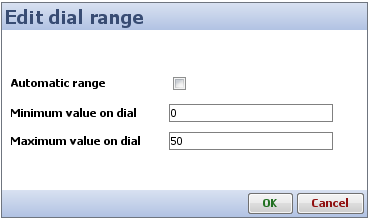 | Automatic range: When this option is ticked, the values for the minimum and maximum are automatically calculated by the view. These values will be determined by the underlying data being displayed.
Minimum value on dial and Maximum value on dial: These two options only become enabled when Automatic range is unticked. These allow you to specify your own minimum and maximum value settings. This can be helpful when you want to limit the values of the dial to a certain range. |
Dial view allows you to set your own alerts when certain conditions are met. For example, if you are monitoring sales target, you could have an alert that tells you once 50% of the the items are sold provide some kind of visual notification. You can also use the multiple alerts functionality of the dial view to add further alerts. However, dial view will only show the text of the first alert that has been met. For example, continuing from the previous example, if you have an alert set at 50% and another at 70%, but if the sales have gone beyond 70%, then the dial view show the alert for 50% and not for 70%. Having said that you can from the alerts dialog change this precedence. When no alert condition have been met, but there are alerts set then dial view shows a white triangle on the edge of the dial to indicate where these alerts have been set. Below is a description of how you can add alerts to your Dial View.
When you click on the Alerts button you are presented with the following dialog. The edit alerts dialog allows you to add new alerts, edit existing alerts, remove alerts or change the precedence of the alerts.
| Add...: Allows you to add more alerts. Edit selected...: Allows you to edit a selected alert. Remove selected: Allows you to remove the selected alert. Up and Down: Allows you to change the precedence of the alerts. |
When you click on either Add or Edit buttons in the Edit alerts dialog you are presented with the Add/Edit Alerts dialog an example of which is shown and described below.
| Alert text: The text to display when the alert condition has been met. Alert position: The position of the alert (i.e. the position of the alert in terms of the range). Alert condition: The actual condition which is used whether a certain value is greater than, less than, equal to etc to the alert position. |
The zones settings allow you to set zones to sub-divide the values into different sections. Each of the sub-sections can be assigned a coloured zone and a label. This can be very useful when you have lots of values, and the values can be seperated into groups i.e Low, Medium and High. Below is a description of how you can add zones to your Dial View.
When you click on the Zones button in the View toolbar you are presented with the following dialog. From this dialog you can add, edit, remove and change precendence of the zones. This is useful when you have two or more zones are overlapping each other, as just like with alerts the earlier zones take precedence.
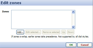 | Add...: Allows you to add a new zone to your dial. Edit selected...: Allows you to edit a selected zone. Remove selected: Allows you to remove a selected zone. Up and Down: Allow you to change the precedence of the zones. |
When you click Add... or Edit selected... buttons in the Edit zones dialog you are shown the following dialog which allows you to configure the zones.
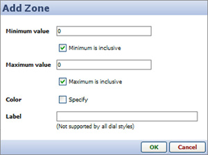 | Minimum value: Represents the minimum value of the zone. Minimum is inclusive: If ticked, means the minimum value is included in the zone. Maximum value: Represents the maximum value of the zone. Maximum is inclusive: If ticked, means that that maximum value is included in the zone. Color: Allows you to specify a colour for the zone. In order to specify the colour you first need to tick the Specify text box. Once you tick the box a colour button will appear next to it from which you can choose the colour. Label: Allows you to specify text to label the zone. This text is shown within the zone in the dial. Please note that this is not supported by all dial styles. |
The value field drop down which is also present in some other views allows you to specify what values to show within the view. By default this is set to Number of records. However, you can easily change this to a particular field. Depending on the type of field you select, a Function: menu will appear, allowing you to chose whether to display the sum, the mean, or some other transformation of the data. If you choose a function such as mean, a Weight: menu will allowing you to specify another field to calculate weighted averages of the values. Below is an example of the Value field menu.
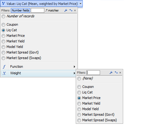
This view is no longer being developed. To use this view, you must enable Settings > Advanced > Show legacy features.
DataPlayers are standard .SWF Flash files which contain the data, multiple visualisations and intuitive query devices used to filter the interactive display(s).
DataPlayers can be created in any size, using either tabbed or simultaneous 'dashboard' layouts and any of many different view types. Interactive DataPlayers are exportable, universally-accessible Flash .SWF files for documents (PowerPoint, Excel and Adobe .PDF) and/or web pages. DataPlayers can be exported from Omniscope files using Professional or Enterprise Editions either directly into documents (with full interactivity), or as an HTML scripted target page, plus related Javascript, images and .SWF files within a single, uploadable folder, or or as standalone .SWF files for refreshing exported DataPlayer data sets by overwriting already posted .SWFs.
The Omniscope DataPlayer View enables DataPlayers to be created and displayed on tabs within Omniscope files. Omniscope .IOK files should be configured with dedicated tabs for one or more exportable DataPlayers. Whenever the data in the .IOK file is refreshed from its linked source or edited from any tab, the DataPlayer(s) will be updated within their Omniscope tab(s) using the newly-refreshed data and the persistent settings in the Views sub-menus.
The example below shows a tabbed configuration using each of the current views, one per tab. The Human Resources data set in the example below is the same as that included in the embedded 'How to use Omniscope.iok' tutorial file's DataPlayer tab. The data describes 111 employees of a fictional company with more than 4 years seniority.
Principal elements of all DataPlayers include:
View chooser buttons (tabbed display only) - each DataPlayer can contain multiple view types. Clicking on these tabs changes the view type displayed, the order of which you can determine by changing the order of the view types in the Views drop-down menu. Simultaneous 'dashboard' display is another Appearance option.
Query devices - the Omniscope Side Bar filter devices and value colouring/ordering settings displayed when the DataPlayer View is opened are replicated in the DataPlayer side filter panel. Like in Omniscope, clicking or sliding the filters in the side panel reduces the displayed record count, as displayed in the barometer at the bottom.
Slider - often, there are more query devices on the side filter panel than can be displayed vertically. DataPlayers where this occurs display a vertical slider to allow the user to access the query devices below the opening set.
Barometer - like Omniscope files, each DataPlayer displays a 'barometer' that indicates the number of records inside the DataPlayer, and the subset of those which are displaying given the current filter settings
Details button - this button can be used at any time to display record (row) level values according to the settings for single and multiple Details display.
Refresh button - like Omniscope files, clicking Refresh returns any filtered records to the visible data set, as confirmed by the barometer.
Within each view, drop-down menus can be configured to give users choices of fields (columns) to display, or no options at all.
Using the menu items available on the DataPlayer View Toolbar (see below), you can extend and refine the opening DataPlayer by adding other DataPlayer view types, and changing the Omniscope Side Bar filter settings to change the query devices available the filter panel generated in the DataPlayer(s) you are creating.
Warning: If you have more than 10-15,000 records in the 'Filtered data (IN)' data set when you first open a DataPlayer View, current limitations in Flash may interfere with full rendering of the initial DataPlayer. It is best to first define either an Aggregation or a Named Query (or both) such that the number of records to be encapsulated in the initial default DataPlayer is reduced to under about 10,000 (depending on row count and data complexity).
Caution: The DataPlayers displayed in the DataPlayer View are fully interactive, and thus it is possible to set filters, change selection drop-downs etc. just as end-users of the DataPlayer will. However, these changes are not persistent. The next time the DataPlayer View is opened and the DataPlayer re-generated, all settings will revert to the settings established in the View Toolbar Views settings menus, as described below.
The DataPlayer View Toolbar includes options to create exportable DataPlayers like the example above, using defined subsets, or even all of your data [75].
The DataPlayer View Toolbar View chooser, Data Subset selector and Aggregation drop-down menus work as they do in all Views. The functions of the other View Toolbar drop-down menus are documented below.
The bottom five commands on the View Tools drop-down are common to all Views and are documented here. Unlike most other views, View Tools > Capture View offers only the option of saving the DataPlayer on a new tab. Options to export DataPlayers to documents and web pages (with full interactivity) are located on the Save/export sub-menu.
|  |
Create skin element > Add skin - DataPlayers are highly customisable. All of the principal elements of DataPlayers use skin elements that can be replaced with skin elements of your own creation. If you wish to add skin elements of your own to a file, select the type of skin element that you have created, give it the name you want to appear in the menus, select the source file containing your version, and set the Inner and Outer Frame limits. For more information on creating and using your own skin elements, see the KnowledgeBase article on modifying and creating skins [76].
All of the settings governing adding additional view types and the view-specific configurations of DataPlayers are on the Views drop-down menu.
Opening View:
| One of each View Type added with names:
|
Add, change, re-order (drag the 'hands' up or down) or remove DataPlayer view types from your DataPlayer using the commands on the Views drop-down menu.
Caution: It is good time-saving practise to re-order the DataPlayer view you are working on from last to first in the list. This is because each time you click 'Apply' or 'OK', the DataPlayer will be updated/re-generated with new settings, and the result will open to the first view/tab. Once all the views have been fully configured, you can re-order the views to suit your readers.
The Edit sub-menu commands (including re-naming each view) specific to each view type are documented on pages accessed from the links below (or from the User Guide DataPlayer View sub-menu links at the upper left of this page).
|
|
|
More view types are in development and will be added to future versions of Omniscope. Over time, the view types available in exportable Flash DataPlayer format will approach those available in the Omniscope project files. If you have urgent particular needs for evolution or addition of view types, please contact us [85].
Regardless of the number of view types in a DataPlayer (either in tabbed or simultaneous layout), options to display user-selected subsets of the records, either singly or in groups, for all of the views in a given DataPlayer are set using the Details drop-down menu.
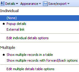 | Individual record (row) display options: (None) - no details display for individual records Edit individual details options - if 'Pop-up details' has been chosen, a three-tabbed options dialog will appear, documented here [86]. Multiple record (row) display options: Show multiple with forward/back - show 'card-deck' style secondary display enabling users to page through the pop-up details display for all the records selected. Edit multiple details options - depending on which option for multiple record display is chosen, a tabbed options dialog will appear, documented here. [86] |
The options governing the overall look and feel of the DataPlayer outside the individual view types are accessed from the Appearance drop-down menu.
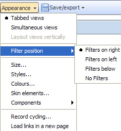 | Tabbed Views - display all one view at a time with buttons to switch views. Size - use sliders to set the width, height and filter panel width in pixels. |
Configuration sub-menus for Size, Styles, Colours, Skin elements and Components options are further documented here [87].
Record cycling - DataPlayers can be animated to 'step through' the highlighting of individual records, displaying Tooltips in some views
Load links in new page - if you have selected Individual details display option External link, tick this option to display the results of the link in a new tab of your readers' default external browser.
DataPlayers are separate Flash .SWF files which can be exported from Omniscope and inserted in documents and web pages with full interactivity. To use the document export options, your machine must have the relevant document-creation applications installed; MS PowerPoint and Excel, and either Adobe Acrobat Reader (free) or a .PDF Publisher.
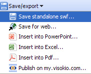 | Save standalone .SWF - exports just the main .SWF file, which can be uploaded with the same name to replace an older online version with a new version containing new data or modified configuration. Save for web - exports an model .HTML file containing <script> tags referencing a collection of files, image folders and scripts and the related, uploadable folder. All you need to do is paste in the <script> text and insert the <object> tags positioning the main .SWF file in the folder on the display page. Insert into PowerPoint - inserts the DataPlayer into a new or existing PowerPoint slide (only displays when presentation is opened in Slide Show mode). Insert into Excel - inserts the DataPlayer into a new or existing Excel workbook tab. Insert into .PDF - inserts the interactive DataPlayer into an Adobe .PDF document. |
Publish on my.visokio.com - you can post a DataPlayer on a blank page hosted by Visokio, then reference this page from your blog or send a link tot he page to your readers by e-mail.
More information on posting DataPlayers online [88]
More information on inserting DataPlayers in common documents [89]
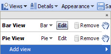
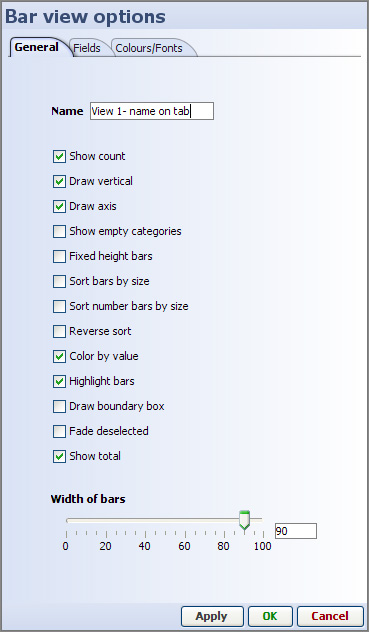
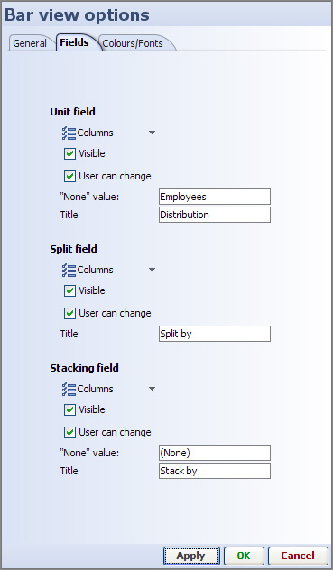
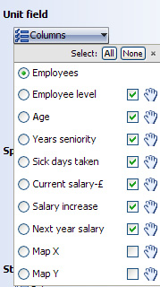
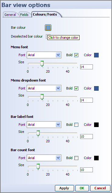
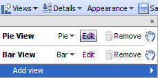
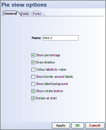
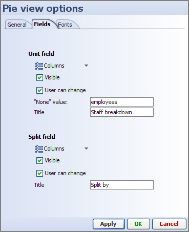
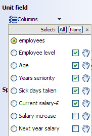
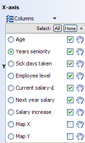
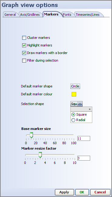
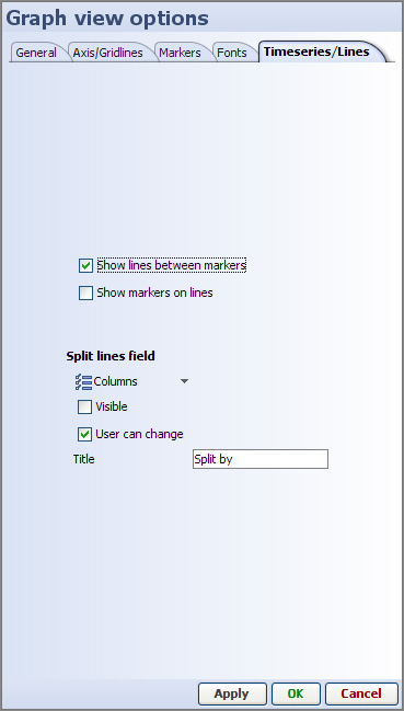
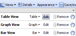
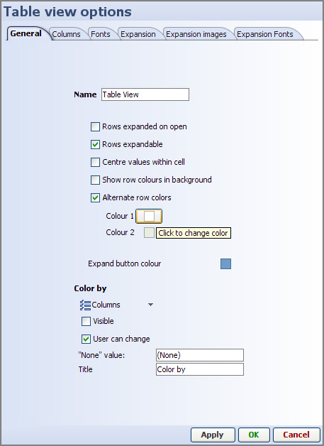
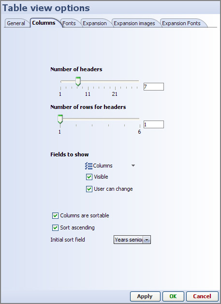
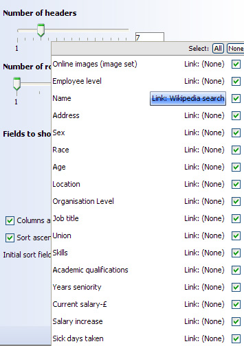
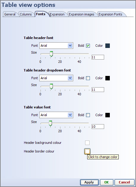
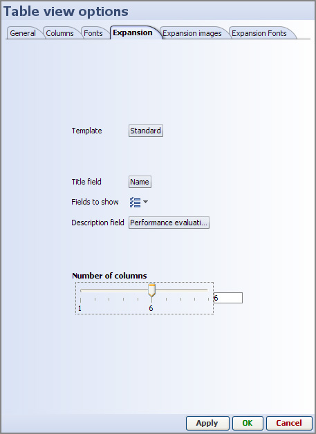
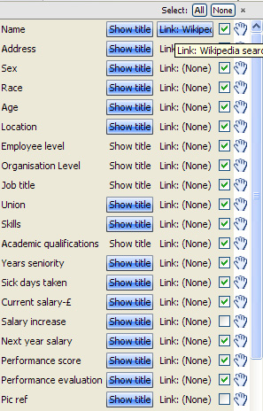
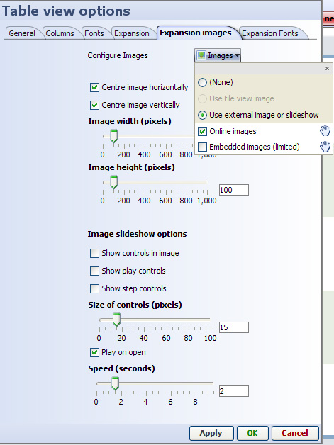
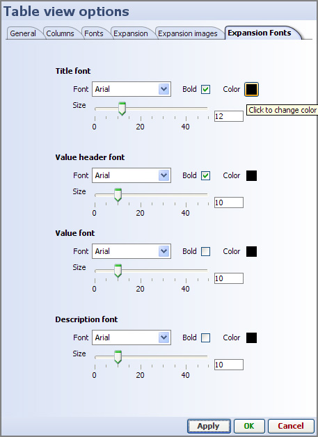
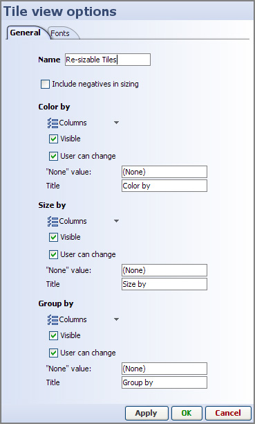
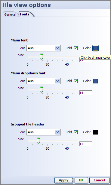
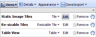
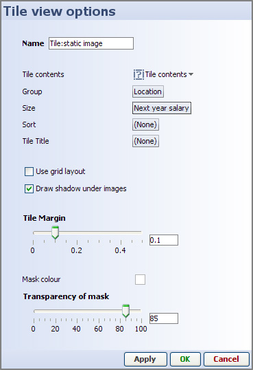 |
Name - the name you give will appear on the tab of the DataPlayer corresponding to this view. Tile Contents - specify either images from defined image sets or values from the data set to appear inside the tiles. |
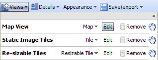

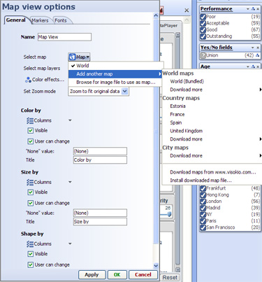
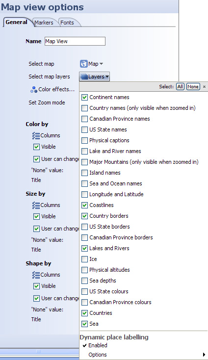
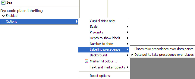
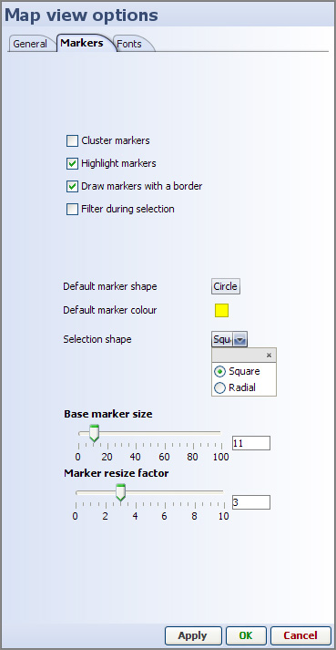
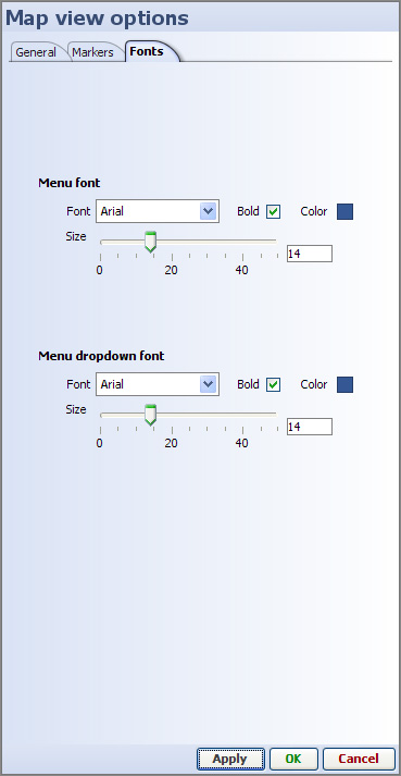
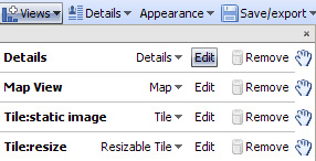
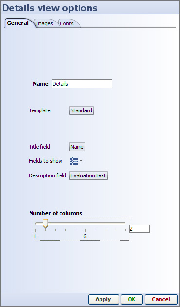
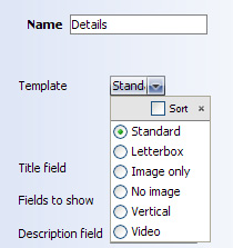
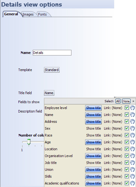
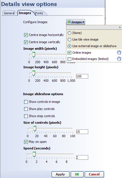
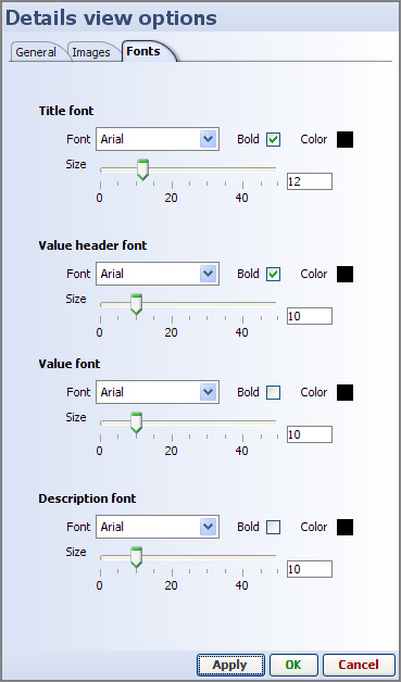
There are several options for configuring the display of the Details display windows that underlie each DataPlayer. Details display windows are not the same as Details View DataPlayers. Every DataPlayer view type includes a subsidiary Details window that responds to user clicks on the Details button.
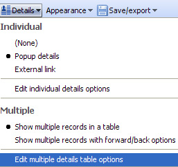 | Individual - refers to details for one record (row) only None - no details display window for individual records Popup details - details window will open on top of DataPlayer, configurable to be slightly smaller...display cannot be larger than DataPlayer External link - allows you to use an external web page to display details (and hi-res images, etc.) for each record. Link must already be defined using Main Toolbar: Settings > Links > Add web link Edit individual details options [90] - all settings controlling the display of details for individual records (rows) Multiple - refers to details for selected subsets of records (rows) Show multiple records in a table [91]-multiple record details in an expandable table. (similar to DataPlayer Table View) Show multiple records with forward/back options [92] - multiple record details in a single window with forward/back paging through records Edit multiple details table options - all settings controlling the display of multiple records according to the choice of either single window or expandable table display. |
If you specify External link, then click on Edit individual details options, you will see a list of the links already configured in the file:
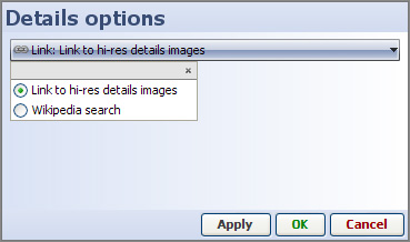 |
If you choose Popup details as the single record details display type, then click Edit individual details display options, you will see a three-tabbed dialog containing all the settings
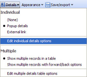 | General tab
Images tab
Fonts tab |
The General tab includes
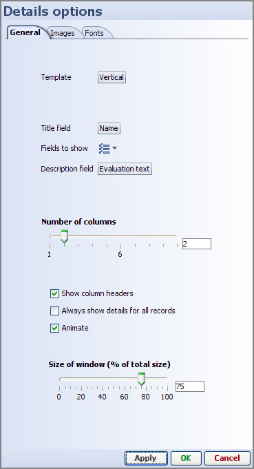 |
Template settings determine the layout of space in the details display window
Standard - Letterbox - Image only - No image - Vertical - Video -
|
Fields to show:
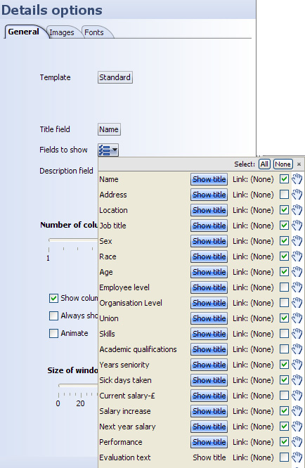 |
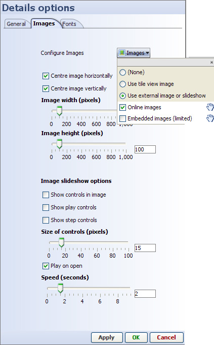 |
 |
(back to top) [93]
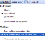
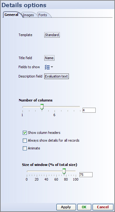
Templates are the same as those for individual record displays
Fields to show drop-down selector works the same as for individual record details display (see above)
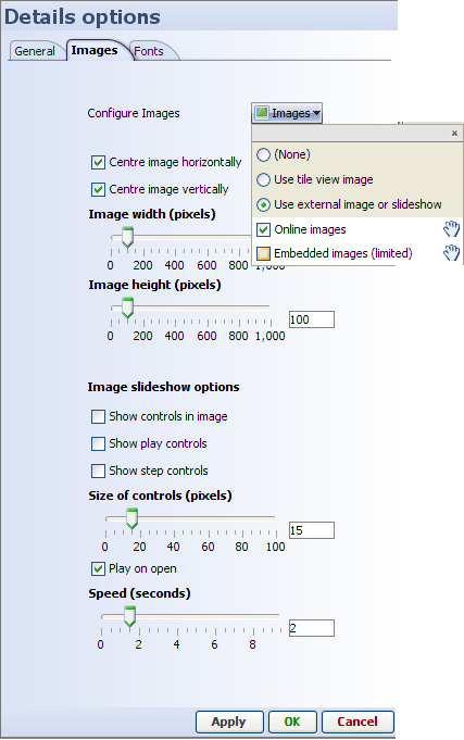
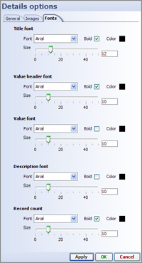
(back to top) [93]
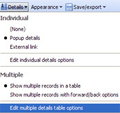
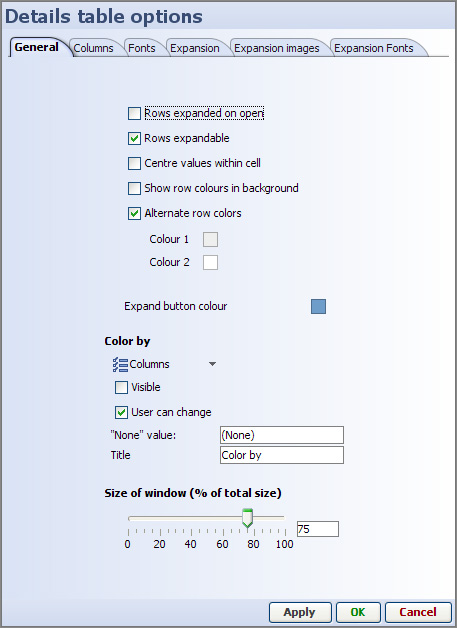
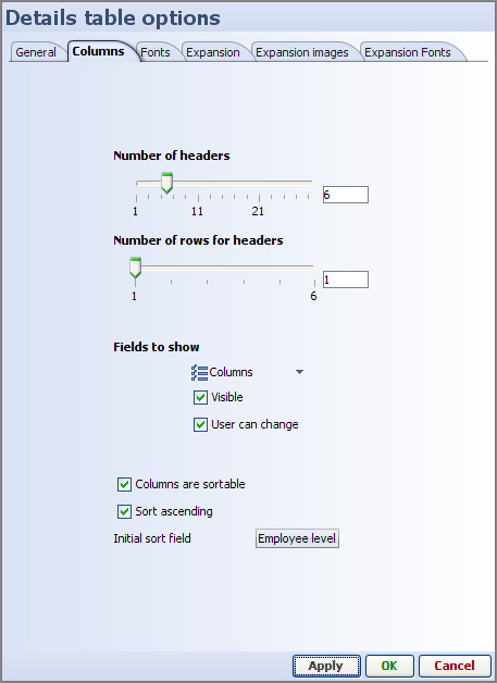
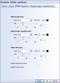
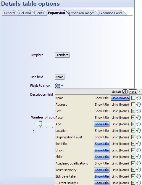
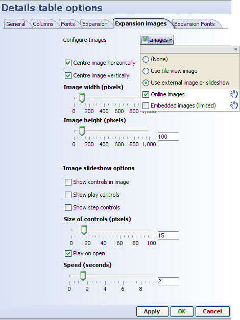
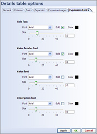
(back to top) [93]
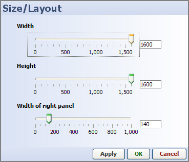 |
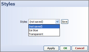 |  |
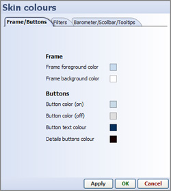 |  | 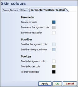 |
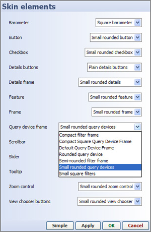 |

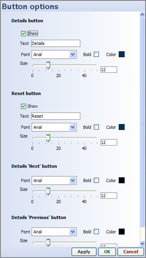
By default, the numbers or dates appear above the sliders. If you have short integer numbers, and mor horizontal space, you can un-tick the Text always above sliders option and the values will appear at the ends of the sliders. (not recommended for dates)
Relatively large data sets may not be able to synchronise the display with movement of the slider in real time. Use the Sliders filter on release option to de-couple movement of the slider from the up-date of the visualisation, improving the user experience.
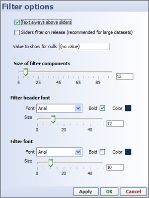
Sets colour options across all view types in the DataPlayer
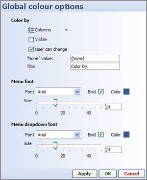
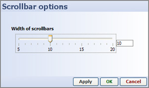
The column(s) to show as tooltips are currently a global Omniscope setting available from Settings > Tooltips (2.5)
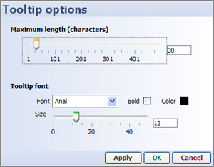
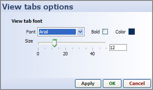
There are currently three options for exporting DataPlayers for display on the web:
If you choose this option, you will be asked to assign a password to the page/file and once your DataPlayer has been successfully uploaded, you will see the link to the page displaying your DataPlayer.
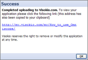 | You can use the resulting link in blogs and e-mails to display a blank web page with just your DataPlayer on it:
http://my.visokio.com/my/How_to_use_Omniscope/ [94]
You can update this online DataPlayer at any time by saving a new file to the same location with the exact same name (you will be asked for the password).
You cannot delete the page or the file, but you can upload a blank or re-directing version if you wish to display elsewhere and cannot recall the links you distributed. |
Choosing the Save for web option exports a blank .HTML file and an associated folder containing some 'helper' files and image folders.
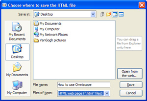 | Choose the name of the DataPlayer save for web file carefully, avoiding spaces and illegal characters, and using caution with upper and lower case naming. Omniscope will check for spaces and illegal characters, but preserve case in the names. Once you approve any changes to the name, Omniscope will save an .HTML page and an associated folder of files and images with the same name to the location you indicate. The blank HTML page can be used as a starting point for creating the page on which the DataPlayer will display, or the code between the <script> tags pasted into an existing display page. The folder of files should be uploaded to the web server preserving the name and the same relative position to the display page (immediate sub-directory). |
The exported Save for web folder contains any image folders (containing all the image files) used/referenced in the DataPlayer, the main .SWF DataPlayer file (with the extension _main.swf) and some helper files used to smooth the loading and display of the DataPlayer in site visitors' browsers.
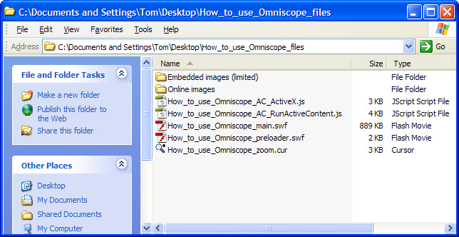
The easiest way of publishing the main SWF DataPlayer file on your intended display page is to use use your CMS to position the Flash file and generate the object tags. Alternatively, you can add hand-coded <object> tags following the model code below. Be sure to note the size of the DataPlayer and provide an appropriate space in the page.
<object classid="clsid:D27CDB6E-AE6D-11cf-96B8-444553540000"
codebase="http://download.macromedia.com/pub/shockwave/cabs/flash/swflash.cab#version=6,0,29,0"
width="750" height="290"><param name="movie"
value="/files/How_to_use_Omniscope_files/How_to_use_Omniscope_main.swf"
/><param name="quality" value="high" /><param name="menu" value="false" /><param name="wmode" value="" /><embed src="/files/How_to_use_Omniscope_files/How_to_use_Omniscope_main.swf"
wmode="" quality="high" menu="false" pluginspage="http://www.macromedia.com/go/getflashplayer [95]"
type="application/x-shockwave-flash" width="750" height="290"></embed></object>
ADVANCED: For advanced users, the blank HTML page exported together with the folder for upload contains the following code, reflecting the names you assigned when you saved the DataPlayer and when you created any associated image folders. If you wish to use scripts, you can paste this code into the various sections of your page.
<HTML><HEAD><script src="How_to_use_Omniscope_files/How_to_use_Omniscope_AC_RunActiveContent.js" type="text/javascript"></script><meta http-equiv=Content-Type content="text/html"; charset=ISO-8859-1"><TITLE>Visokio Omniscope - How_to_use_Omniscope</TITLE></HEAD><BODY align=center topmargin=0 leftmargin=0 marginheight=0 marginwidth=0><center><div style='margin: 10 10 10 10'><!-- using adobe javascript to pre-activate control - needs the How_to_use_Omniscope_files/How_to_use_Omniscope_AC_RunActiveContent.js script file --><script type="text/javascript"> AC_FL_RunContent( 'codebase','http://download.macromedia.com/pub/shockwave/cabs/flash/swflash.cab#version=6,0,47,0', 'width','750', 'height','290', 'id', 'preview', 'quality', 'high', 'bgcolor', '#FFFFFF', 'FlashVars', 'movieToLoad=How_to_use_Omniscope_files/How_to_use_Omniscope_main.swf', 'movie','How_to_use_Omniscope_files/How_to_use_Omniscope_preloader' );</script></div></center><!-- Javascript to get round IE "Click to activate and use control" --><script type="text/javascript" src="ieupdate.js"> theObjects = document.getElementsByTagName("object"); for (var i = 0; i < theObjects.length; i++) { theObjects[i].outerHTML = theObjects[i].outerHTML;}</script></BODY></HTML>If you have already published a DataPlayer and you wish to replace it with a more current .SWF containing refreshed data, or you wish to test the performance or other features, you can choose to export just the main .SWF file. Choose the name carefully, avoiding spaces and illegal characters, and using caution with upper and lower case naming. Omniscope will check for spaces and illegal characters, but preserve case in the names. If you are replacing an existing .SWF on the site, be sure to use the exact same name with the suffix 'main'. In the example above, the relative location and name of the file to be overwritten on your web server is shown following the code 'movieToLoad=
How_to_use_Omniscope_files/How_to_use_Omniscope_main.swf
Note: to display a standalone .SWF locally, you may need to associate the .SWF file extension with your browser.
Links:
[1] http://kb.visokio.com/view-toolbar
[2] http://kb.visokio.com/table-view
[3] http://kb.visokio.com/chart-view
[4] http://kb.visokio.com/pie-view
[5] http://kb.visokio.com/bar-view
[6] http://kb.visokio.com/graph-view
[7] http://kb.visokio.com/display-time-series
[8] http://kb.visokio.com/tile-view
[9] http://kb.visokio.com/pivot-view
[10] http://kb.visokio.com/network-view
[11] http://kb.visokio.com/portal-view
[12] http://kb.visokio.com/map-view
[13] http://kb.visokio.com/connect-markers
[14] http://kb.visokio.com/venn-view
[15] http://kb.visokio.com/web-view
[16] http://kb.visokio.com/web-services
[17] http://kb.visokio.com/content-view
[18] http://kb.visokio.com/dial-view
[19] http://kb.visokio.com/details-view
[20] http://kb.visokio.com/views-reference
[21] http://kb.visokio.com/queries-subsets
[22] http://kb.visokio.com/viewing-details
[23] http://kb.visokio.com/printing
[24] http://kb.visokio.com/layout-menu
[25] http://kb.visokio.com/node/245
[26] http://kb.visokio.com/node/272
[27] http://kb.visokio.com/node/207
[28] http://kb.visokio.com/node/152
[29] http://kb.visokio.com/formula-fields
[30] http://kb.visokio.com/manage-fields
[31] http://kb.visokio.com/node/204
[32] http://kb.visokio.com/node/229
[33] http://kb.visokio.com/node/249
[34] http://kb.visokio.com/node/246
[35] http://kb.visokio.com/node/360
[36] http://kb.visokio.com/node/215
[37] http://kb.visokio.com/node/235
[38] http://kb.visokio.com/node/125
[39] http://kb.visokio.com/files/Resources/OUGuide/125_UsingViews/Graph227/Time Series Example-Bond Yields.iok
[40] http://kb.visokio.com/node/339
[41] http://kb.visokio.com/node/331
[42] http://kb.visokio.com/network-view-appearance
[43] http://kb.visokio.com/network-view-appearance#nodes
[44] http://kb.visokio.com/network-view-appearance#lines
[45] http://kb.visokio.com/network-view-appearance#labels
[46] http://kb.visokio.com/node/231
[47] http://kb.visokio.com/kb/maps-library
[48] http://kb.visokio.com/node/267
[49] http://kb.visokio.com/node/130
[50] http://kb.visokio.com/company#contact
[51] http://kb.visokio.com/node/227
[52] http://kb.visokio.com/node/153
[53] http://kb.visokio.com/node/357
[54] http://kb.visokio.com/node/262
[55] http://kb.visokio.com/maps
[56] http://kb.visokio.com/files/Resources/OUGuide/396_UsingMaps/396_4Maps_800x594.jpg
[57] http://kb.visokio.com/kb/maps
[58] http://kb.visokio.com/kb/projection-transformation
[59] http://kb.visokio.com/merge-files
[60] http://kb.visokio.com/merge-files#cities
[61] http://kb.visokio.com/merge-files#postcodes
[62] http://kb.visokio.com/node/233
[63] http://kb.visokio.com/files/Resources/OUGuide/125_UsingViews/Map233/Connect Markers World Trip.iok
[64] http://kb.visokio.com/node/226
[65] http://kb.visokio.com/node/224
[66] http://kb.visokio.com/node/344
[67] http://kb.visokio.com/node/260
[68] http://kb.visokio.com/adding-styling-text#Edit Annotation
[69] http://kb.visokio.com/adding-styling-text#Web and File Link
[70] http://kb.visokio.com/adding-styling-text#Formula
[71] http://kb.visokio.com/adding-styling-text#Aggregate
[72] http://kb.visokio.com/adding-styling-text#Subset: Filtered data
[73] http://kb.visokio.com/node/635
[74] http://kb.visokio.com/adding-styling-text#Top
[75] http://kb.visokio.com/kb/dataplayer-scaling
[76] http://kb.visokio.com/kb/flash-skins
[77] http://kb.visokio.com/dp-bar-view
[78] http://kb.visokio.com/dp-pie-view
[79] http://kb.visokio.com/dp-graph-view
[80] http://kb.visokio.com/dp-table-view
[81] http://kb.visokio.com/dp-tile-dynamic
[82] http://kb.visokio.com/dp-tile-static
[83] http://kb.visokio.com/dp-map-view
[84] http://kb.visokio.com/dp-details-view
[85] http://kb.visokio.com/contact
[86] http://kb.visokio.com/dp-edit-details
[87] http://kb.visokio.com/dp-appearance-display
[88] http://kb.visokio.com/dp-web-display
[89] http://kb.visokio.com/dp-document-display
[90] http://kb.visokio.com/dp-edit-details#indiv
[91] http://kb.visokio.com/dp-edit-details#mult-tbl
[92] http://kb.visokio.com/dp-edit-details#multfb
[93] http://kb.visokio.com/dp-edit-details#top
[94] http://my.visokio.com/my/How_to_use_Omniscope/
[95] http://www.macromedia.com/go/getflashplayer
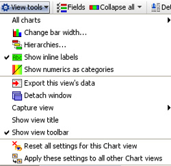
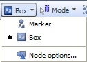
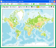
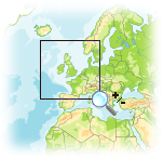
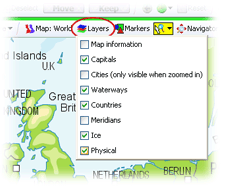
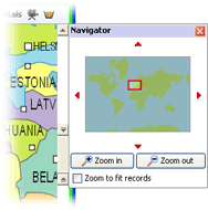
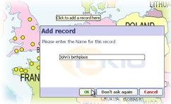
 Mode icon and select Place Marker mode.
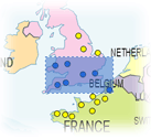
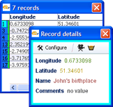
 to see the Show Details pop-up table for all the records located within the selected area
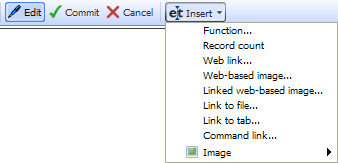
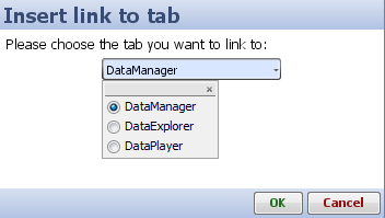
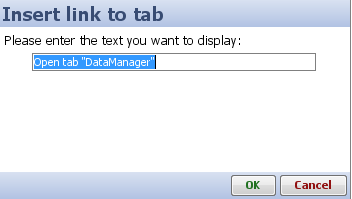
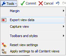
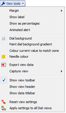
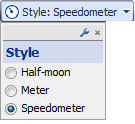
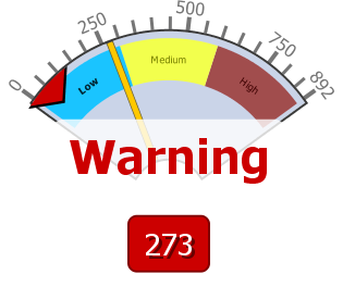
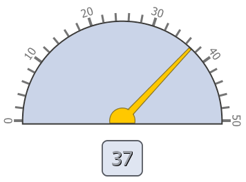
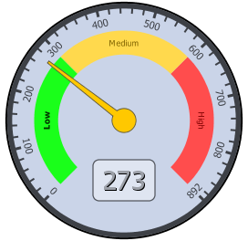
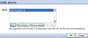
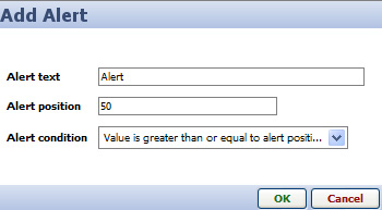
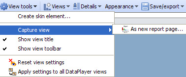
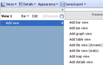
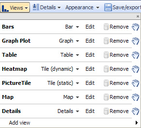